FredZeppelin
Active Member
Violets are blue.
...The Blades are in Europe...
Follow along with the video below to see how to install our site as a web app on your home screen.

Note: This feature currently requires accessing the site using the built-in Safari browser.
All advertisments are hidden for logged in members, why not log in/register?
Violets are blue.
Wednesday are in league 2...The Blades are in Europe...
The home shirt is starting to grow on me after my initial reaction.
I'd prefer white or black socks though.
Wednesday are in league 2
Had to be done.'Tap in' for you there, Pal. ;-)
UTB
OH! What a tangled web we weave, when at first we do deceive.Personally i would like this kit as a departure from our normal red and white as a second kit. As Blades are representing Sheffield on the world stage surely we can acccept a blue stripe mixed into our kit. Change the Nike logos for addidas, our sponsors etc. As we are the Barca of the Premier league who would object, have a twinning arrangement,
Las Ramblas or Ecclesall Road on a pre covid friday night
View attachment 85679
Ban the blue-quick re-View attachment 85725
IT NEEDS TO BE THIS. NOW PUT A BIG PICTURE AND BOLD TEXT. COULDN'T BE MORE CLEAR.
 touch
touchBan the blue-quick re-View attachment 85733touch
Affirmative! Go along with that sir, uncluttered, less is more.Replace the black with red and you have a deal. Almost a replica of the 74-75 shirt
Perfection for a Blades shirtBan the blue-quick re-View attachment 85733touch
I take your point, but my take is more red than white in a straight red and white striped shirt. Black trims are OK also and if needed a touch of gold to add more ambiance.Perfection for a Blades shirt
Has to be black trim or it looks too much like a Stoke City kit
 in my view the white out balances the red so, although it's reasonable not really my cup of tea. Like the cuffs, they almost save it for me.
As I said earlier I don't really understand why we always go with block colour on the upper chest and sleeves/just sleeves.I take your point, but my take is more red than white in a straight red and white striped shirt. Black trims are OK also and if needed a touch of gold to add more ambiance.
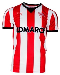
If this is next seasons shirt,View attachment 85739 in my view the white out balances the red so, although it's reasonable not really my cup of tea. Like the cuffs, they almost save it for me.
Also looked ok with white shorts. See if you can put Lavers, Wards or Cantors for the sponsor.Ban the blue-quick re-View attachment 85733touch
That kit was largely an outlier when considering history of our kits since.
That kit was largely an outlier when considering history of our kits since.
They're usually red white and black not completely red and white.
Beacause our badge was different thenIn the history of our kits, from our formation until 1976 there was never any black on our shirts. The addition of it is a recent outlier.
1975In the history of our kits, from our formation until 1976 there was never any black on our shirts. The addition of it is a recent outlier.
1975
View attachment 85725
IT NEEDS TO BE THIS. NOW PUT A BIG PICTURE AND BOLD TEXT. COULDN'T BE MORE CLEAR.
It's shit. Next.....
I take your point, but my take is more red than white in a straight red and white striped shirt. Black trims are OK also and if needed a touch of gold to add more ambiance.
If this is next seasons shirt,View attachment 85739 in my view the white out balances the red so, although it's reasonable not really my cup of tea. Like the cuffs, they almost save it for me.
Only saw them on the box a few weeks back. That shirt though, I really like obviously.So how long have you been a fan of Cracovia? Given your repeated posting of this shirt...
Who do you think I am Tuolouse-Latrick?Also looked ok with white shorts. See if you can put Lavers, Wards or Cantors for the sponsor.
In the history of our kits, from our formation until 1976 there was never any black on our shirts. The addition of it is a recent outlier.
All advertisments are hidden for logged in members, why not log in/register?