Steve Mackan
Greasy Wilder
- Joined
- Apr 9, 2016
- Messages
- 1,086
- Reaction score
- 3,928
I've made a new data dashboard on The Pinch.
Hope some fellow nerds get something out of it. But first, for all the people who like a good graph, I'd be really keen to get any thoughts on how it all works.
I'm biased, but I don't think any other club really has this. Yes, the dashboard comes entirely from publicly available data. But what we (Riley and me) noticed, was that this data is often so often under-explored at club level, which makes sense because it's bloody labour of love to do. So, we've tried to dig a little deeper whilst providing data that can actually be explored.
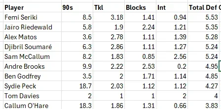
This isn't a series of screenshots or tables you can't sort. We've built something that (with fingers crossed it all works) is a proper statistical sandbox. You can sort tables, search tables and interact with graphs. You can isolate stats from one game and compare them with another. Altogether, there are 12 charts/tables, covering Team Stats, Match-by-Match stats and Player Stats.
Now, I'm totally prepped for the xJUYEC (expected 'just use your eyes' comments). And I have a lot of sympathy with anyone who dislikes the way data in football is covered. But our intention with this is to make Blades By Numbers a bit of a playground; the entire opposite to the StatManDavification in mainstream media, with nobody shoving the xG of a shot down your throat.
Those are a lot more words than I'd planned. Hope a few of you have a play around! And any feedback hugely appreciated.
Ta, Sam!


