As you know I cannot comment other than to say I don't think you will be disappointed no big white plastic if that helps?
Great! Looking forward to buying and spreading the word of John Holland in Mexico!
Follow along with the video below to see how to install our site as a web app on your home screen.

Note: This feature currently requires accessing the site using the built-in Safari browser.
All advertisments are hidden for logged in members, why not log in/register?
As you know I cannot comment other than to say I don't think you will be disappointed no big white plastic if that helps?
 Today's snippet
Not sure if I like it or notAdidas Tiro 13 template.
Oh dearAdidas Tiro 13 template.

Not keenAdidas Tiro 13 template.
While the new away kit looks as if it will be well received, from a players point of view, wouldn't a more prominent colour have a more positive benefit on the playing field?
My theory is that a brighter colour is picked up in the peripheral vision much easier than a darker colour, the lime yellow for example (unless you start passing to stewards).....
Just sayin like......
I'll be disappointed if we've got black instead of the rumoured British racing green. Although as previously mentioned, no matter how nice it is, if there's a sponsor on the back, I won't be buying it.
While the new away kit looks as if it will be well received, from a players point of view, wouldn't a more prominent colour have a more positive benefit on the playing field?
My theory is that a brighter colour is picked up in the peripheral vision much easier than a darker colour, the lime yellow for example (unless you start passing to stewards).....
Just sayin like......
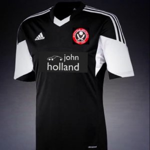
Heinz?Third kit is yellow with black "fade"
Perhaps I can start.
Despite my bias as a blade and having just invested heavily in it, I am more excited about the away shirt than the home (just)
It is unlike anything I have seen before and one of the best shirts I've ever seen
Tony Entwistle
General Manager
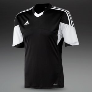
Based on the preview pics, it's something like this. And you've never seen anything like it?
While the new away kit looks as if it will be well received, from a players point of view, wouldn't a more prominent colour have a more positive benefit on the playing field?
My theory is that a brighter colour is picked up in the peripheral vision much easier than a darker colour, the lime yellow for example (unless you start passing to stewards).....
Just sayin like......
Black shirt = bad choice!
And for those who remember the ManUre Grey kit which was dropped because the players couldn't pick each other out (or something like that)!
"Simple" would have been without those unnecessary white blocks on the arms. That would have also been smart.It's basically the same as Southampton's away kit from last season. I like it, simple and smart.
"Simple" would have been without those unnecessary white blocks on the arms. That would have also been smart.
Then make them a little smaller too.Make the white blocks red
I will be buying thatBased on the preview pics, it's something like this. And you've never seen anything like it?
All advertisments are hidden for logged in members, why not log in/register?