beatific blade
Active Member
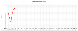
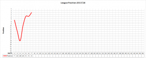
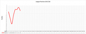
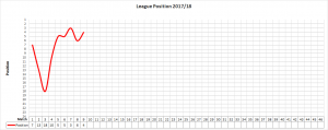
46 points after last night.This is why stats., tables etc. are unreliable with such a small sample size. After we beat Brentford, we were on course for 138 points over the season. After the defeat at Middlesbrough, we were looking at a projection of 69 points. After Cardiff, we've got three points from three games, ergo 46 points over this season.
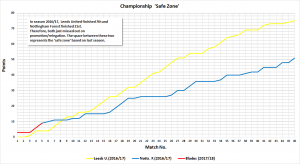
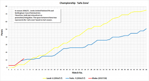
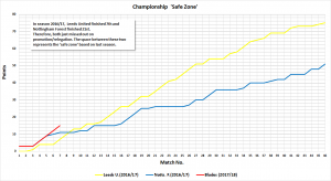
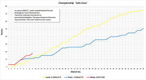
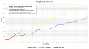
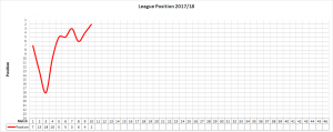
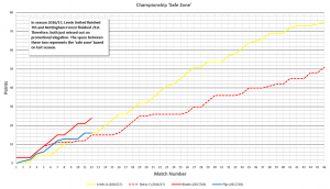
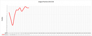
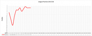
I'm working on it. I see what you mean but, as we all know, the Championship now is a different beast to 2010/11 when we were last relegated from the Championship. For example, Palace, Leicester and Swansea were in the Championship that season. Just as I changed the format last season to comparing 2016/17 to season 2011/12 as comparing last season to Adkins' diabolical effort would be futile, this year I've decided to compare United this season to last season (2016/17) in the Championship. (I don't think we'll get 100 points this season...) It's what I call the 'safe zone'
View attachment 29616
Obviously, I'm open to suggestions. I've really got nowt better to do...
This is probably a lot to ask of you grafikhaus but wouldnt it be a truer reflection of what we need to achieve if we follow a graph comparing us against the average points needed to achieve a) 21st (avoiding relegation), b) 12th place finish (I.e top half), and c) 6th (play offs) over the last 6 seasons (I.e the time we've been away from this league.
Appreciate that's 6 seasons of data to input, but if we have those three average lines to chart against, we have a more accurate representation of how we are doing month-by-month, game-by-game.
Hope that makes some sense - what do we think?

