Birley Blade
Moaner
- Banned
- #91
Wouldn’t take it if it was free. Bag of shit. Who designed that? A 9 year old?

Follow along with the video below to see how to install our site as a web app on your home screen.
Note: This feature may not be available in some browsers.
All advertisments are hidden for logged in members, why not log in/register?

Didn’t like our promotion season one at first but it grew on me due to the success we were seeing in it. Hopefully we’ll be saying the same this time next year.

Not for me. Don’t like the plain back although appreciate that’s a PL requirement (I think?!). The collar is awful.

Two arguing nine year olds.Wouldn’t take it if it was free. Bag of shit. Who designed that? A 9 year old?


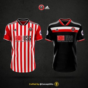
Thoughts on next season's shirt please. Good/bad? Apologies if already posted

"relegation kit" ☹
No, I jest. Things I like: broad red and white stripes. Things I don't like: Too much white on it - especially on the back. I mean, what's with all this cutting down on stripes business? Are they expensive or what? I prefer a shirt that is striped front and back - Oh Lord, is that too much to ask?

Adidas do make them, so it must be coming from the club.
Adidas ought to put their foot down and say "you're having full stripes you twats, we're fed up of the flak".

I tell you the way it works, at least, this is how I think it works...
Adidas (and others) will have a software programme that has stock designs on computer.
It breaks the shirt down into its various positional components...
Front
Back
Sides
Sleeves
Shoulders
Collar
Then it has a series of colours
Red
Blue
White
Black
Gold
Green
Purple
Orange
etc
And then a series of designs...
Stripes vertical narrow/medium/wide/continuous/broken one-third, broken two thirds...etc
Stripes horizontal
Stripes diagonal
Squares
Swirls
Swooshes
Diamonds
etc
and the computer can create any combination of the above. Literally millions of permutations.
They'll encourage clubs to choose something sufficiently different to the previous season's kit, in order for people to want to be seen in a different design. And they'll probably know which elements of the shirt are most appealing to the fans, e.g. for us it's the broad red and white stripes. So they'll create designs that link back to that, but play around with the rest of it. I think the decision will be the club's, but they can ultimately have anything they want.
The only constant thesedays seems to be the material they are made from. It would be nice to see a bit more choice in that, from thick heavy cotton (Rugby type) shirts for winter, to ultra-lightweight shimmering chiffon or silk "peek-a-boo"numbers, with sequins on, for summer.


Agree. If the rule is a plain colour (is it as hearing different views on this), should be red.From what I understand it's the premier League that enforces the plain block colour on the back of shirts to make numbers and names easily identifiable. For what it's worth I think it should be a plain red back. There's too much white and barely any red.
From what I understand it's the premier League that enforces the plain block colour on the back of shirts to make numbers and names easily identifiable.
From what I understand it's the premier League that enforces the plain block colour on the back of shirts to make numbers and names easily identifiable. For what it's worth I think it should be a plain red back. There's too much white and barely any red.
West Brom's new away kit also as fully striped back.Not so, Newcastle's new kit as a fully striped back.
So just to clarify, who fucked this up then?

So just to clarify, who fucked this up then?

I'm a bit mixed about it. The back... yuk! too white!! We ain't L**ds. Only way I think they can improve the shirt is if they put the red Premier League letters and numbers on instead of black to balance it out. Do like the red socks again with the white detail this time not black. But prefer Adidas shorts to have red stripes not white but meh not bothered really. Don't like the fact too that the Adidas logo sits in between the red and white stripes rather than through the middle of one stripe.
Why don't they let fans choose from a choice of so many like they used too?
That bloke who shouts, "Programmes £3.50". Been furloughed for the past few months of course but they felt sorry for him and brought him in to help out with kit design.
We've probably been sent a full stripe design for the last three years by Adidas but the Clubs fax machine is so knackered its managed to print off a blank and two bits of stripes for the last 3 years for the back of the shirt. Now Kevs gone maybe we should buy a new one unless its still required for transfers.
Yeah I know... Its just Wilder and co keep banging on that it is a PROPER football club and the engagement of fans is better etc. Maybe it would be good to find a design thats nice and we could keep for more than than one season, last time was 2002-2004 ffs. Its not like we've changed sponsors.Haven't they only had a fan vote about 3 times in the last ever?


All advertisments are hidden for logged in members, why not log in/register?