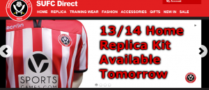
New kit - now released

All advertisments are hidden for logged in members, why not log in/register?

If the kit launch had been done perfectly and the photography was beautiful but it transpired that we were paying a London agency more than we were paying Kevin McDonald, would everyone just be happy we could be proud of our marketing?

I'm guessing all this stuff is a small part of someone's job and we're paying little or nothing for it. Unfortunately that's what happens when you're skint. Ideally we'd have a proper marketing team looking after all this and doing it really well but if we can't afford that, I'd rather cut corners here than on the playing side (and I work in marketing).

Yeah, but hands up how many dedicated fans would've given it a shot either FOC or on a quid pro quo basis?

And just because you possibly aren't getting paid much, it doesn't mean you should lose the capacity to spell. Otherwise, people will take a look and think you aren't worth paying more!
 

If we have someone whose job it is within the club to do design, they should do better.


My point was that maybe we don't. Maybe one of the lads in the ticket office has stuck his hand up and said I'll have a go.

Some very valid criticisms in this thread but think it goes too far when people say things like 'sack someone' for this.

I know that the club started the recruitment process for a 'Head of Marketing' a while ago and then withdrew the role, presumably as part of the cost cutting.

If I was taking over there tomorrow, sorting the photography/design on the website wouldn't be at the top of my priority list. I'd want to get it sorted but there's more important stuff that needs sorting more urgently.
 
Couple more pics....


116.jpg
117.jpg
...and why the tits?
 
Yeah, but hands up how many dedicated fans would've given it a shot either FOC or on a quid pro quo basis?

And just because you possibly aren't getting paid much, it doesn't mean you should lose the capacity to spell. Otherwise, people will take a look and think you aren't worth paying more!

Agree and agree but with regard to point 1, the failure there is that someone higher up hasn't applied a little bit of creative thinking.
 
My point was that maybe we don't. Maybe one of the lads in the ticket office has stuck his hand up and said I'll have a go.

Some very valid criticisms in this thread but think it goes too far when people say things like 'sack someone' for this.

I know that the club started the recruitment process for a 'Head of Marketing' a while ago and then withdrew the role, presumably as part of the cost cutting.

If I was taking over there tomorrow, sorting the photography/design on the website wouldn't be at the top of my priority list. I'd want to get it sorted but there's more important stuff that needs sorting more urgently.

The thing is that you could get it all done for next to nothing compared to all the other expenses the club has and it is something that lots of people see including possible investors who will think we're some amateurish outfit and not want to invest.

My company and Im sure several others would have done it all for pretty much nothing except some free advertising on the scoreboard at half time and around the ground, then you get a professional look and it costs nothing.
 
The home shirt is supposed to be tight fitting. The one little Feb is wearing is about 3 sizes too big.


real-betis-4x3201-852253_478x359.jpg


Nothing can save that away shirt tho!

That one doesnt look too bad if we have to have green
 
First thoughts:

1. Congrats to Bradford Blade for (nearly) getting it exactly right.
2. Don't mind them too much. Even the away strip is not as bad and some on here are saying.
3. The photo they've chosen to release is fucking awful. Someone in Marketing needs to lose their job.
4. I'd have preferred GlasgowBlade's shirts.

Cheers Tarquin,

Must be said, as a trained designer (although far, far, from expert) I made a calculated guess that if we had a black collar (which seemed too simply obvious if I'm honest), it would have to have black trim on sleeves...

But sure, I concur entirely: I thought Glasgow Blade's white collar with red sleeve trim was FAR better (IMHO of course)...

Also, the sponsor's logo aren't too bad, but that away kit colouring :eek::confused:o_O Being an Avenuite (and a bit of a Bhoy), I love green, but that 'design' is a bit, eerrrr, eye searing?! Tell ya what, it'll be selling as a retro shirt on eBay in 15/20 years as a classic :D Remember this below?

Craig UTB!
 

Attachments

  • Blades Navy, Turquoise & Purple 1993-1995.jpg
    Blades Navy, Turquoise & Purple 1993-1995.jpg
    31.3 KB · Views: 5
The thing is that you could get it all done for next to nothing compared to all the other expenses the club has and it is something that lots of people see including possible investors who will think we're some amateurish outfit and not want to invest.

My company and Im sure several others would have done it all for pretty much nothing except some free advertising on the scoreboard at half time and around the ground, then you get a professional look and it costs nothing.


Maybe the plan is to position us a business where lots of improvements can be made very easily and, therefore, very attractive to a potential investor looking to turn the club around and make a profit. :)
 
Honestly with 30 min work I think anyone on this message board could have done 10X a better cutting job. So so crap.

There is really no need for cutting the image out and putting it on that shite background, A regular old pic would have looked miles better, even if it was against a brick wall but ideally on the pitch or something.
 
There is really no need for cutting the image out and putting it on that shite background, A regular old pic would have looked miles better, even if it was against a brick wall but ideally on the pitch or something.

Whats the betting the away kit looked even morelike a buggers muddle against green grass...
 

Maybe the plan is to position us a business where lots of improvements can be made very easily and, therefore, very attractive to a potential investor looking to turn the club around and make a profit. :)

Very true but if I was the investor Id think, these guys don't know what they're doing so they clearly dont know what their club could be worth so Ill offer 10% of what I would HAVE done if they'd just bothered to present themselves properly. Its like getting your car washed before you sell it.
 
I just can't get my head around the fact the first picture of the kits is that. Tiny, badly compressed, badly photoshopped, badly fitted, badly photographed, badly desgined, bad material. I can't think of one redeeming thing about the way this kit was released. Like a few other people on this thread I work for a design firm and I know how much they'd have to spend to at least get a decent photo to upload onto the official site. I'd guess about 300-400 quid. All of those pictures could also be used on the superstore site and maybe on some billboards around the ground.
 
In a way I'm glad the club have made a complete balls up with the kits and has got everyone berating them, there was just too much positivity about the place.

We've got our United back :D.
 
I haven't read any posts as just come back off holiday. I am sure I will be about 290th to reply

WHAT THE F*** IS THE GREEN ALL ABOUT.

Why not read or black

Home kit - I do like
 
Home kit - looks ok, not the best kit macron have done, but it's ok. At least we've got a collar again
Away kit - oh dear if yellow and green wasn't bad enough the shirt looks a terrible shape and the collar looks weird, probably because of the colours.
 
Oh no the shirts of the football team I support aren't exactly how I want them!

FIRST WORLD PROBLEMS
 
Don't like either. Home kit looks old and the away kit is an abomination.
 
The graphics, and quality on the pic make it look like it could be one of the 'finishing' scenes off Mortal Kombat on the PS1 (circa 1997).
And why is the lad in the home shirt treading on the toe of the other lad
 
And why is the lad in the home shirt treading on the toe of the other lad

It's our new 'dirty Leeds' uber competitive mentality that Weir has installed in the lads. Good to see that it's even coming across in the photo shoot...
 
It's our new 'dirty Leeds' uber competitive mentality that Weir has installed in the lads. Good to see that it's even coming across in the photo shoot...
Just hope those two lads aren't 1st team players... I can see the story on the OS now. "Player x will miss the 1st 3 weeks of the season with a toe injury sustained whilst shooting the new kit launch press pics. a second player is recovering in the nrthern general after being struck by lightening during the same shoot. The club are investigating why the photographers decided to shoot the pics by Sheffields lightening conductor...at night....and during the storms of Monday night!"
 

All advertisments are hidden for logged in members, why not log in/register?

All advertisments are hidden for logged in members, why not log in/register?

Back
Top Bottom