New kit - now released

All advertisments are hidden for logged in members, why not log in/register?

I think both kits look fine.

The home one is smart, nice collar on it and most importantly without a sponsor that advertises during Jeremy Kyle.

I can't say I'm overjoyed about having an away kit similar to Norwich City, but it's a vast improvement on the black and orange crap from last year.

Are you blind man..?
 

Top Spring are linked to Scarborough Group and Forsyth Business Centre. No surprise there then. :rolleyes:

Whilst chortling at the marketing bullshit about how linking up with SUFC will aid growth in Russia, you have to say that the number of businesses who dont offer payday loans queuing up to throw money at us must be a round one.

Will there be any mention of the figures involved in sponsoring or (just a thought) is it an inter-business back scratch thing?
 
First thoughts:

1. Congrats to Bradford Blade for (nearly) getting it exactly right.
2. Don't mind them too much. Even the away strip is not as bad and some on here are saying.
3. The photo they've chosen to release is fucking awful. Someone in Marketing needs to lose their job.
4. I'd have preferred GlasgowBlade's shirts.
 
Red and white stripes don't lend themselves to leisurewear so why didn't we go for a plain black or white away shirt that can be used for football or leisure? What is it with the Blades and garish designs?
 
Are you blind man..?

Am I to assume that you don't agree? Come on then, Gok, give us your critique. Would the green shorts make your arse look especially fat?

I can't see anything wrong with the home kit and look forward to buying them for my sons in due course.
 
Official site also making a big deal about having 'international sponsors' on the shirts. They fail to state however that both are linked to Scarborough Group and Forsyth, and we all know where that leads to.

I think the fans would be happier about a local sponsor than some 'international' name no one has ever heard of.
 
They're both pretty disgusting. I'm not sure which is worse. Luckily I never buy football shirts anyway so it won't affect me, but they both look like Sunday league shirts (quite apt given our current level).

They certainly won't be convincing me to break my non-purchasing habits.

How difficult is it to make a simple red and white striped shirt? Why do they have to try to fancy it up with solid blocks of colour and stuff that generally look shite?

Hopefully the team will be better than the shirts.
 
Rather have this back than the yellow and green monstrosity!

DSC04646-500x500.JPG
 
The photography used on that official site photo probably makes them look worse than they are, which is my other gripe. Looks as though that, like the kit itself, has been done on the cheap. Again, a fan with a very small amount of creativity would have no doubt done a smarter piece of work to present it better.
 
I think the fans would be happier about a local sponsor than some 'international' name no one has ever heard of.


I'd have been happier with QuickQuid on the assumption that they'd have paid more for the privilege.
 
Am I to assume that you don't agree? Come on then, Gok, give us your critique. Would the green shorts make your arse look especially fat?

I can't see anything wrong with the home kit and look forward to buying them for my sons in due course.

To be fair the home is OK, my sons can have one each when they get reduced.

The away is simply shocking and I would only buy one for my sons if I wanted them to get teased and bullied.

And for the record my arse is peachy in whatever colour I wear. I just have one of those bums.
 
does anyone really care , really ?
Where are all the doommongers who were slashing their wrists at the prospect of a loan company sponsorship ?
 
does anyone really care , really ?
Where are all the doommongers who were slashing their wrists at the prospect of a loan company sponsorship ?
Which doommongers?
I was against the idea of a payday loan company advertising on our shirts. Is there something you expect of me?
 

Quite like the home kit.

Can't stand the away kit, why we have gone with yellow and green I have no idea. Like someone else said, if they just made it yellow and red like 91 away it would have been fine. Green just looks daft for SUFC.
 
I actually prefer the away to the home BUT both are crap.

Can we get SUFC to employ Glasgowblade to design the next one please? Then I might just buy one
 
First thoughts:

1. Congrats to Bradford Blade for (nearly) getting it exactly right.
2. Don't mind them too much. Even the away strip is not as bad and some on here are saying.
3. The photo they've chosen to release is fucking awful. Someone in Marketing needs to lose their job.
4. I'd have preferred GlasgowBlade's shirts.

Agreed the marketing picture is terrible in that article.

It has been sunny lately so why not just shoot the pictures on the training ground in the sun or something? Rather than blend the images into that shitty background.
 
does anyone really care , really ?
Where are all the doommongers who were slashing their wrists at the prospect of a loan company sponsorship ?
Agreed, it has the r&w stripes, not keen on the solid red shoulder panel but hey ho..... Quite like away strip, but yellow is a favourite colour of mine...
 
Home kit looks pretty good -I have reservations about the sponsor 'sticker' just being a mass of plastic...what happened to the Wards within the fabric style sponsor??

The away shirt is a mess of about 7 colours with the blue on the logo looking awful...doubt I'll buy either!

On a positive, £40 is a fair price considering that nike City shirts are £52!
 
Dont normally care about the kits but these are awful, yellow doesn't go with white and is far too Norwichy, the solid block of colour looks horrid on the home kit too.

I bet Wonga and QuickQuid looked at them and refused to have their names put on such shit shirts
 
I think both kits will look better in the flesh, the problem is the amateur hour marketing surrounding the reveal.

Merchandising should be a big money maker for a club looking to become self sufficient and marketing of said merchandise should be a big project for the marketing department.

I mean, ffs its close season, its a time when the marketing team should be preparing for the new season.

Look at the Citeh away kit images, an hour, 2 wireless flashes and some players or even fans in the new kit in front of the Kop or up on one of the 7 hills of Sheffield and you have instantly got better images than that shite on the site.

It's not hard, I take these kind of images when I'm shooting weddings.

The club has Martyn Harrison for its image needs and has done for years, but if that is the standard of non action based work he is willing to provide for the club (As his action shots are very very good), I think they need to either look elsewhere for PR images or have a word with him.

Yet again the club has missed an opportunity and made itself look amateurish.
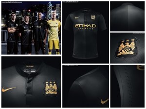
mcfc kit spread.jpg
l-new-kits-2013135-943750_478x359.jpg
 
I like both. Think the main problem with the away is its colours we've never had associated with us before. If the green was red, nobody would have a problem
 

All advertisments are hidden for logged in members, why not log in/register?

All advertisments are hidden for logged in members, why not log in/register?

Back
Top Bottom