New kit - now released

All advertisments are hidden for logged in members, why not log in/register?


The club has Martyn Harrison for its image needs and has done for years, but if that is the standard of non action based work he is willing to provide for the club (As his action shots are very very good), I think they need to either look elsewhere for PR images or have a word with him.
I think a lack of photoshop know-how has let them down, instead of the source imagery.

The photos have been badly cut out and over-compressed.

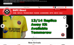
This however, is inexcusable:

tommorow.png
 
Had some crap away kits in our time; but what is the connection between United and Canary yellow & green; it looks bloody awful...maybe am too traditional, but I like to some colour connection. Still think the best away kit was white shirts (with red cuffs), black shorts and socks.

UTB
 
I like both. Think the main problem with the away is its colours we've never had associated with us before. If the green was red, nobody would have a problem

We have had dark green and lime green before ,in fact 2 of of the few kits I own .
 
Also, Mr Photographer: when about to snap make sure you've made the subjects fully aware of the 'look' you're going for or you'll end up with the ''Am gonna git you sucka\WEHEY! TWO DISNEY ON ICE TOYS IN MY SHREDDED WHEAT!!! FANTASTIIIIIIIIC!!!'' dichotmy above.
 
the point of marketing is to get people talking about it .... they've got you :)
 
The home shirt is supposed to be tight fitting. The one little Feb is wearing is about 3 sizes too big.


real-betis-4x3201-852253_478x359.jpg


Nothing can save that away shirt tho!
 
the point of marketing is to get people talking about it .... they've got you :)

The point of advertising is to get you talking. Marketing should actually get you to buy the stuff.

I think they ought to have an away-shirt-ometer on the front page that ticks over to show how many they've sold.
 
Norrrrrrrwich.

It's just like watching Norwich. :cool:

No idea who topspring are, i presume theyre the chinese version of silentnight, but their logo looks bloody horrific on that shirt. Come back wonga or whoever it was.

Be nice if we could employ somebody who could spell "tomorrow", but maybe i'm expecting too much.
 
I'm genuinely astounded by genuinely childlike quality of the design work.

Embarrassing.
 
I've no particular problem with green, yellow, orange, purple, pink or any other colour (bar pig blue) for an away shirt as that is the point in the first place, to avoid a clash of colours i.e. not red, white or black. Don't particularly like this one though with the white bits.

As for the home, not the worst we've had but certainly not the best. Never, ever been a fan of black in the shirt (we declined from the moment we started that) so a white collar with red trim and no black on the sleeves would improve it significantly.

P.S.

The presentation is terrible. Was it a GCSE project for a young fan?
 
Ahem, sorry if it has been mentioned above but I noticed this in relation to the man who owns the company advertising on the home shirt;

A football fan, Dr Pullan, formerly lived in Sheffield when, as chief executive, he oversaw the growth of A4e.
A4e. Would that be the discredited firm that were making so much money out of the government that Cameron severed all links earlier this year? I was a recipient of some of their job search 'help' a couple of years back and I assure you, they were 'stealing' their fees...
Not another one.......... I wonder if United will even get paid...... (watch this space)
http://en.wikipedia.org/wiki/A4e (if you are interested)​
 

Yellow stripes on yellow. It's getting better. The image Linz has put up above makes it grow on me even more.

Both kits are better than both last season. The white was best last year and we wore it about twice
 
Yellow stripes on yellow. It's getting better. The image Linz has put up above makes it grow on me even more.

Both kits are better than both last season. The white was best last year and we wore it about twice


If that doesn't deserve an infraction I don't know what does.

Sod it, go straight to the IP ban.
 
But look at the shadowing on the front page of the OS!

Those are indeed some classy drop shadows... and unusual drop shadow outlines.

Speaking of the utter abomination that is the Official Site, anyone know when our contract with premium TV is up so we can, hopefully, get moved to a "non shoehorned into a template" provider??
 
I quite like the home kit.

The away one is vile but I do think a with a few memorable victories it could become a classic. Its certainly, er.... recognizable. It reminds me of the Chengdu Blades kit that was in the superstore a few years back.
 
And before I'm up with trolling

"TOMMOROW" now that is amateur night graphic design......what the hell?

whoops, sorry Linz, that was your point wasn't it?!


That's nothing to do with graphic design, everyone knows that designers deliberately spell everything wrong (even when they're copying and pasting something that's right) to try and make everyone else look bad.

If the kit launch had been done perfectly and the photography was beautiful but it transpired that we were paying a London agency more than we were paying Kevin McDonald, would everyone just be happy we could be proud of our marketing?

I'm guessing all this stuff is a small part of someone's job and we're paying little or nothing for it. Unfortunately that's what happens when you're skint. Ideally we'd have a proper marketing team looking after all this and doing it really well but if we can't afford that, I'd rather cut corners here than on the playing side (and I work in marketing).


Thing is though Coops, an apprentice on £90 a week who's done 1 year of graphic design and photoshop should be able to do a better job than that.

My wife who's never had any training on Photoshop but can use it to a basic level would do a better job than that.

If we have someone whose job it is within the club to do design, they should do better. Christ, I imagine some agencies would take the job on to flesh out their portfolios.

It's just very... amateur.
 
It smacks of some poor underqualified, overworked sod being given a deadline when they have plenty more to do, and no-one to review their work.

It's just what a cutting organisation ends up with.
 
Couple more pics....


116.jpg
117.jpg


It's the white and green on the away kit...........why not red trim, red shorts and red socks?

even a yellow shirt with white trim, white shorts and white socks would have been better.
 

Thing is though Coops, an apprentice on £90 a week who's done 1 year of graphic design and photoshop should be able to do a better job than that.

My wife who's never had any training on Photoshop but can use it to a basic level would do a better job than that.

If we have someone whose job it is within the club to do design, they should do better. Christ, I imagine some agencies would take the job on to flesh out their portfolios.

It's just very... amateur.

It actually fits in quite well with the rest of the main site...in that it looks like its been designed by a ADHD suffering teenager in his first job.
 

All advertisments are hidden for logged in members, why not log in/register?

All advertisments are hidden for logged in members, why not log in/register?

Back
Top Bottom