New kit 2025/26

All advertisments are hidden for logged in members, why not log in/register?

I mean, it does look really nice. I am probably in the minority, but I really like that collar. There's something about it, its got a very early 00's Italian/ Spanish side feel.

I'd not want Nike at all, template kits galore - the only interesting thing they've done recently is the T90 template, but if everyone gets it as a 3rd shirt, hardly unique!

I posted about this pages ago, but something different like; Kappa, Lotto or Diadora would be great.


That Brighton one is horrific. Looks better on your version as you brought a 3rd colour in that isn't in their design.
I dare say for a top top team like Barcelona, Nike will go the extra mile. But for us? Minimal effort.
Their collars are pretty boring too. Umbro is the one.
 
Last edited:
I’m 58…I’ve got enough red and white striped shirts to see me to the grave.
 
The women's team haven't changed to the white name and numbers.

potentially with the budgets involved they are still wearing the same kits they were for the other preseason games. Hope to god they’ve sorted it for the opening game on 5th Sept otherwise I will really have no clue who is playing for us what with all the new signings
 
I mean, it does look really nice. I am probably in the minority, but I really like that collar. There's something about it, its got a very early 00's Italian/ Spanish side feel.

I'd not want Nike at all, template kits galore - the only interesting thing they've done recently is the T90 template, but if everyone gets it as a 3rd shirt, hardly unique!

I posted about this pages ago, but something different like; Kappa, Lotto or Diadora would be great.

I have been wanting us to go with Hummel for years but, based on this season's kits, I'm now fully in the Kappa camp
 
View attachment 219389

Prefer a fully blank back to this
No, I like it. I think it's much better. First thing I noticed when I watched the Sunderland v Mansfield game the other night. Has a proper 1970's retro vibe to it.

21st-august-everton-0-v-sheffield-united-1-alan-ball-and-joe-royle-take-on-the-united-defence.jpg
 
No, I like it. I think it's much better. First thing I noticed when I watched the Sunderland v Mansfield game the other night. Has a proper 1970's retro vibe to it.

21st-august-everton-0-v-sheffield-united-1-alan-ball-and-joe-royle-take-on-the-united-defence.jpg

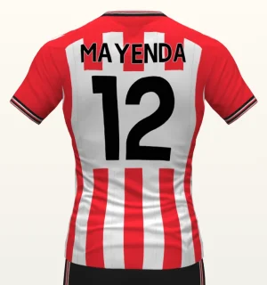
I agree, but the PL numbers are so large now that Sunderland have just blocked all the way instead of a square. Would look much better as a square.

1756458223753.webp1756458262293.webp
 

I agree, but the PL numbers are so large now that Sunderland have just blocked all the way instead of a square. Would look much better as a square.

View attachment 220528View attachment 220529
Indeed, and moved further up, along with the name, like the mock-up. To be honest, I don't see the point of having a name on the shirt, if the numbers are clear enough. Same with test cricket.
 
No, I like it. I think it's much better. First thing I noticed when I watched the Sunderland v Mansfield game the other night. Has a proper 1970's retro vibe to it.

21st-august-everton-0-v-sheffield-united-1-alan-ball-and-joe-royle-take-on-the-united-defence.jpg

I love the white box. Ones on the late 80s and the red one on the 92 are great it’s the fact the name is plonked on stripes that makes it look a mess imo
 
I ordered one of the yellow 23/24 away shirts that season which looked great but on closer inspection the collar and cuffs were very dark green and not black 🤣
Yep there’s always little signs on a fake and dark green collars and cuffs were the obvious ones on that shirt!
 
I agree, but the PL numbers are so large now that Sunderland have just blocked all the way instead of a square. Would look much better as a square.

View attachment 220528View attachment 220529
I believe the reason is the 2 digit numbers that don’t start with 1 wouldn’t fit within the box so that had to use the full width.

Your mockup look like it would just fit but on the actual shirts I don’t think it would.
 
I believe the reason is the 2 digit numbers that don’t start with 1 wouldn’t fit within the box so that had to use the full width.

Your mockup look like it would just fit but on the actual shirts I don’t think it would.
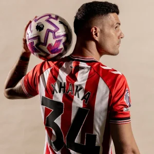
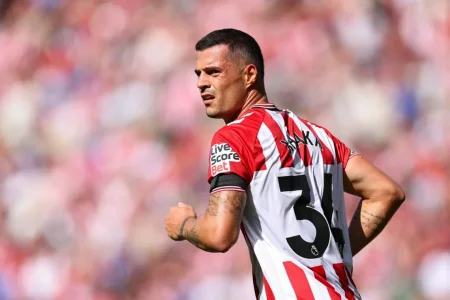
Xhaka's fits in the white stripes

1756478532295.webp

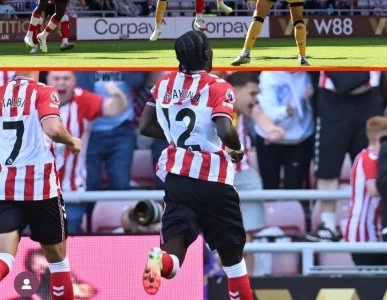
The box into the red stripes makes it look awful

1756478621700.webp
 
Generally the thing with solid backs or gaps like Sunderland's is that they look a bit weird if they're full width, if our one had white side panels or that Sunderland one had red down the sides it'd look better as it creates a frame
 

All advertisments are hidden for logged in members, why not log in/register?

All advertisments are hidden for logged in members, why not log in/register?

Back
Top Bottom