Navigation
Install the app
How to install the app on iOS
Follow along with the video below to see how to install our site as a web app on your home screen.
Note: This feature may not be available in some browsers.
More options
Style variation
You are using an out of date browser. It may not display this or other websites correctly.
You should upgrade or use an alternative browser.
You should upgrade or use an alternative browser.
New kit 2025/26
- Thread starter MCRBlade
- Start date
All advertisments are hidden for logged in members, why not log in/register?
Nedski
Well-Known Member
Fjortoft's Aeroplane
Active Member
- Joined
- Aug 20, 2015
- Messages
- 2,246
- Reaction score
- 3,610
As if the pigs have got red n white on the collar n cuffs! 


KeyffSmyff
Well-Known Member
- Joined
- May 6, 2013
- Messages
- 3,083
- Reaction score
- 3,285
Round our way (northants/oxon) a walled path is a tchure.Agree that was the quote from Google, to me the jennel was a path between two roads that usually went between houses. That was just too confirm it was a word
Tickhill Blade
Active Member
- Joined
- Apr 26, 2019
- Messages
- 2,484
- Reaction score
- 7,051
Bless you!Round our way (northants/oxon) a walled path is a tchure.
Ndiayewillalwaysloveyou
Loyal and that
- Joined
- Jul 13, 2022
- Messages
- 10,972
- Reaction score
- 16,315
Greystones Blade
Active Member
- Joined
- May 23, 2011
- Messages
- 1,174
- Reaction score
- 1,331
Is that the real new kit?
If so phew. At this time of year I dread that the new kit will reveal ….. white shorts…every so often some bright spark at BDTBL thinks it’s time for a change… not often but even once is once too often. Not red either. Our colours are black shorts - long may they stay that way.
metalblade
Well-Known Member
- Joined
- Sep 6, 2005
- Messages
- 16,075
- Reaction score
- 24,273
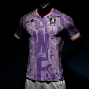
New away shirt has just arrived, really nice 


Birdwell Blade
Active Member
- Joined
- Jul 31, 2015
- Messages
- 1,549
- Reaction score
- 2,757
Young un was first in the queue this morning. Had to wait to get sponsor printed on. Looks ok I suppose but it’s not the best.
Vass Borbokis
Member
- Joined
- Sep 8, 2020
- Messages
- 468
- Reaction score
- 1,594
Was that from DHGate?New away shirt has just arrived, really nice
Club website shows away shirt is at the pre-order stage still.
Fjortoft's Aeroplane
Active Member
- Joined
- Aug 20, 2015
- Messages
- 2,246
- Reaction score
- 3,610
How many different keeper tops have we got this season? I've seen the orange one and the black+gold. Is there a 3rd?
SuperSonicBlade89
Mythic Member
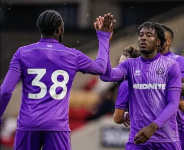
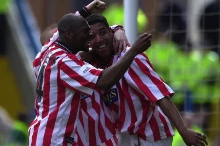
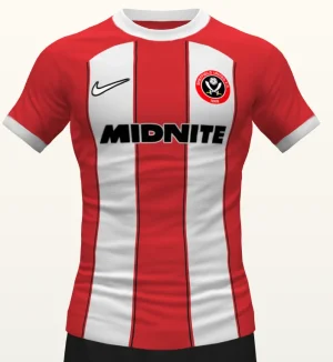
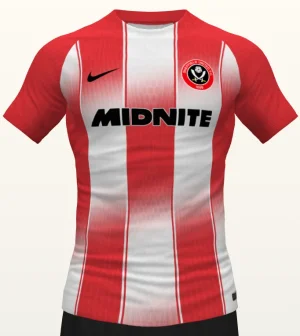
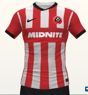
The new home shirt really gives me vibes of the 2000 season (Midas Games shirt).  ... Anyone really remember that mediocre season?
metalblade
Well-Known Member
- Joined
- Sep 6, 2005
- Messages
- 16,075
- Reaction score
- 24,273
No pal, from the club post man just delivered it. Didn't think they were posting until 18th so surprised it came today.Was that from DHGate?
Club website shows away shirt is at the pre-order stage still.
Houston_Blade
Well-Known Member
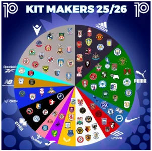
The white is "other". Hull is Kappa, Luton is Reflo, Watford is Kelme, Bristol C. is O'Neills, Wimbledon is Lotto etc etcView attachment 218549
Saw this online, not sure what the white section is. Some mighty clubs with Errea though
mattbianco1
Forum Royalty
View attachment 218549
Saw this online, not sure what the white section is. Some mighty clubs with Errea though
We share the segment with some absolute powerhouses of the English game
I would've expected more in Nike and Umbro
DifferentClass
And Forest are a disgusting set of dog fuckers
Thought Mansfield were still Castore?View attachment 218549
Saw this online, not sure what the white section is. Some mighty clubs with Errea though
ISZA ⚔️
Well-Known Member
- Joined
- Jan 5, 2021
- Messages
- 4,427
- Reaction score
- 10,247
Order of preference for our next kit supplier looking at that would be:View attachment 218549
Saw this online, not sure what the white section is. Some mighty clubs with Errea though
Adidas (classiest)
Kappa/Reebok (somet different)
Nike
Umbro (nostalgia)
Macron (way better now)
Hummel
Joma
Avoid:
New Balance
Errea
Oxen
Puma (pigs)
Houston_Blade
Well-Known Member
The lack of Nike kits amazes me. They obviously don’t see value in UK football kits anymore.We share the segment with some absolute powerhouses of the English game
I would've expected more in Nike and Umbro
Houston_Blade
Well-Known Member
Don’t shoot the messengerThought Mansfield were still Castore?
I would guess the black & orange ones will be the only keeper kits sold in the shop. But would be surprised to see other colours used through-out the season (most likely the same template as the orange kit) where needed due to kit clashes. Especially considering Black & Orange are 2 of the colours referees usually wear.How many different keeper tops have we got this season? I've seen the orange one and the black+gold. Is there a 3rd?
Theres a lot of images on Google of Cooper wearing Orange or Pink kits for both us or Plymouth, so maybe he just likes orange or pink kits?!
I believe Orange, Pink and Black keeper kits were used last season.
Last edited:
Tickhill Blade
Active Member
- Joined
- Apr 26, 2019
- Messages
- 2,484
- Reaction score
- 7,051
DifferentClass
And Forest are a disgusting set of dog fuckers
A lot of Castore clubs are switching to Umbro as they also own the distribution rights and are more of a "name" footballwise, Rangers probably the biggest (also the biggest club to go out of business, piggiesDon’t shoot the messenger
Guessing in Mansfield's case the deal ran out and they switched.
HillStreet Blade
Member
- Joined
- Mar 20, 2019
- Messages
- 198
- Reaction score
- 344
Fjortoft's Aeroplane
Active Member
- Joined
- Aug 20, 2015
- Messages
- 2,246
- Reaction score
- 3,610
The lack of Nike kits amazes me. They obviously don’t see value in UK football kits anymore.
Their designs are awful. Just look at their England kits over the years. Don't think many clubs want them.
DifferentClass
And Forest are a disgusting set of dog fuckers
And they nearly bankrupt Umbro to get the England contract... fuck them.Their designs are awful. Just look at their England kits over the years. Don't think many clubs want them.
Ginger Gnome
Active Member
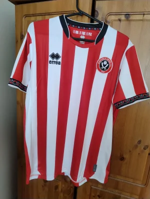
That can't be a genuine product, the collar looks neat, the badge is almost straight and the Errea logo is neatly in the middle of the stripe
Well ive lost 2 stone so now I dont look pregnant in 2xl which is a plusSo, anyone got the home kit and can share opinions on quality, etc?
I saw the away shirt in store looks great
Home shirt I'm kind of over the back of it now. Many shirts are like it these days. Pigs isnt much better, southamptons last year was similar, and ive seen plenty others. I think that black line across the bottom looks awfully out of place but other than that nothing else to moan about. From front it looks super imo.
Oh but the badges are wonky again as per last year. Went trawling for one that wasn't wonky and failed
mattbianco1
Forum Royalty
Similar threads
- Replies
- 32
- Views
- 3K
- Replies
- 93
- Views
- 8K
- Replies
- 280
- Views
- 16K
All advertisments are hidden for logged in members, why not log in/register?

