Navigation
Install the app
How to install the app on iOS
Follow along with the video below to see how to install our site as a web app on your home screen.
Note: This feature may not be available in some browsers.
More options
Style variation
You are using an out of date browser. It may not display this or other websites correctly.
You should upgrade or use an alternative browser.
You should upgrade or use an alternative browser.
Kit thread: Here we go!!!!!!!!!!!
- Thread starter BigBed
- Start date
All advertisments are hidden for logged in members, why not log in/register?

WhiteHawk
Forum Sheep Herder
Didn't notice that colour shirt was available to buy when I looked on the Adidas website. Also, where did you buy the badge from?Nice sponsor free version for Sherburnblade Jr. arrived today, or should I have started another DIY thread?View attachment 42153
bromtom
Well-Known Member/ Former F1 Driver Jos Verstappen
Didn't notice that colour shirt was available to buy when I looked on the Adidas website. Also, where did you buy the badge from?
You can get the shirt on kitlocker.
https://www.kitlocker.com/products/adidas-condivo-18-short-sleeve-jersey-solar-yellow-black-p
WhiteHawk
Forum Sheep Herder
Thought it'd be cheaper than £30.You can get the shirt on kitlocker.
https://www.kitlocker.com/products/adidas-condivo-18-short-sleeve-jersey-solar-yellow-black-p
Barney
Well-Known Member

shorehamview
Pink Sambuca drinking World Champion.
I’d take that back, they’ve only sold you one sock.Very much impressed with the away shirt. To reply to the numerous who have said it's just like the Adkins away shirt it's not. That was luminous green and this is luminous yellow and similar in colour to the original Laver and also the Wards luminous shirts.
The only niggle I have is the Adidas logo on the shorts is stitched in a normal looking yellow rather than a matching luminous yellow.

Barney
Well-Known Member

SHOREHAMST.com
shorehamst.com
- Joined
- Jul 22, 2006
- Messages
- 966
- Reaction score
- 1,672
Lose the Kappa fit and the pig-style supplier, add 6 black stripes and the Adi logo and that’d break away shirt sales records.
bromtom
Well-Known Member/ Former F1 Driver Jos Verstappen
Lose the Kappa fit and the pig-style supplier, add 6 black stripes and the Adi logo and that’d break away shirt sales records.
2-4 Bouncing Day
EV2(-4)
EV2x4 = E<EV8

Barney
Well-Known Member
If we had that away shirt and the home shirt (bar the sponsor) I posted a bit further up, it'd be sales records all round.Lose the Kappa fit and the pig-style supplier, add 6 black stripes and the Adi logo and that’d break away shirt sales records.
cooperblade
Well-Known Member
- Joined
- Aug 7, 2009
- Messages
- 3,204
- Reaction score
- 5,135
Not sure the design makes much difference to sales.
There are 3 groups of people - those who buy it whatever, those who don't buy it whatever and those who decide based on whether or not they like it. I'd say group 3 is by far the smallest one.
There are 3 groups of people - those who buy it whatever, those who don't buy it whatever and those who decide based on whether or not they like it. I'd say group 3 is by far the smallest one.
Fanny magnet
Well-Known Member
- Joined
- Dec 26, 2016
- Messages
- 5,457
- Reaction score
- 8,154
Like a bunch of high pitch Jesse's it's a football shirt and serves no purpose other than for footballers to play football in
You shouldn't be wearing it anyway ,never Mind comenting on the design or colour of it
It's not like you're all walking round in Armani and Versace all the time is it ?
You shouldn't be wearing it anyway ,never Mind comenting on the design or colour of it
It's not like you're all walking round in Armani and Versace all the time is it ?
cooperblade
Well-Known Member
- Joined
- Aug 7, 2009
- Messages
- 3,204
- Reaction score
- 5,135

mattbianco1
Forum Royalty
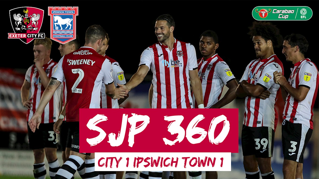
Exeter and Joma showing us what we could've won. The solid red and white numbers make it look so different
CarlMcBlade
Semi active member
Still don’t like our fucking home shirt. The sooner we get away from the awful Adidas template the better for me. The both shirt sponsors ruin the look too. But at least we’ve not become one of the many 32red “franchises.”
aBladeInTheNorthernSky
Member
- Joined
- Nov 17, 2017
- Messages
- 356
- Reaction score
- 1,107
never too early to start again
usually prefer red stripe in the middle... but that's downright sexy. actually like the away as well, bar the badge. add a river plate/peru style 3rd kit (white with red sash) and I think I'd actually start to get aroused.
Billyblade
Semi flaccid member
If that home one had the same stripes on the back I would be close to doing a sex wee
Snowman
Well-Known Member
- Joined
- Dec 24, 2013
- Messages
- 5,397
- Reaction score
- 6,287
never too early to start again
Like them, even if there is a hint of blue/purple. I wonder what black would look like or even red instead of the purple.
TJB.
Make United Fun Again
That crest on the away shirt is something I've advocated for a long time.
You see them swords and you know immediately that it's us. Nowt else is needed. It's minimilist and bold. I love that.
I'd add 1889 in Roman numerals as a wee extra, but once you see what 1889 in Roman numerals actually is you decide against it very long.
You see them swords and you know immediately that it's us. Nowt else is needed. It's minimilist and bold. I love that.
I'd add 1889 in Roman numerals as a wee extra, but once you see what 1889 in Roman numerals actually is you decide against it
very long.Vintage Shirt
Member
- Joined
- Aug 8, 2009
- Messages
- 394
- Reaction score
- 446
I'd love us to go back to umbro. They are producing quality at the moment, then let's put a fat laver sponsor on there.
SW12 to S12 to S18
Active Member
- Joined
- Aug 11, 2015
- Messages
- 2,269
- Reaction score
- 3,462
Not for me, the shirt should always have our club badge on it in full colour, red, white and black.That crest on the away shirt is something I've advocated for a long time.
You see them swords and you know immediately that it's us. Nowt else is needed. It's minimilist and bold. I love that.
I'd add 1889 in Roman numerals as a wee extra, but once you see what 1889 in Roman numerals actually is you decide against it
stringer
Views my own.
- Joined
- Jun 7, 2016
- Messages
- 4,740
- Reaction score
- 6,396
Not sure a half-red away shirt would really be fit for purposeLike them, even if there is a hint of blue/purple. I wonder what black would look like or even red instead of the purple.
Superblades
Well-Known Member
Love the away kit.
never too early to start again
That away kit is beautiful. I loved the last purple and yellow away one.
More Bladier than thou
There's only one Alan Kelly
Bring back Arnold Laver as the shirt sponsor !
Birdwell Blade
Active Member
- Joined
- Jul 31, 2015
- Messages
- 1,549
- Reaction score
- 2,757
They are both outstanding
Boxer Blade
Well-Known Member
- Joined
- Jun 16, 2015
- Messages
- 5,882
- Reaction score
- 8,676
Let's knock the south stand down and go back to three sides
Similar threads
- Replies
- 101
- Views
- 5K
All advertisments are hidden for logged in members, why not log in/register?