shorehamview
Pink Sambuca drinking World Champion.
I’m liking the first away kit. Looks a bit like you’ve been out murdering someone with a chainsaw.couple of quick concepts
Follow along with the video below to see how to install our site as a web app on your home screen.
Note: This feature may not be available in some browsers.
All advertisments are hidden for logged in members, why not log in/register?
I’m liking the first away kit. Looks a bit like you’ve been out murdering someone with a chainsaw.couple of quick concepts
Which dhgate vendor did you use? I ordered and paid 24/5, it "shipped" pretty soon after that but didn't make it to the Dongguan City processing centre until 6/6 and is currently still there!Ordered my promotion shirt from dhgate yesterday, shipped today!
Can't remember. See when it arrives. Thought I'd order it so it'll arrive when I get home in a few weeks.Which dhgate vendor did you use? I ordered and paid 24/5, it "shipped" pretty soon after that but didn't make it to the Dongguan City processing centre until 6/6 and is currently still there!
That macron shirt wasn't all that bad. I got the green and white striped Betis version and it's one of my favourites.Imagine how Conor Coady would feel if he signs, to then have played for United in two of the poorer kit designs and kilt qualities in recent decades...
From this...
View attachment 162283
To this..., Poor sod
View attachment 162284
Bespoke though.Surely if that horrifying shirt is our actual shirt for this coming season, it will be one of the ugliest lowest selling shirts in living memory?
I've already got something similar to that with long sleeves in wool.Would love to see something similar to the Jamaica warm-up design as an away kit for us.
View attachment 162092
Won't be universally popular but I like it. A bit different and I love navy blue with contrasting white/cream.
utb
20/21 is just awful even though it has potential.
2018/9 would've been so much better if the stripes carried on over the back and sleeves or if it was solid red. It looked like watching Fulham when we were kicking towards the away end. And if the sponsor was black instead of green.
The relegation shirt is absolutely ghastly in literally every way. Only home shirt I haven't bought since the days of Macron
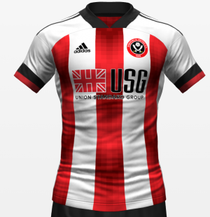

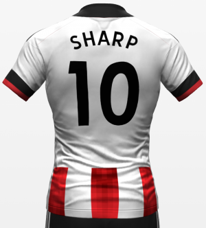
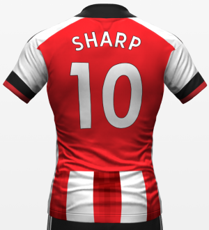
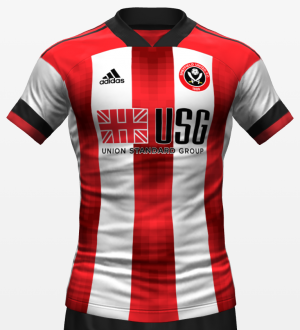
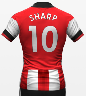
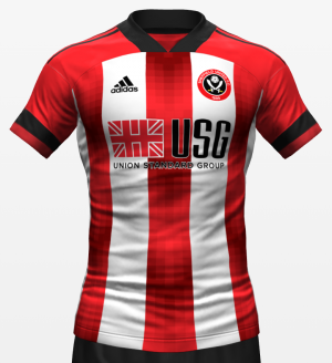
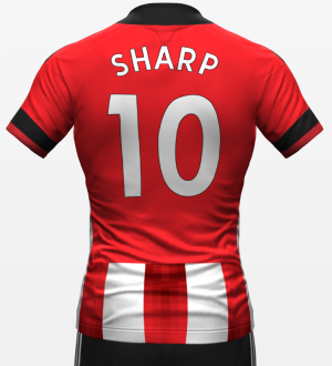
Where have you seen it though?
I know we’re talking mostly about design here but the PL relegation shirt is probably the worst quality football shirt I’ve ever owned. It’s up there with a Barca fake I got when I was 11 years old on holiday. It genuinely put me off buying another Blades shirt.
Where have you seen it though?
Interesting though that this is exactly the same as the one from the Chinese wet market. Either this person has seen that picture and smartened it up a bit or it's a complete coincidence.
Either this person has seen that picture and smartened it up a bit or it's a complete coincidence.
I liked the pinstripe one too as a one off.I quite like it as the mockup. The mannequin one looks like something you’d see at a market stall in Bodrum though.
That said, I seem to be the only person who liked the pinstripe adidas one, so take from that what you will…
Some random concept kit designer on Instagram.
He posted it on 22nd April. That random fake mannequin was shared on here on 2nd June, i think
I hate that colour and design. Reminds me of an old mate when we called to pick him up on our Lambretta to go to Skeggy. He had overslept and dashed downstairs in his yellow pants to open door. When he turned to rush back upstairs to get dressed he had a huge brown skid mark up the back. Scarred me for life that sight.
If we’re talking about the white anniversary home shirt. It’s a lovely shirt just universally disliked due to it being a home shirt.I liked the pinstripe one too as a one off.
Looks like Christmas is getting earlier and earlier every year!Would love to see something similar to the Jamaica warm-up design as an away kit for us.
View attachment 162092
Won't be universally popular but I like it. A bit different and I love navy blue with contrasting white/cream.
utb
We signed Jeremy Beadle?
All advertisments are hidden for logged in members, why not log in/register?
