Navigation
Install the app
How to install the app on iOS
Follow along with the video below to see how to install our site as a web app on your home screen.
Note: This feature may not be available in some browsers.
More options
Style variation
You are using an out of date browser. It may not display this or other websites correctly.
You should upgrade or use an alternative browser.
You should upgrade or use an alternative browser.
23/24 season kit thread
- Thread starter More Bladier than thou
- Start date
All advertisments are hidden for logged in members, why not log in/register?
Sportbilly /Detroit Blade
Well-Known Member
- Joined
- Aug 20, 2019
- Messages
- 7,478
- Reaction score
- 11,245
Would sell whatever, think the vast majority would buy anyway.Surely if that horrifying shirt is our actual shirt for this coming season, it will be one of the ugliest lowest selling shirts in living memory?
- Joined
- Mar 17, 2014
- Messages
- 6,208
- Reaction score
- 15,821
"Like a Battenburg... yellow at the front, brown at the back."I hate that colour and design. Reminds me of an old mate when we called to pick him up on our Lambretta to go to Skeggy. He had overslept and dashed downstairs in his yellow pants to open door. When he turned to rush back upstairs to get dressed he had a huge brown skid mark up the back. Scarred me for life that sight.
(I know Battenburg is pink and yellow, but this is a quote from Aunt Nesta in Man Down)
ISZA ⚔️
Well-Known Member
- Joined
- Jan 5, 2021
- Messages
- 4,399
- Reaction score
- 10,175
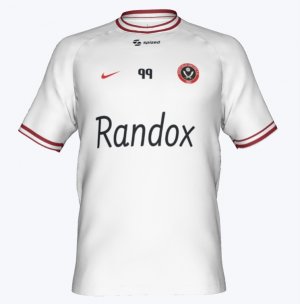
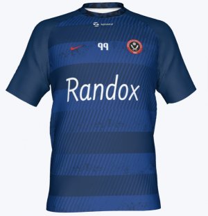
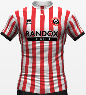
That first one has potential if done in an elegant way like the promotion shirt was.Asked AI for an attempt (just ignore the hands)
View attachment 162321
View attachment 162322
View attachment 162323
mattbianco1
Forum Royalty
Swannyblade
Well-Known Member
- Joined
- May 14, 2017
- Messages
- 2,624
- Reaction score
- 7,241
That's quite nice - would prefer a black collar
CrookesBlade
Well-Known Member
I liked the shirt but sizing was mental. Got a medium which was skin tight so sized up and the large was like a tentI know we’re talking mostly about design here but the PL relegation shirt is probably the worst quality football shirt I’ve ever owned. It’s up there with a Barca fake I got when I was 11 years old on holiday. It genuinely put me off buying another Blades shirt.
Lord Eddard Muir
Nigh invulnerable when Arblastin'
- Joined
- May 11, 2016
- Messages
- 2,674
- Reaction score
- 7,341
Looks like a Barnsley fan with a white scarf on.
Lord Eddard Muir
Nigh invulnerable when Arblastin'
- Joined
- May 11, 2016
- Messages
- 2,674
- Reaction score
- 7,341
Each to their own indeed, I much prefer that bottom mockup to the monstrosity we actually wore. I'd probably have bought that one.I disagree. I think the front of the shirt is absolutely fine. If the back had stripes, it wouldn't have got the stick it did:
View attachment 162295View attachment 162296
The back being plain white puts lots off. If Adidas insisted on a solid back, it should be red, not white.
However, with the design of that shirt having solid shoulders and sleeves, the back had to match the sleeves, otherwise it would have looked out of place.
Solid back...
Official white versus red back:
View attachment 162297View attachment 162298
To go solid red, they would have had to go red shoulders as a minimum, maybe sleeves too.
Red Shoulders:
View attachment 162300View attachment 162299
Shoulders AND Sleeves:
View attachment 162301View attachment 162302
Each to their own obviously, but IMO, white shoulders and sleeves look much better on that shirt than red.
It's the lack of back stripes that cost it for me.
ISZA ⚔️
Well-Known Member
- Joined
- Jan 5, 2021
- Messages
- 4,399
- Reaction score
- 10,175
The problem is that template is awful. Nike are using a very similar one now - see Inter Milan. The way the material is cut and sewn below the collar is both unnecessary and makes any shirt that isn’t a plain colour very difficult to work with, design wise.I disagree. I think the front of the shirt is absolutely fine. If the back had stripes, it wouldn't have got the stick it did:
View attachment 162295View attachment 162296
The back being plain white puts lots off. If Adidas insisted on a solid back, it should be red, not white.
However, with the design of that shirt having solid shoulders and sleeves, the back had to match the sleeves, otherwise it would have looked out of place.
Solid back...
Official white versus red back:
View attachment 162297View attachment 162298
To go solid red, they would have had to go red shoulders as a minimum, maybe sleeves too.
Red Shoulders:
View attachment 162300View attachment 162299
Shoulders AND Sleeves:
View attachment 162301View attachment 162302
Each to their own obviously, but IMO, white shoulders and sleeves look much better on that shirt than red.
It's the lack of back stripes that cost it for me.
Loved the pixelated design of the stripes - and they highlight how that there is plenty of scope to do different things with striped shirts - but on the whole it’s a bad shirt.
On top of that any shirt without stripes on the back is automatically doomed to the average at best category.
Be interesting to see if we keep the stripes on the back this season. There is no reason whatsoever to not have them. No rules, nothing. The club made a point of the last shirt possibly having stripes on the back for the last time due to potential EFL rule changes. Not sure if that rule change has happened but it doesn’t concern us - for now at least. Newcastle - a team in Europe - have released there’s and it’s striped on the back. They will have blocked numbers on the back for the CL games so even then it’s not a difficult workaround.
Ainsley Harriott
I saw this thing on itv the other week
- Joined
- Aug 18, 2016
- Messages
- 21,585
- Reaction score
- 41,104
Ainsley Harriott
I saw this thing on itv the other week
- Joined
- Aug 18, 2016
- Messages
- 21,585
- Reaction score
- 41,104
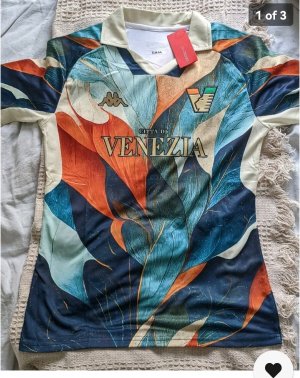
There shirts are all over my ads cause of dhgate and they all look amazing. Very Gucci.This is Venezia's club shop website. We are really lacking when it comes to selling stuff. I don't know what Lido is but I want one.
View attachment 162444
Champagneblade
Stop moaning and get on with it
- Joined
- Jan 24, 2010
- Messages
- 14,662
- Reaction score
- 41,259
Start of July according to the clubAs per usual with United once the window is open and other teams are releasing their kits…
Ainsley Harriott
I saw this thing on itv the other week
- Joined
- Aug 18, 2016
- Messages
- 21,585
- Reaction score
- 41,104
Pigs release their shirt today, we don't even have a picture.As per usual with United once the window is open and other teams are releasing their kits…
What a club.
brownblade
Well-Known Member
- Joined
- Mar 22, 2014
- Messages
- 6,634
- Reaction score
- 9,934
Inter_blade83
Well-Known Member
- Joined
- Jun 11, 2011
- Messages
- 6,553
- Reaction score
- 11,416
So?Pigs release their shirt today, we don't even have a picture.
What a club.
mattbianco1
Forum Royalty
Looking at the piggies' latest offering I find myself wondering, "Isn't that just the same as last years? And the year before? And the one before that?!" In fact, my perception of that lot is that their shirts hardly vary at all year on year. Same boring template it seems, same width stripes, same sleeves - same shit different season!Careful what you wish for.
Short Sleeved £65.
Long Sleeved £72.
Then there's the news announcement
Ours seem to vary much more - Different width stripes, solid sleeves / shoulders, plain backs, stripey backs, black pinstripes sometimes.
Personally I'm glad about that.
Should we be applauded for trying different stuff season to season?
I think so.
Last edited:
coolasanidiot
Active Member
- Joined
- Jul 13, 2017
- Messages
- 1,556
- Reaction score
- 5,759
Collars= WankCareful what you wish for.
Short Sleeved £65.
Long Sleeved £72.
Then there's the news announcement
View attachment 162449
I like button collars but the ones with no buttons like that shite up there are nastyCollars= Wank
leppingslaneblade
Member
- Joined
- Aug 1, 2013
- Messages
- 142
- Reaction score
- 246
Truly awful shirt. Looks like a pork sarnie on the front.Careful what you wish for.
Short Sleeved £65.
Long Sleeved £72.
Then there's the news announcement
View attachment 162449
Ainsley Harriott
I saw this thing on itv the other week
- Joined
- Aug 18, 2016
- Messages
- 21,585
- Reaction score
- 41,104
Be nice to see what's coming that's all. I don't understand why it's not possible to do it.
BigBed
All aboard!!
- Joined
- Jun 8, 2016
- Messages
- 15,929
- Reaction score
- 17,126
- Banned
- #416
They're not men, they're them! Sexist pig!International Women's Shirts started to be released. Here's a ton of them... modelled...by, erm, men!
View attachment 161961View attachment 161962
View attachment 161963View attachment 161964
Swannyblade
Well-Known Member
- Joined
- May 14, 2017
- Messages
- 2,624
- Reaction score
- 7,241
Traditional collars are class, but the more recent ones made out of the same floppy material as the rest of the shirt are crap. Any shirts with big gaping neck openings are also crap.Collars= Wank
blade too long
we go again
Similar threads
- Replies
- 9
- Views
- 2K
- Replies
- 22
- Views
- 1K
All advertisments are hidden for logged in members, why not log in/register?

