Errea....new kit supplier?

All advertisments are hidden for logged in members, why not log in/register?

Thoughts on the kit?


  • Total voters
    641
My first impressions of the new away kit is - I prefer the interim white kit worn since Portugal break without the red black stripe.
I look at it and i think the shirt is a rallying call to go and fight the crusades just a few hundred years too late.
Its a bit like cross of St George with the Randox logo and stripe. Sir Richard Sharp just needs a sword in hand to supplement his photo.

So i will not be purchasing either kit. Lets hope the 3rd attempt is a full on lime green number or something a bit more colourful.

An away shirt would not be enough to tempt me to go off and fight the crusades. I would expect light refreshments also.
 

I’m trying to gauge if it’s actual issues or whether it’s a bit of snobbery.


I was in the club shop today having a nosey around.
The design of the home kits are spot on. But the execution isn't.
The red colour looks too bright and the stitching is really poor. Noticeablely bad.
The texture feels like a dry-fit t-shirt you'd get for the gym for around £15.
The sizing is off (you need to size up at least 1) which means plenty will return if buying online.
Whilst I was in there a bloke was returning his because the badge on the back had peeled off.

I had a look at the leisurewear to see if there was anything I might buy but the quality is really dire. Everything had that nasty wiry nylon feel to it, as opposed to soft cotton.

It's a shame because I went in there with buying something in mind. But lose the Blades badge and it's just a really overpriced bit of cheap fabric.

The away kit concept excited me when I heard "think Ajax," but they'd have been far better off actually thinking Ajax rather than butchering it with that awful collar, trim and all of the black.
 
Judging by the queues on Saturday and the mostly positive reaction to the away shirt I don't think there will be any issues in terms of revenue. If the quality is shit and loads have to take their shirt back then that would obviously be a reason to pull the plug but I'll be surprised if the sales are poor enough to do it.
I’d say that the shirt revenue would be consistent across all brands unless it’s a bit of a cult kit that gets non-shirt buyers deciding to buy one. If you buy a shirt, you’ll generally buy one irrespective of brand.

The additional revenue will be from the training gear and other items. If Errea can churn out some decent items then nothing to worry about, but the tracksuits and training gear by adidas always looked decent.

It’s good to see that the club now have the retro range and some casual wear outside of the main kit supplier. Not something I’d wear but it’s much better than the skeggy market specials we used to have in the club shop.
 
Sued for giving them free advertising? Not sure what the significance of a car wheel close-up in the video is though.
Joking of course but if we've used their logo without their permission they can at least ask us to remove it/stop using it.
 
Btw i'm not furious or owt, don't think many are, just commenting it looks a bit naff. It's difficult to explain how, maybe if theres a graphic designer or somet on here they would understand. But errea just dont seem to know how to turn a good design on paper into a good design on the shirt. They've somehow made a very solid, hard-to-screw-up design look shit with something as simple as stripe width balance between the red and black. It just looks tinpot how the red is too thin given the thick outlines. And if it's anything like the home shirt I'm guessing the quality of material and stitching will be sub-par too
The balance is just off. The black and red elements are fighting with one another. Thinner black central bands that give the red more visual prominence and removal of that shit heavy black collar thing would be a massive improvement. The material again looks a bit shit so probably doesnt help.

I think it could be really nice but execution is a bit BTEC.
 
It's weird even saying this but I think this year's sponsor with randox has been the best looking sponsor we've had on a shirt since I can remember. Just the boldness of the logo fits well with both shirts. Some of the sponsors of previous seasons looked absolutely garbage and tacky, got lost in the shirt.

Now someone reply to my post about how bad Randox Laboratories Ltd is and how they're probably like umbrella corporation in resident evil
 
I like it, prefer that to the home shirt

Agree, always like white shirts as long as they are not too plain.

Havent bought the home shirt for 2 years and was due to buy this years
but will give it a miss and buy the away one instead, it’s in our colours too.

It’s like a typical Southampton home shirt design, they always go for weird red and white stripes alternatives.
 

True it would be similar to this old away kit:

1660301373940-png.141517
At least that explains where the socks style came from, cheers.
 
Don’t like it.

Hoping 3rd kit is black and gold.

Also anyone wanting to offload our Green and gold in medium?
3rd kit has to be something completely unexpected after the middle of the road Home and Away attempts.

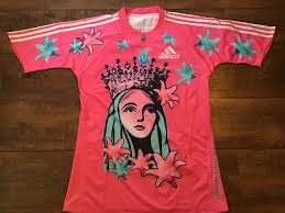
When Stade France came out with this...

1660318066024.png

...it was completely revolutionary.

We need something totally bonkers and memorable

The Sheffield skyline; Vulcan; the outline of a bottle of Hendo's; a barrel of Magnet; a snuff tin; a greasy chip butty; the names of every player who's ever appeared for us etched into the fabric; a Woodbines packet; the outline of the stadium; John Denver; the outline of Fatty Foulkes; a massive 1889 or anything simply madly different!

Just please, please tell the marketing team to think outside the box with kit for a change... and the first team to score from outside the box for a change ;)

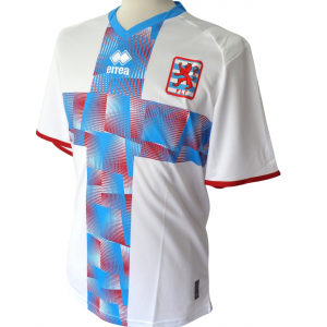
Even Luxembourg is more imaginative than us...

1660318794381.png


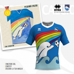
and Pescara too...

1660319052846.png

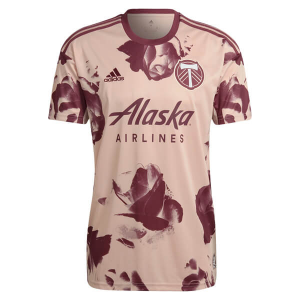
Portland Timbers 🤣 ...

1660319549973.png
 

Attachments

  • 1660319022312.png
    1660319022312.png
    677.8 KB · Views: 4
I was in the club shop today having a nosey around.
The design of the home kits are spot on. But the execution isn't.
The red colour looks too bright and the stitching is really poor. Noticeablely bad.
The texture feels like a dry-fit t-shirt you'd get for the gym for around £15.
The sizing is off (you need to size up at least 1) which means plenty will return if buying online.
Whilst I was in there a bloke was returning his because the badge on the back had peeled off.

I had a look at the leisurewear to see if there was anything I might buy but the quality is really dire. Everything had that nasty wiry nylon feel to it, as opposed to soft cotton.

It's a shame because I went in there with buying something in mind. But lose the Blades badge and it's just a really overpriced bit of cheap fabric.

The away kit concept excited me when I heard "think Ajax," but they'd have been far better off actually thinking Ajax rather than butchering it with that awful collar, trim and all of the black.

Must admit, I'm always baffled why they don't create a replica option in cotton rather than sweat yourself senseless synthetics.
 
3rd kit has to be something completely unexpected after the middle of the road Home and Away attempts.

When Stade France came out with this...

View attachment 141560

...it was completely revolutionary.

We need something totally bonkers and memorable

The Sheffield skyline; Vulcan; the outline of a bottle of Hendo's; a barrel of Magnet; a snuff tin; a greasy chip butty; the names of every player who's ever appeared for us etched into the fabric; a Woodbines packet; the outline of the stadium; John Denver; the outline of Fatty Foulkes; a massive 1889 or anything simply madly different!

Just please, please tell the marketing team to think outside the box with kit for a change... and the first team to score from outside the box for a change ;)

Even Luxembourg is more imaginative than us...

View attachment 141563


and Pescara too...

View attachment 141569

Portland Timbers 🤣 ...

View attachment 141570
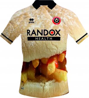
Someone did mock up a chip Butty-inspired shirt within this thread but waaaaaaay back so it'll be hard to find it now. But we should do it. And if not, I'll try and find a firm who could do one for me
 
We could take their idea of using broccoli or peas and give it a Sheffield United twist for our third shirt?

View attachment 137634

Thread closed?

Chip Butty Shirt.jpg
This is the one I refer to.

'in a nod to the clubs anthem, the third shirt shows a chip Butty in a floured breadcake with a smidgen ketchup'
 
3rd kit has to be something completely unexpected after the middle of the road Home and Away attempts.

When Stade France came out with this...

View attachment 141560

...it was completely revolutionary.

We need something totally bonkers and memorable

The Sheffield skyline; Vulcan; the outline of a bottle of Hendo's; a barrel of Magnet; a snuff tin; a greasy chip butty; the names of every player who's ever appeared for us etched into the fabric; a Woodbines packet; the outline of the stadium; John Denver; the outline of Fatty Foulkes; a massive 1889 or anything simply madly different!

Just please, please tell the marketing team to think outside the box with kit for a change... and the first team to score from outside the box for a change ;)

Even Luxembourg is more imaginative than us...

View attachment 141563


and Pescara too...

View attachment 141569

Portland Timbers 🤣 ...

View attachment 141570
The dolphin kit was designed by a little lad and its STILL better than our away shirt.
 
Love the home kit personally but away kit a bit ‘meh’. Don’t like the weird black around collar, stripe should be thicker. Is okay and not horrible. All in all a decent effort contrary to earlier worries about new brand.
 

To be honest I like both more and more, much better than I expected. I think the away shirt will end up being one for collectors in 15 years though, similar to the brown and yellow, a cult classic.
 

All advertisments are hidden for logged in members, why not log in/register?

All advertisments are hidden for logged in members, why not log in/register?

Back
Top Bottom