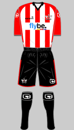
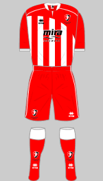
New kit

All advertisments are hidden for logged in members, why not log in/register?

I hope they do change the design. That big white block looks terrible. So much so that it would put me off buying it.

Does anyone have an email address I can give my feedback to? They changed last seasons shirt based on feedback so hopefully they'll do the same again
 

Best kit for years I agree but I also think they have wasted an awful lot of space on that sponsor block.

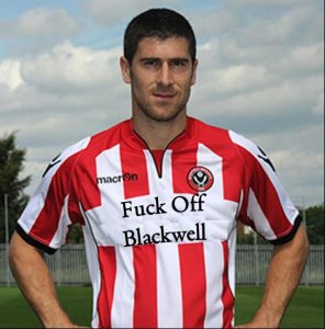
That bladesmad photoshopped one is better, Ive just whipped an email off to Peter Pridmore with it attached to ask him if feedback will be listened to prior to its release.

I figure that the shirt is just plain white material with red stripes printed on to it so they could just program the computer to print that little bit extra.

Still a quality shirt though.

Also, mattbianco don't get giddy, it just means that Macron have a new set of templates.

Macron may have a new template, but we had input into this kit. We told them what we wanted I bet Nike or Adidas wouldn't of done that.
 
I hope they do change the design. That big white block looks terrible. So much so that it would put me off buying it.

Does anyone have an email address I can give my feedback to? They changed last seasons shirt based on feedback so hopefully they'll do the same again

[email protected]

He's Head of Retail and Ive had previous correspondence with him, seems a sound bloke.

I'm sure we have had input but I bet within 6 months something very very similar to our kits are on sale as Macron Teamwear.
 
[email protected]

He's Head of Retail and Ive had previous correspondence with him, seems a sound bloke.

I'm sure we have had input but I bet within 6 months something very very similar to our kits are on sale as Macron Teamwear.

How does that matter? We said what we wanted, they made it to our instruction, and they may release it as their own. It's still our kit, our design, we get what we ask for. You certainly wouldn't get that with other brands maybe that is why they pay us rather than the other way round.
You were claiming it would be an off the peg number, it isn't and the away and 3rd kits certainly aren't. If they chose to know produce our design as teamwear then it is on the back of us. Not us buying it off the peg and sticking a badge on it as you were inferring in the other thread.
 
really like this, hope the macron badges on the side aren't suede again though. a few bits i'd change that have already been mentioned but everyone can't be pleased with one kit. i'd have changed something every kit we've had, but nothing is perfect. this one is real nice-what the prem one should have looked like-was never a fan of the large fit and v-neck collar of that one.

the new away sounds promising-black with the red pins. :thumbup:
 
How does that matter? We said what we wanted, they made it to our instruction, and they may release it as their own. It's still our kit, our design, we get what we ask for. You certainly wouldn't get that with other brands maybe that is why they pay us rather than the other way round.
You were claiming it would be an off the peg number, it isn't and the away and 3rd kits certainly aren't. If they chose to know produce our design as teamwear then it is on the back of us. Not us buying it off the peg and sticking a badge on it as you were inferring in the other thread.


I'll be interested to see what other teams who play in stripes kits look like for next season.
 
I've just found this thread from the kit vote in 2007. (I looked for it.)

Interestingly nobody on here voted for the Grey kit with Yellow trim. I voted for it at the time as unless they bring back the 1989 luminous shirt then they should leave that idea alone.

Anyway, back to the point. Looks like we've finally got the kit 3 years later

http://www.s24su.com/showthread.php?6153-Away-kit-vote&highlight=kit+vote
 
I wouldn't want it as a home kit for us but I think the new Southampton shirt is great.

Southampton_home_kit_10_11.jpg
 
i dont want to come across as a curmudgeon but i think it is .. umm average.. and as a mate of mine would say.. be mega .. be crap but never be average.. it looks like it was designed by a first year graphic design student.. it is over fussy .. it isn't very classy.. i hate the black bits.. (has someone died?).. we dont have black on our shirt .. we're not man utd.. the neck is weird (what is it with us and weird necks.. remember the deano shirt?).. its one plus point is that they have kept the symmetrical stripes but even then managed to fuck it up by making the middle stripe white ffs.. the advertising hoarding is laughable.. why don't we ditch the kit and just have a cycling style shirt with adverts all over it?.. and bloody black socks.. why can't we have white socks or even hooped socks.. are they too difficult to wash?
 
I'd pay to have that shirt Sean!

Personally I can't see the problem with the middle stripe being white. It means if there are seven stripes on the front then the majority are red.

I like the idea of a cycling style shirt. Not for the logos but the ultra tight fit would stop much of the shirt tugging that blights every set piece.
 
I wouldn't want it as a home kit for us but I think the new Southampton shirt is great.

Southampton_home_kit_10_11.jpg

Thats basically an England shirt with a "Miss World" sach across it.

Although they are trying to pass it off as a retro classic effort.

I think Macron and United have cracked it this season.

Good Job.
 

The new shirt is alright. There looks a bit too much white on it though (the sleeves mainly). Also, I think it would look better without the black trim around the neck.
 
I personally am not a great fan of this kit, but it is growing on me. I've just noticed though that our promotion-winning shirt of 2005-06 had a white central stripe. Maybe its a sign!
 
The shorts are pretty plain black by the way... they did play in the new shorts against Mansfield.
 
The new shirt is alright. There looks a bit too much white on it though (the sleeves mainly). Also, I think it would look better without the black trim around the neck.

completely agree. no black on the neck. think i'd prefer the stripes to go all the way up too and over the shoulder too.
 
The shorts are pretty plain black by the way... they did play in the new shorts against Mansfield.

As long as the shorts are "pretty" eh, Delia - I thought you weren't one for reinforcing stereotypes about women and football (or am I wilfully misreading your post?:))
 
any of you photoshoppers out there fancy having a crap at making the away kit? well, what its supposed to look like? (black with red pinstripes)
 
Got this reply from Emma Wylie earlier;

Thank you for your email.


Unfortunately the shirt design is the final one and is unable to be altered now as it is in production ready to go on sale in the next few weeks.


Thank you for your comments and your feedback will be taken into consideration when planning the next design.


Kind Regards


Emma Wylie

Looks like we're stuck with that god awful white panel.
 
really funny thing is that it would seem that all everyone wants is a bog standard retro 1974 style symmetrical red and white stripes going all the way up to the top on the front and back and down the arms .. with red trim and simple collar.. black shorts and white socks.. is it really that difficult?.. they'd sell shed loads of them
 
really funny thing is that it would seem that all everyone wants is a bog standard retro 1974 style symmetrical red and white stripes going all the way up to the top on the front and back and down the arms .. with red trim and simple collar.. black shorts and white socks.. is it really that difficult?.. they'd sell shed loads of them

But then no-one would buy the next design - it just couldn't compete. The trick is to have a rota of barely acceptable kits which subtlely diverge from the ideal in different ways each time. That way you'll entice the maximum number of mugs to make the maximum number of purchases. ;)

JD (From the Bill Hicks school of Marketing)
 
Useless trivia time: it would appear from the pic on the previous page that there are 7 league teams that play in red and white stripes. It occurred to me that Glenn Cockerill played for 4 of them - Lincoln, United, Southampton and Brentford. I bet no one can top that.

But then no-one would buy the next design - it just couldn't compete. The trick is to have a rota of barely acceptable kits which subtlely diverge from the ideal in different ways each time.

You sometimes accidentally get a terrific kit - the Avec one with the stripes in 1997 being a good example. Mind you, it did of course succeed out worst ever home kit.
 
You sometimes accidentally get a terrific kit - the Avec one with the stripes in 1997 being a good example. Mind you, it did of course succeed out worst ever home kit.

That Avec kit was quality, still wear it and it's still in good nick. Good design, good sponsor, good quality.

I think it was automatically considered a nice kit though as it followed the 'diamond fiasco' and was around the same time as the purple/yellow halved shirt (which I have a soft spot for, but which is ultimately an horrific football shirt).

Also, am I alone in wanting the club crest on the shirt to back into the shield design rather than the current circular version?
 

Also, am I alone in wanting the club crest on the shirt to back into the shield design rather than the current circular version?

Yes!!!!

Our badge is a red circle with black circle inside. What we do need is to have yellow handles back on the blades
 

All advertisments are hidden for logged in members, why not log in/register?

All advertisments are hidden for logged in members, why not log in/register?

Back
Top Bottom