Navigation
Install the app
How to install the app on iOS
Follow along with the video below to see how to install our site as a web app on your home screen.
Note: This feature may not be available in some browsers.
More options
Style variation
You are using an out of date browser. It may not display this or other websites correctly.
You should upgrade or use an alternative browser.
You should upgrade or use an alternative browser.
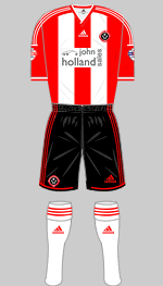
Kit thread: Here we go!!!!!!!!!!!
- Thread starter BigBed
- Start date
All advertisments are hidden for logged in members, why not log in/register?
bromtom
Well-Known Member/ Former F1 Driver Jos Verstappen
I like it .
Runs for cover
Me too.
You know you've been spoiled by nice kits when a perfectly fine kit comes out and the reaction is like someone's coloured a Primark value white t-shirt in with a felt tip and then wiped their arse on it.
DifferentClass
Wilder out
- Joined
- Jul 8, 2015
- Messages
- 18,705
- Reaction score
- 26,951
- Location
- Carried away by a moonlight shadow
Shit sponsor and white back aside, it's growing on me.
We'll probably be wearing red numbers this season, which'll cover the back somewhat.
inb4 "this is worse than the fucking Cantors kit, diamond kit and 125th anniversary kit combined!"
We'll probably be wearing red numbers this season, which'll cover the back somewhat.
inb4 "this is worse than the fucking Cantors kit, diamond kit and 125th anniversary kit combined!"
GrayBlade
100% Blade
I don’t usually overreact when it comes down to the new kit. I reckon if we have a good season most supporters tend to look back on a kit with fondness however poor it is. In this case however I’ll make an exception. I’d love to know who at the club thought that this bag o’ shite would be popular with the fans and that it would make the team look classy and professional?
Tommy Cooper tried it years ago, and all he got was laughed at...
Tommy Cooper tried it years ago, and all he got was laughed at...
The Crab
2nd Rate Satirist
- Joined
- Mar 3, 2016
- Messages
- 33,912
- Reaction score
- 70,523
FlamingLip
Active Member
last seasons appeared to have at least some uniqueness to it. this one looks really generic and boring. Sponsor looks tinpot and a full white back looks crap without any numbering and lettering. Least i can pretend to act my age and not waste 45 quid 
Worksop II
Defectum Heroicis
Well ...... I'm getting one ....... end of March 2019 for tenner 
Booker4
Well-Known Member
- Joined
- Dec 19, 2015
- Messages
- 9,004
- Reaction score
- 13,159


So in summary one decent home shirt for me from Adidas- last season. The first was too much red, the second was just awful, the third ok but too much red and the last one was good although I wanted red and white sleeves.
This season's almost as bad as the full white one. I admit I'm a traditionalist but even with red and white stripes all over the shirt you can still vary things such as the sock colour, the thickness of the stripes, adding black pin stripes, different designed shorts.
I cannot abide by a solid back especially white.
SUFC Guy
Well-Known Member
- Joined
- Jul 9, 2010
- Messages
- 9,772
- Reaction score
- 13,645
Same hereWell ...... I'm getting one ....... end of March 2019 for tenner
FinchleyBlade
Active Member
- Joined
- Apr 26, 2017
- Messages
- 1,131
- Reaction score
- 2,856
Out of interest - does anyone know where I can get my hands on last seasons home shirt in adult male size? Club are sold out and can't find any online.
bromtom
Well-Known Member/ Former F1 Driver Jos Verstappen
I think they forgot to do the back?

It was originally this

But Wilder stepped in because that door doesn't go with his decor.
bromtom
Well-Known Member/ Former F1 Driver Jos Verstappen
Out of interest - does anyone know where I can get my hands on last seasons home shirt in adult male size? Club are sold out and can't find any online.
I'd say eBay saved search and possibly Facebook marketplace if you're in Sheffield.
Blade58
Once a Blade, always a daft ****
Well ...... I'm getting one ....... end of September 2018 for tenner
Just corrected it for you
Pittsburg Blade
Well-Known Member
Marketing Dept Ramsdens: "We won Blades' sponsorship bid Guv'nor. Ont' front anole. How ya want it?"
Chairman Ramsdens: "Mek it big. I want back o' kop to see it. Biggest font ya got. Pick a colour that will really stand out and mek shure it's in capitals".
Marketing Dept Ramsdens: "Ya wanna spend anything extra on a nice font Guv?"
Chairman Ramsdens: "Nah, just whatever the default is on yer computer"
Marketing Dept Ramsdens: "Windas95 default it is then Guv"
Chairman Ramsdens: "Yeh, looks smashin' that.
DeanLearner'sCat
Active Member
- Joined
- May 18, 2016
- Messages
- 1,624
- Reaction score
- 6,062
It's so nearly great. If only the back wasn't white. If only the sponsor wasn't so shit.
SteveBlade
Well-Known Member
- Joined
- Mar 20, 2009
- Messages
- 5,913
- Reaction score
- 18,292
The sponsor is shit.
No black.
Even if it was a really nice kit, it'd still be shit due to having 'DoorDeals' slapped on the back.
Nope.
No black.
Even if it was a really nice kit, it'd still be shit due to having 'DoorDeals' slapped on the back.
Nope.
Macfarlane21
Active Member
- Joined
- Jun 15, 2009
- Messages
- 1,542
- Reaction score
- 2,318
You'll both have one by September lolSame here
Right Back
Member
- Joined
- Jun 14, 2015
- Messages
- 367
- Reaction score
- 943
When do the teasers for the away kit start? 
Ron_Justice
Well-Known Member
- Joined
- Jul 2, 2014
- Messages
- 2,622
- Reaction score
- 6,267
Green text, inside a white box ruins what is otherwise a decent shirt (shame about the rear stripes).
Just putting black text on the stripes, without the white box would improve things a lot.
Just putting black text on the stripes, without the white box would improve things a lot.
Tom Bott
Well-Known Member
- Joined
- Oct 27, 2017
- Messages
- 7,224
- Reaction score
- 11,779
Right Back
Member
- Joined
- Jun 14, 2015
- Messages
- 367
- Reaction score
- 943
Exactly this.small changes but makes it look much better imo

Ron_Justice
Well-Known Member
- Joined
- Jul 2, 2014
- Messages
- 2,622
- Reaction score
- 6,267
small changes but makes it look much better imo

Just do this with the sponsor and its job done
Ricky
Banned
- Joined
- Sep 3, 2015
- Messages
- 18,219
- Reaction score
- 35,781
- Banned
- #956
I'm not one to obsess about the kits but that is ABSOLUTELY FUCKING AWFUL.
White sleeves? White back? A big green sponsor on the front and the door deals logo on the back to finish it off. Shocking.
A big fuck off to Adidas. Clearly they've become complacent and can no longer be arsed to make an effort.
And why haven't they even got proper actual photos of it on the website? Useless.
bromtom
Well-Known Member/ Former F1 Driver Jos Verstappen
I sort of feel sorry for DoorDeals because I assume being a local company the owner really bloody loves United and it's plenty of money they're putting in to get such visible sponsor space but everyone hates that fucking logo with a passion haha
GrayBlade
100% Blade
All it needs is red shorts and it’ll be like watching Poland when we’re kicking away.
GrayBlade
100% Blade
That would be the icing in the feckin cake.That shirt with white shorts.
Blimey, we’re going to look like a naff Stoke City
Hang on...... It’s not white socks aswell is it?
Similar threads
All advertisments are hidden for logged in members, why not log in/register?


