Navigation
Install the app
How to install the app on iOS
Follow along with the video below to see how to install our site as a web app on your home screen.
Note: This feature may not be available in some browsers.
More options
Style variation
You are using an out of date browser. It may not display this or other websites correctly.
You should upgrade or use an alternative browser.
You should upgrade or use an alternative browser.
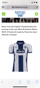
Kit thread: Here we go!!!!!!!!!!!
- Thread starter BigBed
- Start date
All advertisments are hidden for logged in members, why not log in/register?
IOM Blade
Spectre
With all the hoo-ha surrounding the home kit, has anyone else noticed how hideous the puke yellow and orange GK kit is? 
bromtom
Well-Known Member/ Former F1 Driver Jos Verstappen
With all the hoo-ha surrounding the home kit, has anyone else noticed how hideous the puke yellow and orange GK kit is?
Puke yellows a bit harsh, I'd say two tone orange, wotsit and irn bru.
Ben_1982
Member
bromtom
Well-Known Member/ Former F1 Driver Jos Verstappen
Could be worse sponsor wise ...
West Brom Vs Ipswich tickets will have to come with a sickbag for the sponsor spotters.
mattbianco1
Forum Royalty
Could be worse sponsor wise ...
Great shirt that for West Brom. Ruined by the big daft sponsor.
bromtom
Well-Known Member/ Former F1 Driver Jos Verstappen
Great shirt that for West Brom. Ruined by the big daft sponsor.
Burnley's new sponsor is a reyt state too.

I think we've got off lightly with Ramsdens to be honest.
Blade for Sale
Well-Known Member
Only a solitary 'i' away from being a pair of curtains....Burnley's new sponsor is a reyt state too.
I think we've got off lightly with Ramsdens to be honest.
mattbianco1
Forum Royalty
It doesn't look too bad in this image. If only the stripes continued around the back:

bromtom
Well-Known Member/ Former F1 Driver Jos Verstappen
It doesn't look too bad in this image. If only the stripes continued around the back:
From the front I think it's one of the nicest United shirts ever, sponsor excluded, the stripes are right, simple v neck, gorgeous. I don't mind the arms either, it's different.
The back is just disappointing.
ShefRedandWhite
Member
- Joined
- Jan 8, 2012
- Messages
- 252
- Reaction score
- 583
By the way if anyone is interested in seeing the build of Brentford new stadium go youtube and enter the Brentford fc drone, although perhaps not to much to see at the moment hopefully the steelwork should start going up in the coming week. A new drone footage is available usually every Monday morning. This week being week 7.
Good stuff I love a good stadium upgrade series.
If you want to see one on the Blades check the riveting 11 piece thriller, starting here:
Better than watching paint dry! (Just)
Kozzy_is_my_Dad
"No excuses, no dickheads".
- Joined
- May 14, 2015
- Messages
- 10,903
- Reaction score
- 26,970
I genuinely think (and hope!) that they'll struggle to shift a number of our shirts at the launch.
BladeFisher
Well-Known Member
- Banned
- #1,124
It doesn't look too bad in this image. If only the stripes continued around the back:
God that is shit!
Another money making exercise for the seriously addicted. A bit like in the 70's and 80's if band X brought a single out even if it were crap people would buy it, just because band X released it.
Perhaps the designer was a Gooner.
bromtom
Well-Known Member/ Former F1 Driver Jos Verstappen
The sponsor is nowhere near as bad in real life as it is on the photoshops. The writing is darker (to the point I saw one in the window and thought they'd made it black) and it seems less boxy. It's also thin and doesn't affect the movement which some people were worrying about.
Really nice material though and really really neat. Just a shame about the back, door deals and plain white.
Really nice material though and really really neat. Just a shame about the back, door deals and plain white.
SHOREHAMST.com
shorehamst.com
- Joined
- Jul 22, 2006
- Messages
- 966
- Reaction score
- 1,672
I could live with the sponsor. It’s just the sleeves and back. It’s frustrating because with the woven material they’ve used for the front it could’ve been an absolute classic. Use the same cut of cloth for the sleeves and back and hey presto.The sponsor is nowhere near as bad in real life as it is on the photoshops. The writing is darker (to the point I saw one in the window and thought they'd made it black) and it seems less boxy. It's also thin and doesn't affect the movement which some people were worrying about.
Really nice material though and really really neat. Just a shame about the back, door deals and plain white.
Even better - make the collar and sleeve-ends black and put the tree stripes down the sides.
SherburnBlade
Forged in Rum
Any idea what colour the numbers/names are going to be on the back?The sponsor is nowhere near as bad in real life as it is on the photoshops. The writing is darker (to the point I saw one in the window and thought they'd made it black) and it seems less boxy. It's also thin and doesn't affect the movement which some people were worrying about.
Really nice material though and really really neat. Just a shame about the back, door deals and plain white.
bromtom
Well-Known Member/ Former F1 Driver Jos Verstappen
I could live with the sponsor. It’s just the sleeves and back. It’s frustrating because with the woven material they’ve used for the front it could’ve been an absolute classic. Use the same cut of cloth for the sleeves and back and hey presto.
Even better - make the collar and sleeve-ends black and put the tree stripes down the sides.
Yeah they were so close. It's the best United bib ever haha
Bet they couldn't have sold it for under £50 though with that woven fabric everywhere.
bromtom
Well-Known Member/ Former F1 Driver Jos Verstappen
Any idea what colour the numbers/names are going to be on the back?
Black. They'd got some made up on the little island things.
SherburnBlade
Forged in Rum
Cheers. Shame, I reckon they could have clawed a little back with red numbersBlack. They'd got some made up on the little island things.


Jonboy60
Well-Known Member

Some look black to me. Or is it the light. Edit: Just seen pictures above, story of my life, always too late.The sponsor is nowhere near as bad in real life as it is on the photoshops. The writing is darker (to the point I saw one in the window and thought they'd made it black) and it seems less boxy. It's also thin and doesn't affect the movement which some people were worrying about.
Really nice material though and really really neat. Just a shame about the back, door deals and plain white.
bromtom
Well-Known Member/ Former F1 Driver Jos Verstappen
View attachment 41166
Some look black to me. Or is it the light. Edit: Just seen pictures above, story of my life, always too late.
Definitely darker for me. As I said, I saw one in the window and it looked black. It's green no doubt but if I had to guess the Photoshop job is the file they sent to the printers, and whatever process is used to print them doesn't really do emerald green very well, so we get a darker logo.
mattbianco1
Forum Royalty
I like the white away shirt... oh wait 

IdLiketoRogerMoore
Has a well-used member
- Joined
- Aug 19, 2016
- Messages
- 8,492
- Reaction score
- 19,768
I've changed my mind. I'm in. Picking my boy up from school and heading down!!
As a chunky 41 year old I can't get away with a football ball shirt but I can vicariously live through my 6 year old!!
As a chunky 41 year old I can't get away with a football ball shirt but I can vicariously live through my 6 year old!!
cooperblade
Well-Known Member
- Joined
- Aug 7, 2009
- Messages
- 3,204
- Reaction score
- 5,135
What's the squiggle next to the name?
LoughboroBlade
Well-Known Member
What's the squiggle next to the name?
Part of the logo for the charity Mind, who have a partnership with the Football League this season.
aBladeInTheNorthernSky
Member
- Joined
- Nov 17, 2017
- Messages
- 356
- Reaction score
- 1,107
Part of the logo for the charity Mind, who have a partnership with the Football League this season.
so is that squiggle on all replica and player kits this season? surely donating a fiver from each shirt sale would have been better, that looks annoying as shit
Similar threads
- Replies
- 101
- Views
- 5K
All advertisments are hidden for logged in members, why not log in/register?