Ainsley Harriott
I saw this thing on itv the other week
- Joined
- Aug 18, 2016
- Messages
- 21,585
- Reaction score
- 41,104
Ordered. £15.50.Already up to order.View attachment 164664
Follow along with the video below to see how to install our site as a web app on your home screen.
Note: This feature may not be available in some browsers.
All advertisments are hidden for logged in members, why not log in/register?
Ordered. £15.50.Already up to order.View attachment 164664
Randox have gone but there's new Tory input for next sponsor. Fits the club well, but I don't think anyone will be happy.
Front of shirt:
AUSTERITY
You don't need money
Do you think it'll actually have Errea and Blades badge on? They don't in the pictures.Ordered. £15.50.
Already over 300 orders on the two or three listings (combined). It says.Already up to order.View attachment 164664
Some people on here are so easily embarrassedTo get kit out but not sorting a sponsor is a tad embarrassing
Yeah they do, they’re just not allowed to advertise them with the badge and kit manufacturer onDo you think it'll actually have Errea and Blades badge on? They don't in the pictures.
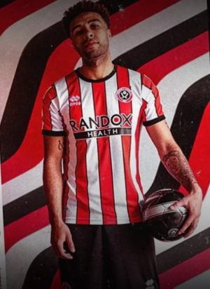
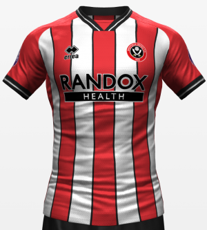
I'd kind of like to order one for my boy, but the pictures look crap, just a striped shirt...
Aye
All they have to do is read this thread - sorted
Kin ell that didn’t take longOrdered. £15.50.
Do you know what, when I first saw those red and white stripes on a shirt, I thought, that symbolises the clubs rise to the premier league whilst at the same time Sheffields transformation rooted in steel making to one that thrives creativity, arts, technology and music.
First thing I thought. Incredible what a few stripes can do.
Funny how we all see it slightly differently isn't it. I saw it 'Steel city, rising' and thought "Yeah, for one season max, more like steel city risen, steel city being unable to compete, getting it's arse handed to it, barely staying solvent, meandering without a strategic plan and then plummeting again 12 months from now".Couldn't agree more!
For me it's all about:
Embodying the spirit of resilience and progress, the ‘Steel City, Rising’ campaign perfectly aligns Sheffield United's journey to the Premier League with the city's transformation. It celebrates the fusion of tradition and modernity, emphasising the club's determination to reach new heights while embracing Sheffield's evolving identity.
In design, not in manufacturing quality.Actually, having allowed two hours to pass, I don't think it's that bad at all.
It doesn't compare well to last seasons, but last seasons was my favourite ever kit, so it was always going to be a high bar.
On balance, I think Errea have served us pretty well so far.
It's a race now. Can a professional football club get shirts out that they've had in production for months, beat some sweatshop workers who only found out the design a few hours ago...?Kin ell that didn’t take long
As it's McBurnie, he's more likely to be wondering who would win a fight between a lion and a grizzly bear.MacBurnie wears the new kit to ponder on the meaning of life, the existence of God and the origin of the universe.
View attachment 164682
cBurnie
You've got me thinking about it now.As it's McBurnie, he's more likely to be wondering who would win a fight between a lion and a grizzly bear.
If they want upwards of £50 for a product, I want £50+ for the quality of it. You wouldnt dare pay £50 for a top in primark when Hugo Boss are selling tops at the same price. That's essentially what this is. Primark quality at Boss prices.In design, not in manufacturing quality.
Grizzly, I reckon.You've got me thinking about it now.
But adding more stripes makes it pretty much the same as last seasons.Stripes too wide and that Borbokis shirt as well as the diamond remain two of the shirts that I didn’t buy.
It’s not horrific just not stripey enough for me.the Adidas one with the wider stripes was almost perfect
It looks very cheap from the pics, not that fitted for athletic footballers


Funny how we all see it slightly differently isn't it. I saw it 'Steel city, rising' and thought "Yeah, for one season max, more like steel city risen, steel city being unable to compete, getting it's arse handed to it, barely staying solvent, meandering without a strategic plan and then plummeting again 12 months from now".
Literally so that every time we shut a team out, we can post a load of pictures of his pristine shirt on Twitter, with related gags.The keeper kit is terrible. Why would you put a keeper in white?! I feel he might be getting that dirty.
The new kit look pretty poor. Saved, slightly, by striped on the back. Were we paying by the stripe and ran out of money?
Both look cheap, which they very much aren't to buy.
They do. They just don't show the branding for copyright reasonsDo you think it'll actually have Errea and Blades badge on? They don't in the pictures.
I'd kind of like to order one for my boy, but the pictures look crap, just a striped shirt...
Love it !!I can't say I hate it
View attachment 164631
Most obvious turn of events in historyTypical.
Kit dun't come out, we're whinging.
Now it's out we're whinging.
My 1st shirtAll I ask from a kit is that they keep it simple and keep it balanced.
We rarely ever get it right.
View attachment 164643
All advertisments are hidden for logged in members, why not log in/register?
