Alf Tuppers Shorts
Member
- Joined
- Oct 10, 2019
- Messages
- 409
- Reaction score
- 591
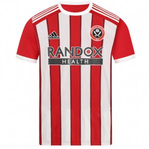
Bloody Nora. Bought cars for less.Nice kit, ordered the kids one each, £206 with name and number plus postage for 2 kits
Follow along with the video below to see how to install our site as a web app on your home screen.
Note: This feature may not be available in some browsers.
All advertisments are hidden for logged in members, why not log in/register?
Bloody Nora. Bought cars for less.Nice kit, ordered the kids one each, £206 with name and number plus postage for 2 kits
I think we now get club cash. For season tickets and burnley game, should credit into club cash from August.and this is where I remember no discounts for season ticket holders anymore or have I missed this fact?
Doesn’t like shirt discussion. Clicks on new kit thread.The amount of grown adults getting triggered by this on Twatter really us a sight to behold.
If you don't like it then don't buy it. If you like it then do.
I'm really not sure why anyone over the age of about 10 feels the need to let their tampon fall out over something that really isn't that important!
Yeah exactly. So the home kit is blue and white stripes what's the big deal?")
Doesn’t like shirt discussion. Clicks on new kit thread.
But the kits probably last longerBloody Nora. Bought cars for less.
Got what looks like a different warm up/ training kit on while warming up, it's white and looks like it's got a camouflage pattern on it, like our pink away but white, with Yelo on the front.

A lot of people, even adults would wear them as leisure ware if they’re on holiday or whatever. Some you would and some you wouldn’t.Where does my post imply I don't like shirt discussion?
I've enjoyed this thread and mattbianco1 mock ups but I sincerely believe grown adults getting triggered by a football kit is a bit pathetic.
New pre-match shirt.
Southampton have gone with this option.Maybe would look better with red trim and sponsor?

Aye May just defeat the object of being the sponsor mind-I like the new away kit. Just wish the main sponsor logo was less conspicuous!
Ours is better than that.Southampton have gone with this option.
View attachment 116490
Website says pre-order and that orders will be shipped 21st July onwardsAre the shirts on sale at the club shop yet?

Stay away from U.S. Cavalry shirts.me in a football shirt has a certain naffness about it.
The footy headlines one?Home shirt unveiled this week. But it got leaked anyway
The footy headlines one?


All advertisments are hidden for logged in members, why not log in/register?