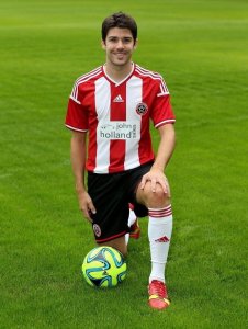
So it's finally revealed

All advertisments are hidden for logged in members, why not log in/register?

What do you think?


  • Total voters
    161
Nope. Could have done with white panels under the arms. It's not the worst kit I've seen but could be better. Oh and sorry but the sponsor logo looks gash. Very Sunday pub league if you ask me. :(

Agree. What spoils it is the silly solid red 'arm bands'. Looks like your kid left 'em on after swimming up the baths at Glossop Road (anyone remember them c1960's).

Other than that very League 1 I'd say. 5/10. :rolleyes:
 
Last edited:


Agree. What spoils it is the silly solid red 'arm bands'. Looks like your kid left 'em on after swimming up the baths at West Street (anyone remember them c1960's).

Other than that very League 1 I'd say. 5/10. :rolleyes:

By "Armbands" do you mean the space that adidas have left for the League Patches to go so the famous 3 stripes are not covered in a messy fashion? The same space it leaves on the shirts of Champions League and World Cup teams?

Yeah very league one.
 
After last season's kit, (which was one of the worst I've seen, on a par with the diamond one from the 90's) this is a spectacular return to form. I hope the away kit's worth buying. That shitty Norwich City-esque knockoff really displeased me.
 
Brilliant
image.jpg

Shorts and socks look great too.

What would have made it perfect is the Adidas logo on the side level with the badge rather than central
 
Last edited:
Want wools have made it perfect is the Adidas logo on the side level with the badge rather than central

Unfortunately they probably felt that wouldn't have been possible from a design point of view to make the logo visible across two stripes - they'll have wanted one solid back to it, impossible if you have it mirroring the badge.
 
What would have made it perfect is the Adidas logo on the side level with the badge rather than central

Or, seeing as the Adidas logo is in the middle, the Blades 125th anniversary badge could have gone on the opposite side to the club badge.

I must admit, it is starting to grow on me the more I see it.
 
I have to say I'm slightly disappointed. I'm not a fan of the middle logo, it loses symmetry, and if I was Mr Holland I would be having a word about that wishy washy logo, it does not stand out enough from any sort of distance - IMO a back background might have been a better contrast or dare I say a nice yellow - hey, it worked for our old pal Arnold!

Still I'm sure it will sell exceptionally well and in fairness it's one of the nicest we have had for a while all been said. Good work blades it's all coming together nicely.
 
I like it. But it would look classier and better IMO if there was some black trim maybe the Adidas 3 lines. Might wait and see the away kit...
 
Or, seeing as the Adidas logo is in the middle, the Blades 125th anniversary badge could have gone on the opposite side to the club badge.

I must admit, it is starting to grow on me the more I see it.

That's a great shout Jon Bon for the 125th logo on there, I thought the club would try to commemorate it or recognise it in some way shape or form.

I also agree it's setting to grow on me as well
 
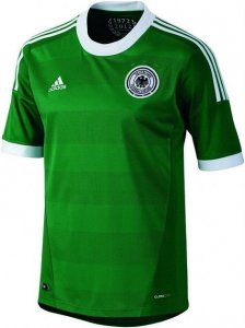
I really liked last seasons kit and the one before, this one is also great. We tend to get the home kits right it's just the away ones that have looked shite recently. The Norwich one grew on me but I hope we can pull off another classy kit from the off. Heard it's green what about a Blades version of this...
 

Attachments

  • image.jpg
    image.jpg
    62 KB · Views: 5
Liking it. Would've probably made a few modifications i.e.
* a bit of black trim on the kit somewhere such as around the blades crest,
* perhaps a little concerned about the positioning of the logistics logo on the back

but on the whole, a nice-looking kit. Good job!!

Glad seaso's get 10% discount. Dare I get a Maguire 5?
 
I like the new kit. Very classy looking. Hopefully Brayford will be modelling one of those shirt's shortly
and be kicking off the new season in it. Training kit looks good too. Hope the leisure range will have
some exciting additions that we can show off on holiday this summer. Overall very pleased with the
contribution from Adidas so far.


I can't believe so many people care! I have no opinion, it's red and white striped like it always has been, that'll do. Never understood all the anticipation and excitement for a kit launch. Let's worry about the players, not their gear!
 
It's fine.

It always takes something disastrous or amazing to provoke a reaction either way from me.

As it is is, red and white stripes, black shorts, job done.
 
  • Like
Reactions: LSF
'Shorts don't matter....it's what goes inside them that counts'

;D
 
“I didn't come here on a free transfer from Walsall to stand and watch a bunch of morons arguing about football shorts!”
 
I will buy one. Unless the away kit is better.
 
I can't believe so many people care! I have no opinion, it's red and white striped like it always has been, that'll do. Never understood all the anticipation and excitement for a kit launch. Let's worry about the players, not their gear!

I think it matters to a lot of people.

1. It shows the club is listening and thinking of the fans and not just churning out yet another kit for purely commercial gain.

2. It engenders a feel good factor that will permeate onto the pitch to the players. The nuance is that it's another element to the overall match day experience and if a lot of people like it and feel it represents SUFC and what that stands for it will make a positive and perceptible difference to the atmosphere at games.

3. We all know packaging is an important factor for any premium product we purchase. A first team kit that gets the fans interested and engaged means that the sales of the other stuff around it - the quality leisure wear that will inevitably accompany it - will be much higher than if apathy ruled. How many times have we all been around the club shop and noted, "shite, tat, shite, tacky, WTF, shite, etc and walked out the shop with just another car sticker?

It's another factor that the club management have, yet again, done the right thing. We have a really positive vibe from this administration and I cannot remember any other time in my Blades supporting life that it was as engaging, accessible and as encouraging as this.


Fuck me - both Selahattin and the Phippster follow me on Twatter. If that's not fan engagement then I am a rather delicate porcelain cream jug
 
Last edited:


I think it matters to a lot of people.

1. It shows the club is listening and thinking of the fans and not just churning out yet another kit for purely commercial gain.

2. It engenders a feel good factor that will permeate onto the pitch to the players. The nuance is that it's another element to the overall match day experience and if a lot of people like it and feel it represents SUFC and what that stands for it will make a positive and perceptible difference to the atmosphere at games.

3. We all know packaging is an important factor for any premium product we purchase. A first team kit that gets the fans interested and engaged means that the sales of the other stuff around it - the quality leisure wear that will inevitably accompany it - will be much higher than if apathy ruled. How many times have we all been around the club shop and noted, "shite, tat, shite, tacky, WTF, shite, etc and walked out the shop with just another car sticker?

It's another factor that the club management have, yet again, done the right thing. We have a really positive vibe from this administration and I cannot remember any other time in my Blades supporting life that it was as engaging, accessible and as encouraging as this.
Very well put young man. A+ and top of the class.

A+ for the kit too. It's almost perfect.
 

All advertisments are hidden for logged in members, why not log in/register?

All advertisments are hidden for logged in members, why not log in/register?

Back
Top Bottom