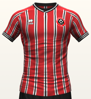
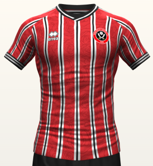
Not a fan, but could be worse. The wider red stripes kinda save it compared to the 90's original which looks like a pyjama shirt if I'm being honest.
Navigation
Install the app
How to install the app on iOS
Follow along with the video below to see how to install our site as a web app on your home screen.
Note: This feature may not be available in some browsers.
More options
Style variation
You are using an out of date browser. It may not display this or other websites correctly.
You should upgrade or use an alternative browser.
You should upgrade or use an alternative browser.
Is it time for a New Kit Thread?
- Thread starter FifeBlade
- Start date
All advertisments are hidden for logged in members, why not log in/register?
Wincobank S9 Blade
Wincobank blade
Kits so far under Errea have been nods from the past, one every now an again yeah but I’d mix it up a bit however I’d take anything over the thick stripes like we had last season.
RWE
Member
- Joined
- Feb 23, 2017
- Messages
- 903
- Reaction score
- 2,220
Nice that. Proper red too. Hate it when we have a light red prefer it towards the maroon side of red.
FriethBlade
Well-Known Member
- Joined
- Aug 18, 2015
- Messages
- 5,913
- Reaction score
- 9,834
Bladesman I would gladly bet a large amount of money that I will like your mock up better than what we release.
I don't like pinstripe kits as we play in red and white stripes and a pinstripe kit to me looks like a red shirt with a bit of white and black on it. However you seem to have managed to turn it into something I would wear
ChipButtyBlade
Well-Known Member
I fink it will be fine pinstripes red/white (like Saints home shirt last season)but across the whole front and a solid red back,with black accents on collar and sleeve ends
Bladesman
The Great Grumbleduke
Bladesman I would gladly bet a large amount of money that I will like your mock up better than what we release.
I don't like pinstripe kits as we play in red and white stripes and a pinstripe kit to me looks like a red shirt with a bit of white and black on it. However you seem to have managed to turn it into something I would wear
I think the pinstripes can work it just needs to done correctly. Slightly thicker pinstripe and slightly thicker red stripes. It makes it stand out better.
Not my choice ideally but my first ever shirt was that Laver pinstripe shirt minus the Laver sponsor.
FredZeppelin
Active Member
Usually look forward to the new kit launch as a bit of excitement but the Errea era has (imo) been an absolute disaster and I have no hopes for the new home kit.
Poor quality and laughable sizing now means I don't even consider buying it for either family members or (occasionally) myself. Training kit just looks cheap and tacky to my eyes.
Hopefully, this is the last year of this utter shite company and we can go with someone who'll put a bit of quality and enthusiasm back into our merchandise.
utb
Bladesman
The Great Grumbleduke
Usually look forward to the new kit launch as a bit of excitement but the Errea era has (imo) been an absolute disaster and I have no hopes for the new home kit.
Poor quality and laughable sizing now means I don't even consider buying it for either family members or (occasionally) myself. Training kit just looks cheap and tacky to my eyes.
Hopefully, this is the last year of this utter shite company and we can go with someone who'll put a bit of quality and enthusiasm back into our merchandise.
utb
Whats annoying about them is the poor quality and sizing of the shirt. When the designs for the most part have been alright so if they were made by another manufacturer.
Blade58
Once a Blade, always a daft ****
I see they re already flogging the away shirt on DH Gate 
mattbianco1
Forum Royalty
Trigger Blade
Cheerful twaddle
Just a stab in the dark, but what the new kit needs is a faint Yorkshire rose pattern in the fabric (with somebody in the video having a Yorkshire rose haircut), bur what do I know? 
Revolution
Well-Known Member
- Joined
- Aug 12, 2009
- Messages
- 13,806
- Reaction score
- 23,825
I do not understand why we releasing kits based on designs that were unpopular at the time they were originally released. The third kit will be diamonds at this rate.
Westran
Ashleigh Spires Clubman of the Year 1994
- Joined
- May 28, 2010
- Messages
- 4,320
- Reaction score
- 10,230
They weren't unpopular with everyone.I do not understand why we releasing kits based on designs that were unpopular at the time they were originally released. The third kit will be diamonds at this rate.
Melbourne Blade
Active Member
Who modelled the away kit from the ladies team btw? Asking for a friend...
ISZA ⚔️
Well-Known Member
- Joined
- Jan 5, 2021
- Messages
- 4,413
- Reaction score
- 10,203
Errea only has the contract for the away kit this year. Adidas doing the home and Hobott the third.If the new shirt is manufactured by Errea
Revolution
Well-Known Member
- Joined
- Aug 12, 2009
- Messages
- 13,806
- Reaction score
- 23,825
They were unpopular with most people. The 1993-4 away kit was disliked because of its colour, and the 1990-1 kit was not well received because (1) nobody liked the pinstripes and (2) the use of black was an echo of when we dropped through the divisions. There was press coverage about this at the time.They weren't unpopular with everyone.
The 1993-4 away kit also followed two very popular away kits and sold nowhere near as well.
sufc323
Active Member
- Joined
- Apr 18, 2017
- Messages
- 1,636
- Reaction score
- 9,243
Don't mind something different every now and again, it's only a season and there's only so many ways you can create a red and white striped shirt.
I liked the Adkins kit, and the reaction towards it was way overboard IMO especially as it was a remake of our first kit for an anniversary season. You'd have thought we'd have been playing in blue and white the way some people went off about it.
I liked the Adkins kit, and the reaction towards it was way overboard IMO especially as it was a remake of our first kit for an anniversary season. You'd have thought we'd have been playing in blue and white the way some people went off about it.
Crafty Blade
Like a gallon of DIPA
The kits are probably more popular now than they were at the time, which is the key factorI do not understand why we releasing kits based on designs that were unpopular at the time they were originally released. The third kit will be diamonds at this rate.
Jon Bon II
Here's Jonny!
- Joined
- Dec 6, 2016
- Messages
- 10,764
- Reaction score
- 26,028
- Banned
- #592
Fambriated isn't a real word.Ha. I just assumed fambriated was a typo. Didn’t think it was a real word.
mattbianco1
Forum Royalty
Blade56
10 men UTD relegate 🐷🐷🐷🐷🐷
- Joined
- Mar 7, 2014
- Messages
- 28,903
- Reaction score
- 40,513
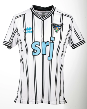
You had a sneak preview and all you can tell us is what the collar is like?I managed to get a sneak peak of it. The collar is exactly the style of the Dunfermline template. There's rose detailing on the red stripes, very impressed with it this year.
Jon Bon II
Here's Jonny!
- Joined
- Dec 6, 2016
- Messages
- 10,764
- Reaction score
- 26,028
- Banned
- #596
WYSDP?I managed to get a sneak peak of it. The collar is exactly the style of the Dunfermline template. There's rose detailing on the red stripes, very impressed with it this year.
Eric_Brooks
Active Member
- Joined
- Aug 17, 2020
- Messages
- 1,455
- Reaction score
- 2,031
I managed to get a sneak peak of it. The collar is exactly the style of the Dunfermline template. There's rose detailing on the red stripes, very impressed with it this year.
Sponsors Google or Tesla?
ISZA ⚔️
Well-Known Member
- Joined
- Jan 5, 2021
- Messages
- 4,413
- Reaction score
- 10,203
Stripe thickness pinstripe execution etc…. GOI managed to get a sneak peak of it. The collar is exactly the style of the Dunfermline template. There's rose detailing on the red stripes, very impressed with it this year.
mattbianco1
Forum Royalty
Anymore white/black stripes than i've done above and it will look awful IMOStripe thickness pinstripe execution etc…. GO
Crafty Blade
Like a gallon of DIPA
But red roses are for Lancashire
Similar threads
All advertisments are hidden for logged in members, why not log in/register?


