Away kit

All advertisments are hidden for logged in members, why not log in/register?

Hello by the way. Yes I did join especially for that shirt design critique and yes I am old enough to know better and know it doesn't really matter! Just bugs me a bit for some irrational reason!

Hello... as you can tell by the thread that is now at 571 responses, you are amongst friends here :D

As for the rest of you, I've asked Foxy to knock up a quick template so you can colour it in with your design. We'll dig Tony Hart up and get him to show the best ones in the gallery. Don't forget to include your ages ;)
 

Best thing about the away kit is that it means when 10,000 Blades celebrate winning the title at the Ricoh, it's going to remind me of Filbert Street in May 1990.
I remember turning up at the Victoria Ground (that's Stoke for the youngsters) and it looked like 3000 steward were walking up the road.

That kit is iconic, it was a trendsetter, and I can't ever see it being beaten.
 
Hello... as you can tell by the thread that is now at 571 responses, you are amongst friends here :D

As for the rest of you, I've asked Foxy to knock up a quick template so you can colour it in with your design. We'll dig Tony Hart up and get him to show the best ones in the gallery. Don't forget to include your ages ;)
Woohoo - I will be able to try out my new Crayons before the season starts - have em all tested for the Matchday Shoutbox
 
Comparing two adidas home kit designs for red and white stripes;
Look how cheap and nasty ours looked compared with Sunderland's of this season. The sponsor on the Sunderland kit fits in seamlessly, ours less so. The stripes are too big on ours and perfect on theirs, the way they incorporate the red and black trims along the bottom, the sleeves and the collar is top notch and also the stripes along the shoulders look alot better on the Sunderland kit. I know they're in the prem but that shouldn't prevent us producing better quality than the shirt below. Everything about theirs is better and we need to look to improve on the kit front in general. The away kit this time round I can cope with, don't know about this seasons home kit though, if you can call it that.

The Blades;

New-SUFC-Home-Shirt-14-15.jpg


Sunderland;

Sunderland-15-16-Home-Kit%2B%25281%2529.jpg
 
Another let down. The badge colours on the away shirt should match the away shirt colours.

What a load of rubbish, the badge is red, white and black, our club colours, we're not the bloody mccaw and black wizards. The orange and black shirt looked rubbish with an orange logo, the gold and lilac monstrosity wouldn't have looked any better with the proper badge, but at least it would have had one thing right on it. Changing club colours just so they match the colours of a crappy away shirt is one of the worst things kit manufacturers do
 
The DIY kit making.

I've got one of those and the home shirt from that season too.

They were given to me by an Umbro sports rep after a girl who worked at Worthington Sports in Horsforth told him that there was a Blade working in the bank over the road.

Absolute top quality, embroidered badges and I can still just about squeeze into em.

Top man that rep. Never saw him before and never seen him since.

The one in the picture is actually mine. I have a vary sizeable number of blades shirts in my collection hence the reason I get a tad over excited by new kits.

 
I agree with Beat Jedi

The kit would've looked so much better with the band around the bottom like the Ajax one. I would have had it red/white though as opposed to red/black.

Also the badge blended into the shirt is a great look too IMO. Home shirt should always be proper badge. Away shirt - do what you like.

Here's what we mean with blended in badge
11-Third-Soccer-Jersey-Kit.jpg
 
Is there any truth in the pink 3rd kit? I like to get a shirt each season, so if we are having a pink 3rd kit that would be my 1st choice.
 
Comparing two adidas home kit designs for red and white stripes;
Look how cheap and nasty ours looked compared with Sunderland's of this season. The sponsor on the Sunderland kit fits in seamlessly, ours less so. The stripes are too big on ours and perfect on theirs, the way they incorporate the red and black trims along the bottom, the sleeves and the collar is top notch and also the stripes along the shoulders look alot better on the Sunderland kit. I know they're in the prem but that shouldn't prevent us producing better quality than the shirt below. Everything about theirs is better and we need to look to improve on the kit front in general. The away kit this time round I can cope with, don't know about this seasons home kit though, if you can call it that.

The Blades;

New-SUFC-Home-Shirt-14-15.jpg


Sunderland;

Sunderland-15-16-Home-Kit%2B%25281%2529.jpg
I guess that's the Ajax template with the trim round the hem and cuffs. Real and Bayern have the same it looks like it's two different layers. Obviously third division teams don't get that template! Nice though. Sunderland have also ruined their lime green away kit though like us (someone posted it earlier in this thread) by leaving the badge as red/white/black!
 
Is there any truth in the pink 3rd kit? I like to get a shirt each season, so if we are having a pink 3rd kit that would be my 1st choice.
Only if they make the badge pink! No way can you have a red badge on a pink kit! Real's was pink on their's last season. So if it's ok for them..... Probably suited Ronaldo and Bale more than it will our lot though to be fair.
 
I agree with Beat Jedi
Also the badge blended into the shirt is a great look too IMO. Home shirt should always be proper badge. Away shirt - do what you like.

Here's what we mean with blended in badge
11-Third-Soccer-Jersey-Kit.jpg
That's an ugly black outline of a Chelsea badge and is even stupider because the kit actually contains blue, so a regular badge would match it just fine

If the away kit doesn't matter, lets play in blue and white stripes, it's only the away kit, who cares if it's not our colours
 

Really don't understand this fascination with yellow. We had ONE decent yellow kit and despite numerous poor attempts to recreate it each and every one since has been a shit effort.

Would've thought the club would realise the home kit error and bring out a red and white one, but that was a long shot.

Poor attempt for a decent Adidas away kit.

So far with the wonderful Adidas we've had one decent kit in 4, actually the White kit looks good... It's just not a home kit.
I like it but is there a way of getting the sponsors off it?
 
That's an ugly black outline of a Chelsea badge and is even stupider because the kit actually contains blue, so a regular badge would match it just fine

If the away kit doesn't matter, lets play in blue and white stripes, it's only the away kit, who cares if it's not our colours
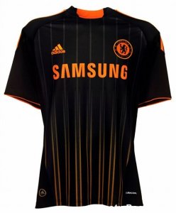
adidas-chelsea-away-shirt-black-orange-2010-2011.jpg This is a better example IMO. I don't think this would look better with a blue badge.....and there's plenty of colours to choose for away kits - no need to resort to blue and white stripes!
 
That's an ugly black outline of a Chelsea badge and is even stupider because the kit actually contains blue, so a regular badge would match it just fine

If the away kit doesn't matter, lets play in blue and white stripes, it's only the away kit, who cares if it's not our colours

What I meant by "do what you like" is push the boat out. Do something different. Divide opinions. Bring our away shirts that go down in history as classics if we do well that season or horrors if we don't.

Barcelona have always pushed the boat out on away kits. Newcastle are a good example of having random kits in this country.

We need to either do this or stick to a Yellow or White away.
 
Its not the same shirt

Yeah, it's a bit different. It's more technical, mesh on shoulders, and stripes finish at different points. Black finishing stripe too on the back. A DIY one would look odd this season!!!
 
'technical' .............. ? !

in the same way that a patchwork quilt is more 'technical' than a blanket!

fake technical perhaps, don't you just love that new suit the Emperor is wearing?
 
Sorry Breeny, I meant no personal attack, its just that the word 'technical' has been creeping into general and particularly sporting misuse of late........'technical area' (Football commentatorese - meaning bit of grass where the manager is allowed to stand)......'a very technical descent' (Tour de France commentary - meaning steep, winding road)....the first online dictionary I consulted says;

technical/ˈtɛknɪk(ə)l/
adjective
  1. relating to a particular subject, art, or craft, or its techniques.
  2. involving or concerned with applied and industrial sciences.
  3. resulting from mechanical failure.
  4. according to a strict application or interpretation of the law or rules.
noun
  1. (in areas with guerrilla warfare) a small truck with a machine gun mounted on the back.

don't get me wrong, I'm hugely interested in the technology of fabric, the warp, the weft, the way you stretch woven cloth on the bias, the topology of knitting, indeed, knot theory and the way crotcheting grows 'organically' so can be used (coincidentally) to imitate the building of corals and their reefs.

But because adidas® stick different bits of fabric together just to make a shirt look as though it cost more to make than it really did.... isn't technical in my book - just sly.

just looked it up - perhaps the commentators use it correctly - it meant art or skill in Ancient Greek, so maybe they should call the penalty area the 'technical' area but then again only in the Premier League?
 
Last edited:
Sorry Breeny, I meant no personal attack, its just that the word 'technical' has been creeping into general and particularly sporting misuse of late........'technical area' (Football commentatorese - meaning bit of grass where the manager is allowed to stand)......'a very technical descent' (Tour de France commentary - meaning steep, winding road)....the first online dictionary I consulted says;

technical/ˈtɛknɪk(ə)l/
adjective
  1. relating to a particular subject, art, or craft, or its techniques.
  2. involving or concerned with applied and industrial sciences.
  3. resulting from mechanical failure.
  4. according to a strict application or interpretation of the law or rules.
noun
  1. (in areas with guerrilla warfare) a small truck with a machine gun mounted on the back.

don't get me wrong, I'm hugely interested in the technology of fabric, the warp, the weft, the way you stretch woven cloth on the bias, the topology of knitting, indeed, knot theory and the way crotcheting grows 'organically' so can be used (coincidentally) to imitate the building of corals and their reefs.

But because adidas® stick different bits of fabric together just to make a shirt look as though it cost more to make than it really did.... isn't technical in my book - just sly.

just looked it up - perhaps the commentators use it correctly - it meant art or skill in Ancient Greek, so maybe they should call the penalty area the 'technical' area but then again only in the Premier League?

Generally agree but technical descents mean lots of cornering, and there's a technique to cornering. I think Bardet won a stage in the Dauphine bc of his technique on the descent, Pinot lost time in the Tour bc of poor technique - and fear, and then Wiggo in the Giro 2013 in the rain, Bambi on Ice. (Not sure of all the names.)

And there's a great video set to music of Cancellara gracefully rejoining the peloton on a descent.

http://m.youtube.com/?#/watch?v=RxXqQqAc2pA

Having a "techinical area" coned off for Sunday morning u9s was a bit ridiculous though :)
 
It seems a bit bizarre having a white (light) home kit and a fluorescent green (light) away kit. Think of the poor fans who suffer from achromatopsia when we play away at Port Vale for example. Or low income fans watching the highlights on TV who can only afford a black and white set. God help us if one of our midfielders suffers from achromatopsia. It will be like having Montgomery back for the day.
 
Generally agree but technical descents mean lots of cornering, and there's a technique to cornering. I think Bardet won a stage in the Dauphine bc of his technique on the descent, Pinot lost time in the Tour bc of poor technique - and fear, and then Wiggo in the Giro 2013 in the rain, Bambi on Ice. (Not sure of all the names.)

And there's a great video set to music of Cancellara gracefully rejoining the peloton on a descent.


To be fair to Pinot, he had been beaten up a lot due to more than his fair share of crashes and falls on early stages of the tour. His GC chances had gone so he just wanted to win a stage to remind people he still had ability. He does have dodgy technique on descents so it's not surprising he was a bit "cautious" when doing something he knew he was crap at.
 

Thanks for that Fatty - I just watched it, thus inspired, I decided I ought to be on me bike and it promptly chucked it down in Donny.

No mudguards - no can do
 

All advertisments are hidden for logged in members, why not log in/register?

All advertisments are hidden for logged in members, why not log in/register?

Back
Top Bottom