Kozzy_is_my_Dad
"No excuses, no dickheads".
- Joined
- May 14, 2015
- Messages
- 11,297
- Reaction score
- 28,029
I am aroused.

Follow along with the video below to see how to install our site as a web app on your home screen.
Note: This feature may not be available in some browsers.
All advertisments are hidden for logged in members, why not log in/register?


Handily, currently play 6-a-side in white


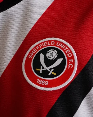
Literally everything you said is wrong.Monochrome badges are stupid at the best of times but doing it when the colours don't.even clash is ridiculous, would look much better with the red ring.
The keeper top is a similar abomination to the one Ramsdale wore a few seasons back, whoever picks bright blue to appear on a Blades shirt shouldn't work for the club.

No it isn't, the monochrome badge is pointless and looks crap. Having a Leeds away shirt for a keeper kit is naff and lazy.Literally everything you said is wrong.

I didn’t buy any of the Errea stuff. I’ve got a couple of Adidas ones, a hoodie and a training top thingy with a quarter zip. I shall definitely be getting some of the new stuff though, I do like an Adidas top or two.This will probably be the season I start getting some club merch again since the last time we had adidas as a provider.
Their ‘Ice’ training gear from a few seasons ago was stunning. Wouldn’t mind a bit more of that!
You see that's fine, properly commit to it rather than just having blue trim because that's the default in the pub team catalogue.


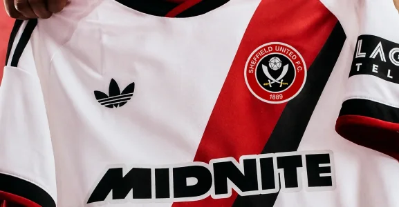
yes...it's weird isn't it? Such a good shirt but that one detail somehow stops it being marvellous...nice kit BUT I don’t like how the sash doesn’t go up to the shoulder and just stops - looks a bit weird to me.
yes...it's weird isn't it? Such a good shirt but that one detail somehow stops it being marvellous...nice kit BUT I don’t like how the sash doesn’t go up to the shoulder and just stops - looks a bit weird to me.
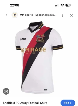
that's miles better with he sash all the way ti the shoulder...Not sure if anybody else has mentioned it but it’s very similar to Sheffield FC’s away shirt 21/22 (which I absolutely love, and bought


This is one sexy away shirt I'll definitely be buying. Will seek "sizing guidance" from you all on here before ordering online


Much better than the home shirt. A classic kit slightly spoilt by the adidas stripes on the shoulders imo. Good to hear its with white socks as well. Unfortunately the goalkeeper shirt is the complete opposite. As someone else posted it does look like a Wendy away kit.


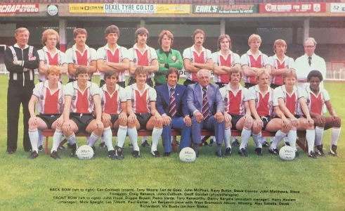
Did we have a shirt of similar design (sash) a long time ago Len De Goey era.....i remember going to Field Mill in the early days of that season think we lost 2 or 3 nowt.
Haha easy to spend somebody else's money eh?!Nice shirt, bloody kids already said they want one, I was gonna cheap out on the away kits and go to DHgate but these are actually nice so I’ll have to go official now.

You're meant to wear it not wipe your ringpiece with it!Surprised.
Looks lovely. However its white and it wont stay looking nice

Thinking about it and checking ....i think we played in our home kit and we won 4-3.......there was a sash kit i remember after looking at the historical sites.Probably this one I would have thought.

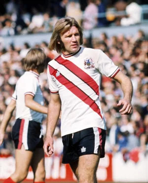
I bought a lot of the errea stuff. Yeah the quality isnt as good but some awesome designs. The 24 25 home shirt, that seasons 3rd and the 25 26 away all crackersThis will probably be the season I start getting some club merch again since the last time we had adidas as a provider.
Their ‘Ice’ training gear from a few seasons ago was stunning. Wouldn’t mind a bit more of that!

Yeah thought exactly the same. Suits the shirt. The red on our crest is brighter than the red they’ve used for the sash that’s why it looks busy.Think I actually prefer the black badge. Looks a busy to me with the normal one.
All advertisments are hidden for logged in members, why not log in/register?