Edgar Allan Poo
From the poisoned pen of....
- Joined
- Mar 4, 2021
- Messages
- 18,030
- Reaction score
- 29,567
Whose this?!
M'Bappé. Please see Squad Reshape thread.

Follow along with the video below to see how to install our site as a web app on your home screen.
Note: This feature may not be available in some browsers.
All advertisments are hidden for logged in members, why not log in/register?
Whose this?!

Pity we're notThat’s top tier


 what is that all about? who approved that?

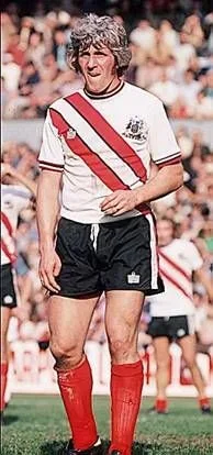


I do too.I think that jacket is class


Not surprised, you've allegedly got more "lolly" than Walls ice cream!That’s two absolutely class kits. Will be buying both
Them days are long goneNot surprised, you've allegedly got more "lolly" than Walls ice cream!


It’s only about the blue trim to upset some. I think the 2 I’ve seen you produce are not far off if you can imagine the colour somewhere within that range not minty green as was originally mentioned to me.I’d knock a design up but you’ve gone quiet on me

Pffft, Premier League is overrated!!!Pity we're not

Fluorescent? Like our previous ones?It’s only about the blue trim to upset some. I think the 2 I’ve seen you produce are not far off if you can imagine the colour somewhere within that range not minty green as was originally mentioned to me.

Is it another trefoil badge or standard adidas for the 3rd kit?It’s only about the blue trim to upset some. I think the 2 I’ve seen you produce are not far off if you can imagine the colour somewhere within that range not minty green as was originally mentioned to me.
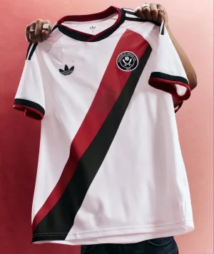
I believe there will be an all white one including trimThis looked so good
View attachment 240345
Until I saw the full thing…
View attachment 240346
Plain white with red stripes down the sleeve would’ve been perfect.
Along those linesFluorescent? Like our previous ones?

Standard EQT logo I believe.Is it another trefoil badge or standard adidas for the 3rd kit?
I think it’s back to the other most of my attention was on the away kitIs it another trefoil badge or standard adidas for the 3rd kit?
UnderstandableI think it’s back to the other most of my attention was on the away kit


All advertisments are hidden for logged in members, why not log in/register?