Edgar Allan Poo
From the poisoned pen of....
- Joined
- Mar 4, 2021
- Messages
- 18,030
- Reaction score
- 29,566
Surprised.
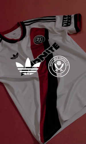
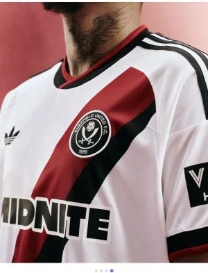
Looks lovely. However its white and it wont stay looking nice
Have a word with Crouchy.

Follow along with the video below to see how to install our site as a web app on your home screen.
Note: This feature may not be available in some browsers.
All advertisments are hidden for logged in members, why not log in/register?
Surprised.
Looks lovely. However its white and it wont stay looking nice

I think that looks nice, horses for coursesMeh. Actually not fussed

No, it just looks rubbish because it doesn't match the colours of anything else to do with the club, plenty of other trim colours are available.Are you that insecure that a bit of blue offends you because it’s “Wednesdays colour” ?!

My sentiments exactly.I haven't bought a shirt for years, because I'm 46; but I am tempted to revisit my youth with that one!

I haven't bought a shirt for years, because I'm 46; but I am tempted to revisit my youth with that one!


Monochrome badges are stupid at the best of times but doing it when the colours don't.even clash is ridiculous, would look much better with the red ring.
The keeper top is a similar abomination to the one Ramsdale wore a few seasons back, whoever picks bright blue to appear on a Blades shirt shouldn't work for the club.
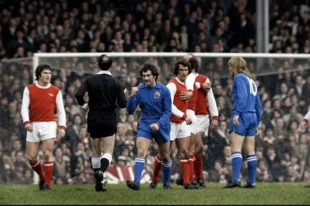


A bit of blue?

Look forward to seeing it next week then3rd kit normally follows in September


That is a very sexy shirt

Get ready for kit number 3


I’d knock a design up but you’ve gone quiet on meGet ready for kit number 3


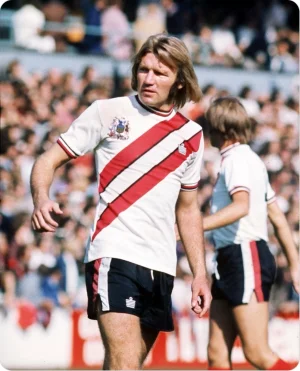
This looked so good
View attachment 240345
Until I saw the full thing…
View attachment 240346
Plain white with red stripes down the sleeve would’ve been perfect.

I'll be buying itThis looked so good
View attachment 240345
Until I saw the full thing…
View attachment 240346
Plain white with red stripes down the sleeve would’ve been perfect.
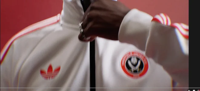
I agree it’s class, would have looked so good all white though, still a good unI think that jacket is class
All advertisments are hidden for logged in members, why not log in/register?