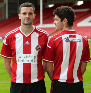
New Kit for next year?

All advertisments are hidden for logged in members, why not log in/register?


Superman on BladesMad has come up with some good ideas regarding a stand alone sponsor logo without a white box..

3311t8j.jpg

None of those home shirts are better than the real one.

Only 12 & 17 are any good as aways. I'm looking forward to Racing Green though
 
I may be wrong but I think the sponsor will be slightly different on the shirt when they arrive on sale, if they left it so late then they may have had to rush the press conference launch shirts out so the logo may have had to be of a lower quality due to time.
Hopefully the for sale version will be a bit better quality and not have the white back panel.
 
I think sensiblade makes a good point, and I'm not sure that the shirts fitted the players who were modelling them but does anyone agree that the badge is too low down on the chest?

And I still think that adidas's insistence on 3 stripes down the arms means that they often get the sleeves wrong. The short sleeves don't look as if they lie correctly (because there are too many different bit of cloth all sewn together) and while I think that solid red short sleeves are OK, I think the long sleeve version may be a mess.

If there is an iron on black number on the back, then it'll be just as illegible as it always was. As a side issue, the league insists on its own trade-marked numerals which is a pity seeing as the adidas 3 striped font is a real classic.
 
I may be wrong but I think the sponsor will be slightly different on the shirt when they arrive on sale, if they left it so late then they may have had to rush the press conference launch shirts out so the logo may have had to be of a lower quality due to time.
Hopefully the for sale version will be a bit better quality and not have the white back panel.

This is what I am hoping for.....
 
So here it is then! ;)

SO what do we think?

Honestly its not that bad but could have been so much better :(

It's a 'lazy' design, a basic Condivo 14 template with 2 white stripes on the front and (thankfully) 2 on the back

Anyone who had a crack at designing their own using the miadidas website knows that this would have taken the Adidas design team 3 or 4 mouse clicks (about 30 seconds) to get to this design - just not good enough :(

How simple would it have been to just click white side panels (oh look 3 RED stripes!!!)
Click white bottom to the shelves (oh look striped arms!!!)
Black trim on cuff, collar, arms and shoulders (would have been mint!)

Logo and badge placement all wrong too and lets not talk about the sponsors logo (oh dear) :(


SUFC Shirt 2014.PNG

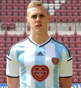
Look what they did with a bit of effort for the Hearts (away) shirt and you'll understand :/

Hearts kit.PNG
 
Adidas have nothing to do with the sponsor logo application.

Somewhere between the factory and the shop floor is some numpty with a heat transfer machine, ruining football shirts. They use this cheap looking method as it's exactly that, cheap.

It started last season, with the sports games bollocks and reached a pinnacle of shitness when poor Scougs scored at Wembley with a sponsor logo nearly as big as him!

20140413-l-stefan-scougall-cele-vhull135-1486340_478x359.jpg
 
Adidas have nothing to do with the sponsor logo application.

Somewhere between the factory and the shop floor is some numpty with a heat transfer machine, ruining football shirts. They use this cheap looking method as it's exactly that, cheap.

It started last season, with the sports games bollocks and reached a pinnacle of shitness when poor Scougs scored at Wembley with a sponsor logo nearly as big as him!

View attachment 8841

Guess it's too much to ask or too bespoke to have the sponsor as part of the shirt like Wards was.
 
So here it is then! ;)

SO what do we think?

Honestly its not that bad but could have been so much better :(

It's a 'lazy' design, a basic Condivo 14 template with 2 white stripes on the front and (thankfully) 2 on the back

Anyone who had a crack at designing their own using the miadidas website knows that this would have taken the Adidas design team 3 or 4 mouse clicks (about 30 seconds) to get to this design - just not good enough :(

How simple would it have been to just click white side panels (oh look 3 RED stripes!!!)
Click white bottom to the shelves (oh look striped arms!!!)
Black trim on cuff, collar, arms and shoulders (would have been mint!)

Logo and badge placement all wrong too and lets not talk about the sponsors logo (oh dear) :(


View attachment 8839

Look what they did with a bit of effort for the Hearts (away) shirt and you'll understand :/

View attachment 8840

Bang on the money Todwick. While it's better than some of the previous years efforts, it's annoying as it could be so, so MUCH better with a few of the tweeks mentioned to more replicate the Hearts away style. And don't get me started about the big white iron-on box... :mad:
 

So here it is then! ;)

SO what do we think?

Honestly its not that bad but could have been so much better :(

It's a 'lazy' design, a basic Condivo 14 template with 2 white stripes on the front and (thankfully) 2 on the back

Anyone who had a crack at designing their own using the miadidas website knows that this would have taken the Adidas design team 3 or 4 mouse clicks (about 30 seconds) to get to this design - just not good enough :(

How simple would it have been to just click white side panels (oh look 3 RED stripes!!!)
Click white bottom to the shelves (oh look striped arms!!!)
Black trim on cuff, collar, arms and shoulders (would have been mint!)

Logo and badge placement all wrong too and lets not talk about the sponsors logo (oh dear) :(


Look what they did with a bit of effort for the Hearts (away) shirt and you'll understand :/


So in one breath you are pissed off that we have used a "basic template" then in the next breath are pissed off that it's not the same as the Hearts shirt that uses the same "basic template"? :tumbleweed:
 
So in one breath you are pissed off that we have used a "basic template" then in the next breath are pissed off that it's not the same as the Hearts shirt that uses the same "basic template"? :tumbleweed:


I think he/she is referring to the sponsorship logo
 
I think he/she is referring to the sponsorship logo

Don't think so...

"How simple would it have been to just click white side panels (oh look 3 RED stripes!!!)
Click white bottom to the shelves (oh look striped arms!!!)
Black trim on cuff, collar, arms and shoulders (would have been mint!)"

For what it's worth, i would've liked White on the side rather than red. I'm fine with the red sleeves and lack of black though
 
Last edited:
But if they design the perfect shirt this season, where does that leave us to go next season? I can't wait to see the shirt for the 2029/2030 season.
 
It's ok Matt, don't cry.

I'm not the one crying and contradicting myself.

SUFC will have had a range of designs to choose from and no doubt had one identical to the hearts one in red. Whoever makes the decisions at SUFC decided to take this option.

This has nothing to do with Adidas being "lazy" as Todwick suggests.
 
So in one breath you are pissed off that we have used a "basic template" then in the next breath are pissed off that it's not the same as the Hearts shirt that uses the same "basic template"? :tumbleweed:
Hi ;)
No not 'pissed' off I actually like the shirt, just sad they didn't make the effort to make it just that little bit 'special'

As I said it's a lazy design based in the Condivo 14 template - shame :(

(And it's a He thanks Highbury) ;)

UTB!!!
 
There's some proper picky buggers here. I bet Christmas is a right old laugh fest.

"But I wanted an Optimus Prime and a bmx, why have I got socks and aftershave?"

"Because you're 38 Geoff. Now stop moaning and open the Buck's Fizz, and if you make one more crappy Cheryl Baker joke you'll not get a cracker."
 

All advertisments are hidden for logged in members, why not log in/register?

All advertisments are hidden for logged in members, why not log in/register?

Back
Top Bottom