Is it time for a New Kit Thread?

All advertisments are hidden for logged in members, why not log in/register?


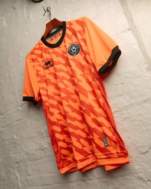
The funny thing is these kits by Errea are no more bespoke than what we’d get with adidas. All kit manufacturers work from their in house templates which usually include a custom front (and sometimes sleeve) panel which can be printed however the club wants.
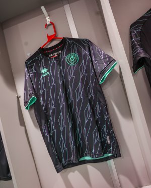
Yeah, I'm expecting the back of the new away shirt to be plan black.
Don't think the pattern will continue on the back
 
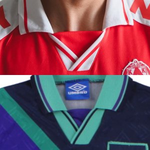
I’d love to know which stupid cunt was shown the Errea 24/25 catalogue of collars and chose that ugly fucker.

07E2A4D1-AB1F-419C-A0CC-BF9D56736F94.jpeg

And, bearing in mind the shirt “takes inspiration from the popular away kit from 1993”, Errea have a collar which is almost identical to the collar on that very fucking shirt (93)…

790308DC-3E36-41F0-AB99-0CE3ACC67E78.jpeg
 
Really like this kit. I like the keepers kit as well. Feels pretty unique. Wasn’t a fan of Errea and i know the quality isn’t the best but in terms of the design I think it’s great.
👏
 
I’d love to know which stupid cunt was shown the Errea 24/25 catalogue of collars and chose that ugly fucker.

View attachment 187435

And, bearing in mind the shirt “takes inspiration from the popular away kit from 1993”, Errea have a collar which is almost identical to the collar on that very fucking shirt (93)…

View attachment 187436
Never a fan of those fly away collars, a nice V neck would've been perfect.
 
Says its purple but looks grey to me. I think it will look better 'in person'

Given the colour we aren't going to need a third kit as there can't be a team we play who's home kit classes with both our home and away kits !
Are you a dog??
 

The stuff on the back of the neck looked pretty worky on some of them today too.

That collar is weird and the plain back kind of ruins it, weird how they can put the same pattern front and back on garish training gear but don't do it on the actual match shirts. I hate monochrome badges anyway but the green on that being slightly different to the rest of the green looks odd, would be far better with white blades, rose and writing, even if it doesn't have the red ring on it.
 
Wonky badges are back 🤣🤣

20240713_114048-jpg.187597
Out Run. Out Fight. Out Source.
 
Looking at the match day photos, they've managed to design a kit that looks ill fitting on most players.

That's actually quite impressive.
 

All advertisments are hidden for logged in members, why not log in/register?

All advertisments are hidden for logged in members, why not log in/register?

Back
Top Bottom