Navigation
Install the app
How to install the app on iOS
Follow along with the video below to see how to install our site as a web app on your home screen.
Note: This feature may not be available in some browsers.
More options
Style variation
You are using an out of date browser. It may not display this or other websites correctly.
You should upgrade or use an alternative browser.
You should upgrade or use an alternative browser.
Is it time for a New Kit Thread?
- Thread starter FifeBlade
- Start date
All advertisments are hidden for logged in members, why not log in/register?
Chimpan-A
Active Member
- Joined
- Feb 17, 2021
- Messages
- 1,103
- Reaction score
- 3,058
I reckon it’s in honour of Sabella’s move to United. It’s the 46th anniversary, so obviously they would commemorate it somehow.
Ndiayewillalwaysloveyou
Loyal and that
- Joined
- Jul 13, 2022
- Messages
- 10,916
- Reaction score
- 16,137
What, just like that utter shite corrugated iron, grey, white, mucky abomination of a third kit last season?
Seen once and never again since? One of our all time worst. All three last season were dire.
I got the all red shorts for me birthday.. are they from the grey 3rd kit?Yellow was great. Red shorts should've been the standard colour though
The Fox
Well-Known Member
I wish we'd get one design and just stay with it. Widths of stripes , numbers of stripes etc. Of course they can piss about with the coller etc but the shirt design and look should be permanent.
Should be our registered design and our brand not interfered with by kit manufacturers .
Realise I'm a dinosaur but what company has its visual identity changed every couple of years
It'll not happen but still have a pipedream .
Should be our registered design and our brand not interfered with by kit manufacturers .
Realise I'm a dinosaur but what company has its visual identity changed every couple of years
It'll not happen but still have a pipedream .
Pollingtonblade
Well-Known Member
Will the takeover impact on the new kit?
I'm a simple man but unfortunately a somewhat controversial one.
No back stripes
No black pin stripes
Basically one of my favourite kits was our last Adidas one with the USG sponsor. Wasn't the biggest fan of the sleeves but my favourite in recent years.
No back stripes
No black pin stripes
Basically one of my favourite kits was our last Adidas one with the USG sponsor. Wasn't the biggest fan of the sleeves but my favourite in recent years.
JayGreen17
Well-Known Member
- Joined
- Apr 2, 2017
- Messages
- 3,706
- Reaction score
- 6,704
The pinstripes are what separates us from the other red and whites… so much more classy and not like a stick of rock, deck chair or a pram from the 80’sI'm a simple man but unfortunately a somewhat controversial one.
No back stripes
No black pin stripes
Basically one of my favourite kits was our last Adidas one with the USG sponsor. Wasn't the biggest fan of the sleeves but my favourite in recent years.
mattbianco1
Forum Royalty
They're listed as alternate shorts I think.I got the all red shorts for me birthday.. are they from the grey 3rd kit?
But they were released so they could be used with any of the 3.
We wore them with the home shirt at Man City and the yellow shirt at Brighton
Ron_Justice
Well-Known Member
- Joined
- Jul 2, 2014
- Messages
- 2,719
- Reaction score
- 6,602
For me, the thing about plain Red and White stripes is the overall design has to be really, really solid to look good. The black pinstripes add a graphic element that helps prop up otherwise so-so shirts.I'm a simple man but unfortunately a somewhat controversial one.
No back stripes
No black pin stripes
Basically one of my favourite kits was our last Adidas one with the USG sponsor. Wasn't the biggest fan of the sleeves but my favourite in recent years.
3 colour designs allow for a far greater level of variety in the design that 2 colours simply can't achieve.
Add to that, that the 1990-92 kit coincided with the time l really started to identify as a Blade, l prefer us to have a black element on the home kit.
I just think the black pin stripes look a bit tacky, cheap and a bit busy. No pin stripes for me makes the design cleaner, perhaps I could be persuaded with very thin black pin stripes.For me, the thing about plain Red and White stripes is the overall design has to be really, really solid to look good. The black pinstripes add a graphic element that helps prop up otherwise so-so shirts.
3 colour designs allow for a far greater level of variety in the design that 2 colours simply can't achieve.
Add to that, that the 1990-92 kit coincided with the time l really started to identify as a Blade, l prefer us to have a black element on the home kit.
BladeByChoice
Member
The pinstripes are what separates us from the other red and whites… so much more classy and not like a stick of rock, deck chair or a pram from the 80’s
I look at some Blades kits and think meh, I look at others and think OOooooo, just realised all the OOooooo kits have pinstripes, you've nailed it.
ISZA ⚔️
Well-Known Member
- Joined
- Jan 5, 2021
- Messages
- 4,410
- Reaction score
- 10,199
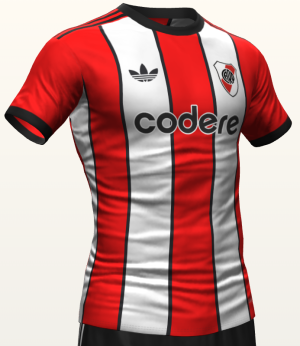
Not an Adidas fan but dear lord!!!!
View attachment 185895

Adidas River Plate 24-25 Third Kit Design Leaked?
Update: Based on our leaked design, 3D designer @marito_plottier has rendered the River Plate 24-25 third shirt to see what it could look like.www.footyheadlines.com
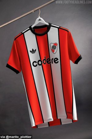
Probably have the cleaners modelling it like Wednesday did.Won't need much kit with a threadbare squad
ChipButtyBlade
Well-Known Member
Ive seen it and immediateley had images of the horrors of WW2 flashing in my head.Probably have the cleaners modelling it like Wednesday did.
Ours i think will be very thin stripes like 94/95.
Swannyblade
Well-Known Member
- Joined
- May 14, 2017
- Messages
- 2,630
- Reaction score
- 7,248
Good lord that's naughty
MTBlade
Member
- Joined
- May 23, 2024
- Messages
- 321
- Reaction score
- 781
I wondered this also.Will the takeover impact on the new kit?
I guess it could IF the takeover happens and if the current deal was signed with UW or SUFC
DifferentClass
Proud Wilder cultist
I've just cum.
ISZA ⚔️
Well-Known Member
- Joined
- Jan 5, 2021
- Messages
- 4,410
- Reaction score
- 10,199
Dirty bastardI've just cum.
Ron_Justice
Well-Known Member
- Joined
- Jul 2, 2014
- Messages
- 2,719
- Reaction score
- 6,602
mattbianco1
Forum Royalty
designblade
Member
- Joined
- Aug 18, 2009
- Messages
- 492
- Reaction score
- 985
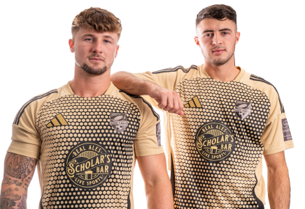
Looks smart doesn it! Gold should be reserved for teams that have won summat though
JayGreen17
Well-Known Member
- Joined
- Apr 2, 2017
- Messages
- 3,706
- Reaction score
- 6,704
Beautiful! One could only hope!
DifferentClass
Proud Wilder cultist
The third kit we had season before last was an absolute belter.
Kozzy_is_my_Dad
No excuses, no dickheads.
- Joined
- May 14, 2015
- Messages
- 10,689
- Reaction score
- 26,308
WeEaRz kIt?!?1!?
mattbianco1
Forum Royalty
S5Blade
Nom, Nom, Nom
Need some acid for my eyes after seeing that. Jesus
SW12 to S12 to S18
Active Member
- Joined
- Aug 11, 2015
- Messages
- 2,224
- Reaction score
- 3,358
It shouldn't be a fashion show, red and white stripes, front and back, no pin stripes, black shorts and whatever choice of socks, red, black or preferably white. It's a football kit, nothing more.
Some people won't be satisfied until it lights up.
Some people won't be satisfied until it lights up.
Similar threads
All advertisments are hidden for logged in members, why not log in/register?

