R&WStripedBlood
Member
- Joined
- Aug 23, 2009
- Messages
- 337
- Reaction score
- 718
He nicked ‘em off Grbic when he signed. Could be a reason for Grbic “underperforming”His gigs are shocking though!
Follow along with the video below to see how to install our site as a web app on your home screen.
Note: This feature may not be available in some browsers.
All advertisments are hidden for logged in members, why not log in/register?
He nicked ‘em off Grbic when he signed. Could be a reason for Grbic “underperforming”His gigs are shocking though!
Think you'll find Grbic is so blind he uses David Blunkett as his eyes around town!He nicked ‘em off Grbic when he signed. Could be a reason for Grbic “underperforming”
Reckon it will be used v BurnleyLoads of clubs do this kind of thing for the third kit. Man U did similar last year and think Arsenal have this year.
Fantastic kit. Probably never get used, like.
The badge looks absolutely terrible. Why would they mess with the best badge in football?This could have been an all time great but there's something really off about it.
The simplified badge seems too big which makes the entire thing look unbalanced.
The badge looks absolutely terrible. Why would they mess with the best badge in football?
I think that’s Bronte Jones from Gladiators isn’t it?"Is that a canoe in my pocket"...........
View attachment 189325
"Down boy, down"!
Rrrrrrrrrrrraaaaaaarrrrrrrrrr!!!
utb
Think it’s called a one off.The badge looks absolutely terrible. Why would they mess with the best badge in football?
Yea yer a miserable old bastard !Call me an old fashioned miserable bastard, I just don't get all this kit launch video bollocks .And then grown geezers actually having a debate and moaning about it ....
It's a Football shirt , it's what's inside it that matters
Loads of clubs do this kind of thing for the third kit. Man U did similar last year and think Arsenal have this year.
Fantastic kit. Probably never get used, like.
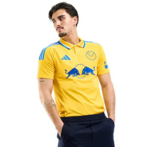
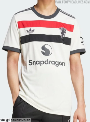
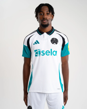
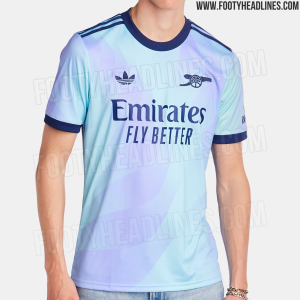

I'd love us to have a retro style shirt with the adidas trefoilAdidas have started doing it this season on away/third kits using old crests. Man Utd and Arsenal have even got the Trefoil Adidas Logo
Leeds
View attachment 189340
Man Utd
View attachment 189341
Newcastle
View attachment 189342
Arsenal
View attachment 189343
Celtic
View attachment 189344
View attachment 189322View attachment 189323
Behold the emblem of valor and heritage, a timeless crest resplendent in its martial grandeur: two swords, crossed in perfect symmetry, forging an indomitable testament to chivalric tradition. These gleaming blades, wrought from the finest steel, their edges honed to perfection, converge at their hilts, adorned with intricate engravings that echo tales of legendary battles and noble quests. Encased in an aura of eternal glory, the swords are framed by a laurel wreath, symbolizing victory and honor. This classic insignia, a paragon of heraldic artistry, commands reverence, evoking the valor of knights and the noble ideals of a bygone era. In its presence, one is transported to a realm where honor reigns supreme, and the spirit of the warrior endures eternally.
That shouldn’t be an excuse to make a really shit kitThink it’s called a one off.
Makes me laugh how annoyed people get about the kits. These days, if you don't like a kit, there's 2 more (plus GK tops and training tops) to choose from. If you don't like any of them, there's always next year! We should be able to experiment with different colours, accents, stripes width/directions etc. without people losing their minds about it.That shouldn’t be an excuse to make a really shit kit
Yep. Shes a Blade.I think that’s Bronte Jones from Gladiators isn’t it?
easy to remove
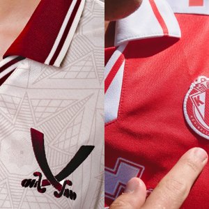
First thing I noticed about the collar is that it's not level! On the shirt that the big bald bloke has on anywayIt’s well known I’m a collar nerd on here now so allow me to go in to some detail about the third shirt…
I saw - and liked - this collar from Errea a few weeks ago. Mentioned it should have been used on the away shirt in teal/jade/whatever. (https://www.s24su.com/forum/threads/is-it-time-for-a-new-kit-thread.99556/post-5232332)
Would also improve the home shirt imo.
KV Kortrijk - whoever they are - have the same collar (template…) but it’s done in the same fabric as used to make the shirt. Making it look cheap and very flimsy. But fair fucks to Errea or whoever at United made sure it was done in the proper stretchy knit rib cuff stuff. Because it makes the shirt look ten times better and worth the money.
View attachment 189359

All advertisments are hidden for logged in members, why not log in/register?
