Blades kit: black pin stripes, yay or nay...

All advertisments are hidden for logged in members, why not log in/register?

Black pin stripes?

  • Yes to black pin stripes.

    Votes: 153 72.5%
  • No to black pin stripes.

    Votes: 58 27.5%

  • Total voters
    211
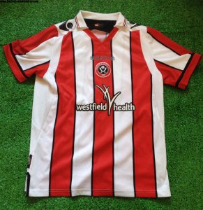
My ideal kit would be the 2017-18 teletext shirt.
The 2016-17 shorts (with red Adidas stripes, best feeling material too)
And the new 2020-21 socks (red and white)


I've asked this before but don't recall getting an answer. Is it a Premier League requirement that all striped shirts have a solid colour back? I found this article from Stoke City from a few years back, but not much more.

"As the Premier League are looking to introduce a rule to enforce squad number visibility to complement UEFA’s rules for clubs playing in European competition, we have incorporated a white panel on the reverse of the shirt." - Stoke City statement

Taken prior to the 2016 season. So maybe Adidas not to blame for solid backs after all?

Just realised this is in the wrong thread! Oh well!

I’m going to take this question at face value. As has been mentioned repeatedly when this question pops up, it is not, and has never been, a Premier League requirement. It is also why Newcastle and West Brom will not face any punishment for their all-stripe backs in their recently announced kits.

Put simply: it is entirely the club & Adidas’s fault that we do not have an all-stripe back for the home shirt.
 
I think that goes to show that it massively depends on which shirt you grew up with as the Laver shirt is from my childhood and my favourite ever, closely followed by the Teletext (Bouncing Day Massacre) shirt.

I find the shirts without the black pinstripes quite bland and boring if I'm honest. The Westfield Health one would be one of my least favourite of the last 30 years. It's just so 'Meh'.

Which one as we had that sponsor two years running? I'm going to presume you mean the first one (1st season in L1/Hudders P/O defeat/Chedgate)? If so I agree with you that the shirt was a bit 'Meh' but what I did like about that kit was the return of white socks since 2004.

The second Westfield one (the 70's throwback with black pinstripes & central crest) I thought was absolutely gorgeous and probably Macron's best for us. I hummed and hawed about buying it for ages and although I shouldn't have let it the main downer for me it being a L1 shirt. Ironic really as the 77/78 it was based on were dark days down in the lower leagues also.

I meant the Westfield Health one in this picture:

1596630294846.png

When I see the Classic Laver one or the 2017/18 shirt I immediately think 'that's a Sheffield United shirt' but the Westfield one could easily be mistaken for Stoke City, Southampton or Sunderland for me. It's just a bit bland IMO.
 
I’m going to take this question at face value. As has been mentioned repeatedly when this question pops up, it is not, and has never been, a Premier League requirement. It is also why Newcastle and West Brom will not face any punishment for their all-stripe backs in their recently announced kits.

Put simply: it is entirely the club & Adidas’s fault that we do not have an all-stripe back for the home shirt.

Cheers Loughboro, it was a genuine question and I thought so previously until someone on facebook said otherwise. So in essence its back to my original thoughts that Adidas home shirts for us are just crap - that's my view anyway.
 
Anyone?

su.png
I’d buy it.......So long as ain’t got a plain white back.......
 
I meant the Westfield Health one in this picture:

View attachment 87622

When I see the Classic Laver one or the 2017/18 shirt I immediately think 'that's a Sheffield United shirt' but the Westfield one could easily be mistaken for Stoke City, Southampton or Sunderland for me. It's just a bit bland IMO.
No you got it right first time
 
The 2012/13 kit that was a play on the 70’s kit was pretty good with a pinstripe though.


A look back at shirts we've had and what they would have looked like if they had added, or removed the pinstripes. For the purpose of the exercise, i'm only changing the stripes. Nothing else.

2023
Actual versus Black Removal

1672927659975.png1672927716523.png

2022 Actual versus Black Removal

1672928243999.png1672928301543.png

2021 Actual versus Added Black

1672929030636.png1672928989732.png

2020 Actual versus Added Black
1672927141426.png 1672927167444.png

2019 Actual versus Added Black
1672927529019.png1672927566250.png

Personally, i prefer all but one of them WITHOUT black. Only last seasons shirt looks better with black. For me anyway
 
A look back at shirts we've had and what they would have looked like if they had added, or removed the pinstripes. For the purpose of the exercise, i'm only changing the stripes. Nothing else.

2023
Actual versus Black Removal

View attachment 150466View attachment 150467

2022 Actual versus Black Removal

View attachment 150468View attachment 150469

2021 Actual versus Added Black

View attachment 150473View attachment 150472

2020 Actual versus Added Black
View attachment 150462 View attachment 150463

2019 Actual versus Added Black
View attachment 150464View attachment 150465

Personally, i prefer all but one of them WITHOUT black. Only last seasons shirt looks better with black. For me anyway
Good work sir 👏
Personally, I think every one of those look better with the black pinstripes!
It's all about opinions innit (bruv)?
 
A look back at shirts we've had and what they would have looked like if they had added, or removed the pinstripes. For the purpose of the exercise, i'm only changing the stripes. Nothing else.

2023
Actual versus Black Removal

View attachment 150466View attachment 150467

2022 Actual versus Black Removal

View attachment 150468View attachment 150469

2021 Actual versus Added Black

View attachment 150473View attachment 150472

2020 Actual versus Added Black
View attachment 150462 View attachment 150463

2019 Actual versus Added Black
View attachment 150464View attachment 150465

Personally, i prefer all but one of them WITHOUT black. Only last seasons shirt looks better with black. For me anyway

Could you make it a bit more realistic and put the badge on upside down on the current one?
 
I did always wonder whether they should have used the full shield for the wards sponsor though. Maybe not

1673008944908.png
 
Im come accustomed to most of our kits now having the pin stripes. Interesting to see that we first introduced that style in 1975. Does anyone know if that was just a design change or a reason for it?
 

All advertisments are hidden for logged in members, why not log in/register?

All advertisments are hidden for logged in members, why not log in/register?

Back
Top Bottom