Away kit

All advertisments are hidden for logged in members, why not log in/register?

My advice is get down to Lea Mills (it'll take less than half an hour), visit the John Smedley factory shop and come home with 2 beautiful sea-island cotton shirts for the price of one embarrassing piece of nylon,

- on your return you'll immediately be surrounded by beautiful women and you'll probably get a pay rise,

FACT

£100 for a T-shirt.....someone's doing well
 

WOW Is that the look the ladies go for on grab a granny night ?

No. In my experience it's this:

0-1.jpeg


Never failed me yet.
 
we always seem to leave the away kit till last minute. I think we need to release it alot earlier, the club are not maximizing their sales by leaving it late,replica kits are a very big revenue stream and people like to buy and wear them on holiday.also it stops alot of bickering.next season shirts are finalised around xmas time,Mr phipps told me that,so its stupid we still dont even know what it looks like,let alone able to buy one. same shit every year
 
Every manufacture uses templates and every club, even at the very top have the templates.
 
There was. They are all templates, you can mix and match different parts, say swap the collar from another template but no one sat down, designed a kit from scratch and then had it manufactured.
 
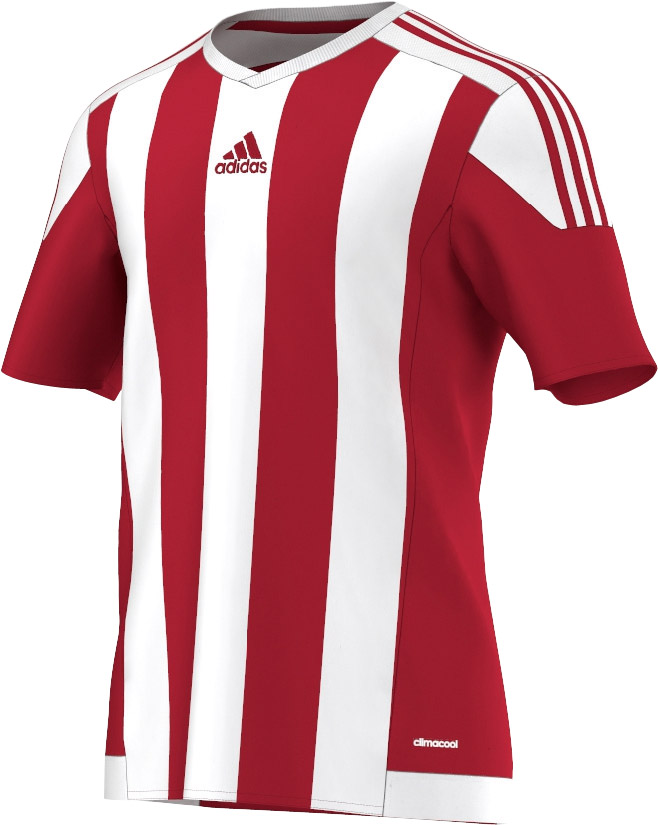
This is the template for our kit. Look closely at the how the patches meet up around the bottom of the stripes and around the shoulder, also look at how the patches are around the bottom of the shirt. All they did was swap the collar and took the front from one of the pin stripe shirts.

adidas-striped-15-jersey-red-white%2B(1).jpg

Sheffield-United-15-16-Home-Kit%2B(2).jpg

CJelW2pWsAAbF33.jpg
 
Is it just me that hates having a luminous yellow kit?
The 1989 one is iconic and a fantastic shirt. The 90s one with black sleeves was OK. Then they tried it again, its getting a bit tedious.

I hate yellow... it reminds of Leeds 70s away kits and those that shall not be named in the 80s.... don't want yellow....ugh.

We have three colours on our home kit, why do we need a fourth?
 

Fucking templates :mad:

Take a look at @UberFootbalI's Tweet:


I think about the only kit supplier that does bespoke kits for over 50% of its clubs is Umbro. Mind you, they're only just starting out again after the Nike debacle so they may use more templates once they get more contracts.

That is fucking diabolical though, you could just buy a QPR badge and sew it on and you'd have the shirt. At least Adidas actually mix and match template elements. It might not be bespoke to every club, but it's more unique than what Nike are pumping out.
 
for the 1st year with adidas,yes. but there was no template for our new home kit.you can have what you want after the 1st year

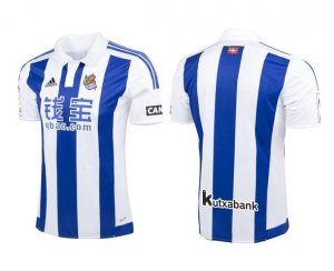
There is a template. Adidas are using 2 or 3 this year, ours with the "proper collar", then the one with the chequered collar and cuffs. Here are multiple shirts based on our template.

Matchbook-Brentford-Kit-2015-16.jpg Real-Sociedad-Jersey-2015-2016.jpg Feyenoord-Home-Kit-15-16.jpg ITFC-Home-Kit-15-16.jpg
 
Is it just me that hates having a luminous yellow kit?
The 1989 one is iconic and a fantastic shirt. The 90s one with black sleeves was OK. Then they tried it again, its getting a bit tedious.
The worst of the bunch IMO was this tango monstrosity. Awful design and the material was some sort of boil-in-the-bag plastic. I saved some dosh not getting that one.

DSC08080-650x650.JPG
 
The worst of the bunch IMO was this tango monstrosity. Awful design and the material was some sort of boil-in-the-bag plastic. I saved some dosh not getting that one.

DSC08080-650x650.JPG
Mine fell to bits when the cardboard sponsors logo somehow got caught in the washing machine and shredded the shirt when it span. We had red shorts and socks that year too.

I really liked the yellow away shirt that we had in 91/92 and 92/93. Something like that would be good.
 
The worst of the bunch IMO was this tango monstrosity. Awful design and the material was some sort of boil-in-the-bag plastic. I saved some dosh not getting that one.

DSC08080-650x650.JPG

Only good thing about that shirt was the orange away day at reading when the club put on free travel and there were loads of orange balloons etc. the game was also memorable, not for the result (bore draw 0-0) but the song that was sang about Katie Harris from coronation street killing her on screen piggy dad, whoever made that song up is a genius.
 
Only good thing about that shirt was the orange away day at reading when the club put on free travel and there were loads of orange balloons etc. the game was also memorable, not for the result (bore draw 0-0) but the song that was sang about Katie Harris from coronation street killing her on screen piggy dad, whoever made that song up is a genius.

And the draw at Highbury in the FA Cup. Last minute pen.
 
Mine fell to bits when the cardboard sponsors logo somehow got caught in the washing machine and shredded the shirt when it span. We had red shorts and socks that year too.

And I thought Macron shirts were the only ones to fall to bits in the wash! :D

I really liked the yellow away shirt that we had in 91/92 and 92/93. Something like that would be good.

Absolute classic that. Remember my uncle had both the deckchair shirt and the away shirt, I used to wear them around the house even though I was a little un at the time so they were more like a dress than a shirt!
 
Only good thing about that shirt was the orange away day at reading when the club put on free travel and there were loads of orange balloons etc. the game was also memorable, not for the result (bore draw 0-0) but the song that was sang about Katie Harris from coronation street killing her on screen piggy dad, whoever made that song up is a genius.

I got banned from FootballGroundGuide forum for having that song as my signature. Crazy.
 

its speaks for the 'quality' of the manufacture that even in the publicity shots, the collar doesn't sit correctly, is it buttoned??? that said, I quite like this kit, part of that is a classic Opel logo that actually looks the part - we used to have the even more iconic maltese cross on our shirts though it was slightly let down by the 'come to Malta' writing in suitably laughable comic sans or some related grotesk font.
 

its speaks for the 'quality' of the manufacture that even in the publicity shots, the collar doesn't sit correctly, is it buttoned??? that said, I quite like this kit, part of that is a classic Opel logo that actually looks the part - we used to have the even more iconic maltese cross on our shirts though it was slightly let down by the 'come to Malta' writing in suitably laughable comic sans or some related grotesk font.

Its a press stud button at the top. Very smart tbh
 

All advertisments are hidden for logged in members, why not log in/register?

All advertisments are hidden for logged in members, why not log in/register?

Back
Top Bottom