Navigation
Install the app
How to install the app on iOS
Follow along with the video below to see how to install our site as a web app on your home screen.
Note: This feature may not be available in some browsers.
More options
Style variation
You are using an out of date browser. It may not display this or other websites correctly.
You should upgrade or use an alternative browser.
You should upgrade or use an alternative browser.
23/24 season kit thread
- Thread starter More Bladier than thou
- Start date
All advertisments are hidden for logged in members, why not log in/register?
Kozzy_is_my_Dad
No excuses, no dickheads.
- Joined
- May 14, 2015
- Messages
- 10,671
- Reaction score
- 26,258
Always. Mebbes that's the sponsor. Otherwise the club are daft, there's a cossy livs crisis going on.Would this be a good time to reccomend Fairy non bio pods which are kind to sensitive skins?
Lord Eddard Muir
Nigh invulnerable when Arblastin'
- Joined
- May 11, 2016
- Messages
- 2,674
- Reaction score
- 7,341
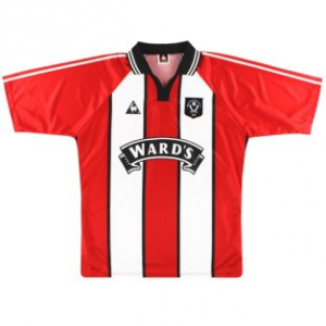
Full disclosure: I started going to games in the Wards shirt era and have kept hold of my original ever since (not that it's fit me for a couple of decades) so I'm possibly a bit biased.
ISZA ⚔️
Well-Known Member
- Joined
- Jan 5, 2021
- Messages
- 4,402
- Reaction score
- 10,176
It was always gonna be a downgrade on last years which was close to if not perfect design-wise.
It’s over complicated. The shoulders are entirely red which looks poor but the cut/shape of them takes them up to the neck and all the way round the back with an extra piece of material plonked in as well. The collar didn’t need that extra horizontal bit of black. A simple V neck would look way better.
There’s stripes on the back and that can never be underestimated.
Yours, the S2 knitting circle.
sufc323
Active Member
- Joined
- Apr 18, 2017
- Messages
- 1,629
- Reaction score
- 9,206
That's basically the only difference.
Collar's a different colour, different colour pinstripes, the turkey shirt has stripes all the way around instead of the block down the side and it has Randox across the front but apart from that..
Edgar Allan Poo
From the poisoned pen of....
- Joined
- Mar 4, 2021
- Messages
- 15,758
- Reaction score
- 25,348
Looks fine. Not exactly a masterpiece but looks fine. They always look weird with no sponsor on.
Are they pure white stripes?
White with a hint of steel!
Swannyblade
Well-Known Member
- Joined
- May 14, 2017
- Messages
- 2,624
- Reaction score
- 7,241
It's nice, very happy with that...just need a sponsor logo that's black now
ChipButtyBlade
Well-Known Member
When they in shop ?
Ainsley Harriott
I saw this thing on itv the other week
- Joined
- Aug 18, 2016
- Messages
- 21,585
- Reaction score
- 41,104
And they're going to charge £50 for that. That's a basic Errea shirt with a badge onView attachment 164637Confirmed as keeper kit.
Kozzy_is_my_Dad
No excuses, no dickheads.
- Joined
- May 14, 2015
- Messages
- 10,671
- Reaction score
- 26,258
More stripes, thinner than these. A better collar, better sleeves.It’s nice. God only knows what people want from a red and white striped shirt.
But most of that fades into insignificance, for me, the main issue is the quality of manufacturing and the need for a better supplier than Errea.
Kozzy_is_my_Dad
No excuses, no dickheads.
- Joined
- May 14, 2015
- Messages
- 10,671
- Reaction score
- 26,258
Does the Errea deal run out at the end of this season?
Antarctic Monkey
Member
- Joined
- Sep 3, 2014
- Messages
- 759
- Reaction score
- 1,260
Available early August, what a showet
Ainsley Harriott
I saw this thing on itv the other week
- Joined
- Aug 18, 2016
- Messages
- 21,585
- Reaction score
- 41,104
Now you're picking spots. It's the turkey shirt template then. Shit collar. Broad stripes. The similarities are a bit close for coincidenceCollar's a different colour, different colour pinstripes, the turkey shirt has stripes all the way around instead of the block down the side and it has Randox across the front but apart from that..
SouthEssexBlade
...for wit and sage wisdom
That's basically the only difference.
Collar is different
Stripes different
Cuffs are different
Badge is different
Errea logo is different
Colour is different
Material is different
Apart from that it's the same
Lower Drop Blade
Active Member
- Joined
- May 15, 2016
- Messages
- 1,703
- Reaction score
- 2,663
It's ok.......let's get some decent players in it
Another fan who first started attending regularly in 97/98 and still have the original (I can just about get into it but wouldn't want to be seen in public wearing it!) I really like the design but it's quite underwhelming compared to the promo celebration shirt and again, the collar is fucking wank. Material looks itchy and shiny, the stuff they used for the black 3rd shirt was pretty decent, hopefully it's more like that.
Roygbiv
Well-Known Member
Full disclosure: I started going to games in the Wards shirt era and have kept hold of my original ever since (not that it's fit me for a couple of decades) so I'm possibly a bit biased.
That's my favourite ever home shirt which is why I like this one so much. Really hope the sponsor doesn't ruin it
Booker4
Well-Known Member
- Joined
- Dec 19, 2015
- Messages
- 9,108
- Reaction score
- 13,409
My first thought was exactly the same re the red sleeves but with the thickness of the stripes being so thick you couldn't get in a white stripe either I doubt to the sleeves. I like it, I agree with you on that I would prefer is the red and white stripes on the back to go to the top, but overall it's not bad, I still prefer it to almost all the home kits Adidas produced.It was always gonna be a downgrade on last years which was close to if not perfect design-wise.
It’s over complicated. The shoulders are entirely red which looks poor but the cut/shape of them takes them up to the neck and all the way round the back with an extra piece of material plonked in as well. The collar didn’t need that extra horizontal bit of black. A simple V neck would look way better.
There’s stripes on the back and that can never be underestimated.
Yours, the S2 knitting circle.
ISZA ⚔️
Well-Known Member
- Joined
- Jan 5, 2021
- Messages
- 4,402
- Reaction score
- 10,176
Gin&Juice
Well-Known Member
- Joined
- Apr 10, 2014
- Messages
- 8,184
- Reaction score
- 16,164
I like it. Brings back nostalgia of aeroplane celebrations in Sunday league, Katchouro bagging a hat-trick after coming back from a collapsed lung, Steve Bruce getting put on his arse by Michael Bridges, DEANO DEANO DEANO his return against Sunderland, Coventry away, Gareth Taylor scoring against Forest etc. etc.
Lower Drop Blade
Active Member
- Joined
- May 15, 2016
- Messages
- 1,703
- Reaction score
- 2,663
To get kit out but not sorting a sponsor is a tad embarrassing
CoatesyBlade
Active Member
- Joined
- Jul 10, 2018
- Messages
- 2,180
- Reaction score
- 3,768
The collar on the goalie shirt would've looked way better on the home kit.It was always gonna be a downgrade on last years which was close to if not perfect design-wise.
It’s over complicated. The shoulders are entirely red which looks poor but the cut/shape of them takes them up to the neck and all the way round the back with an extra piece of material plonked in as well. The collar didn’t need that extra horizontal bit of black. A simple V neck would look way better.
There’s stripes on the back and that can never be underestimated.
Yours, the S2 knitting circle.
I do like it (fond memories of the original) ... apart from that collar! 8.5/10
Macfarlane21
Active Member
- Joined
- Jun 15, 2009
- Messages
- 1,543
- Reaction score
- 2,319
Just seen it. Absolute beauty of a kit!!!
Gotta to say though I am gutted that it wasn't released today for sale. That will be another birthday for me with no presents because the kits not released in July
When will we start capitalising on the summer holiday market?!
In other news... weerz away kit!
Gotta to say though I am gutted that it wasn't released today for sale. That will be another birthday for me with no presents because the kits not released in July
When will we start capitalising on the summer holiday market?!
In other news... weerz away kit!
Last edited:
£50? You're hoping aren't you?!And they're going to charge £50 for that. That's a basic Errea shirt with a badge on
Probably £60
Tickhill Blade
Active Member
- Joined
- Apr 26, 2019
- Messages
- 2,460
- Reaction score
- 6,968
Marcelo and his 2 shirtsI like it. Brings back nostalgia of aeroplane celebrations in Sunday league, Katchouro bagging a hat-trick after coming back from a collapsed lung, Steve Bruce getting put on his arse by Michael Bridges, DEANO DEANO DEANO his return against Sunderland, Coventry away, Gareth Taylor scoring against Forest etc. etc.
Similar threads
- Replies
- 9
- Views
- 2K
- Replies
- 22
- Views
- 1K
All advertisments are hidden for logged in members, why not log in/register?


