Navigation
Install the app
How to install the app on iOS
Follow along with the video below to see how to install our site as a web app on your home screen.
Note: This feature may not be available in some browsers.
More options
Style variation
You are using an out of date browser. It may not display this or other websites correctly.
You should upgrade or use an alternative browser.
You should upgrade or use an alternative browser.
23/24 season kit thread
- Thread starter More Bladier than thou
- Start date
All advertisments are hidden for logged in members, why not log in/register?
Grecian2000
Borderline mentalist.
- Joined
- Aug 12, 2009
- Messages
- 7,744
- Reaction score
- 8,963

Did they build a special Meccano crane to make him look really tall?
idleurchin
Happy-Go-Lucky Nihilist
Love it.
Nelson1889
Active Member
- Joined
- Nov 12, 2014
- Messages
- 1,357
- Reaction score
- 7,613
 Confirmed as keeper kit.
Inter_blade83
Well-Known Member
- Joined
- Jun 11, 2011
- Messages
- 6,665
- Reaction score
- 11,716
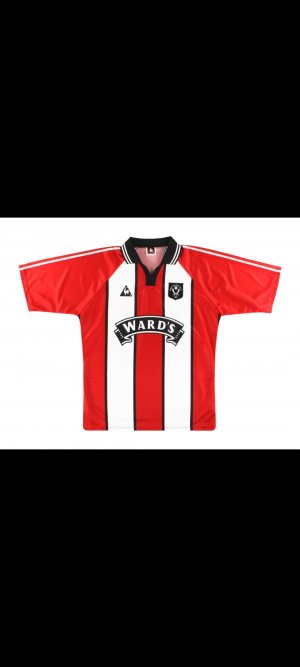
If that's the true colour of it, it looks a lot better than in the video.I can't say I hate it
View attachment 164631
Dhgate will be getting another order soon I imagine, if I can get it WITHOUT a sponsor.
Superblades
Well-Known Member
How was a fake version out in the shops at Turkey complete with Randox on the front when I was there? I saw it and thought it was just a fake version of the 97/98 shirt 
BridBladesman
Member
- Joined
- Jun 2, 2015
- Messages
- 363
- Reaction score
- 429
It’s very nice as it is…without the sponsor on it ! 
DeanLearner'sCat
Active Member
- Joined
- May 18, 2016
- Messages
- 1,678
- Reaction score
- 6,406
It's much better than the rumoured atrocity.
Antarctic Monkey
Member
- Joined
- Sep 3, 2014
- Messages
- 759
- Reaction score
- 1,260
BLADES1988
Well-Known Member
- Joined
- Jun 20, 2016
- Messages
- 3,317
- Reaction score
- 5,630

Lord Eddard Muir
Nigh invulnerable when Arblastin'
- Joined
- May 11, 2016
- Messages
- 2,857
- Reaction score
- 7,844
That's a very polite and measured way of saying it looks fuck all like it.There are similarities, but is not the same View attachment 164635
sufc323
Active Member
- Joined
- Apr 18, 2017
- Messages
- 1,706
- Reaction score
- 9,619
JAN ARGE...FJORTOFT
Probably my favourite home kit as a kid, probably due to the players who wore it.
Ron_Justice
Well-Known Member
- Joined
- Jul 2, 2014
- Messages
- 2,776
- Reaction score
- 6,736
I'll have a Goaly shirt this year. Home shirt looks great, need to see the sponsor to really appreciate/hate it though.
ISZA ⚔️
Well-Known Member
- Joined
- Jan 5, 2021
- Messages
- 4,538
- Reaction score
- 10,431
I still think your source is correct mate. Club can gtf.Apologies for my source being incorrect, although I think I prefer it
I mean, it isn't bad. Not quite as good as last years.Good points
• stripes front and back
• pays homage to a classic kit
• looks great with no sponsor (club need to offer this as an option when they go on sale IMO)
Bad points
• no stripes on the sleeves, never looks right with solid sleeves.
• shorts are basically last years template, hardly bespoke as promised.
• looks a bit plain when compared to last seasons and especially the limited edition shirt.
Was expecting much more but I don't hate it. Possibly one that will grow on us
It's the little things though. Wish the central stripe married up to the collar rather than slightly overlapping it. Or even if it had the collar from the kit it was tributing.
Mistake not to release it today/ sell a sponsorless version.
CoatesyBlade
Active Member
- Joined
- Jul 10, 2018
- Messages
- 2,186
- Reaction score
- 3,800
I like the home kit (black socks again too  ) I'd have preferred the white kit collar on it though if I'm being picky. Speaking of which, what is that white kit? Looks a bit odd for the goalie! But if that means yellow is the away then happy days!
) I'd have preferred the white kit collar on it though if I'm being picky. Speaking of which, what is that white kit? Looks a bit odd for the goalie! But if that means yellow is the away then happy days!Same same. But different.That's a very polite and measured way of saying it looks fuck all like it.
- Joined
- Jun 5, 2022
- Messages
- 5,053
- Reaction score
- 16,996
- Banned
- #1,339
This has saved it from being a complete disaster in all fairness. Stripes on the back is a redeeming feature.
Block panels should be banned and punishable by hanging.
Block panels should be banned and punishable by hanging.
Lord Eddard Muir
Nigh invulnerable when Arblastin'
- Joined
- May 11, 2016
- Messages
- 2,857
- Reaction score
- 7,844
Like it better than last year's already. Last year's was bare-minimum bog standard fare, this has some class to it.
ChipButtyBlade
Well-Known Member
Stripes on the back....nice l like it.
snb69
Active Member
It's fine - stripes on the back, black pin stripes, no ridiculous stripe pattern. Solid
- Joined
- Mar 17, 2014
- Messages
- 6,208
- Reaction score
- 15,834
Bit meh. But not horrible.
Main criticism is that it looks like a red shirt with two blocks of white on it, rather than red and white stripes. But it could have been a whole load worse. It also could have been a whole lot better, but hey.
Main criticism is that it looks like a red shirt with two blocks of white on it, rather than red and white stripes. But it could have been a whole load worse. It also could have been a whole lot better, but hey.
Ainsley Harriott
I saw this thing on itv the other week
- Joined
- Aug 18, 2016
- Messages
- 21,585
- Reaction score
- 41,107
The iconic red shirt, adorned with two thick white stripes, captures the essence of Sheffield's rich industrial history, paying homage to the city's steel heritage and the 96/98 home shirt. However, the design also reflects Sheffield's dynamic present and promising future as a vibrant hub of innovation and culture.
-
What? It's red and white stripes ffs. How do they come out with this bollocks and believe it? How does it "capture the essence" of a rich industrial heritage? Where? How? It's red and white stripes.
-
What? It's red and white stripes ffs. How do they come out with this bollocks and believe it? How does it "capture the essence" of a rich industrial heritage? Where? How? It's red and white stripes.
- Joined
- Jun 5, 2022
- Messages
- 5,053
- Reaction score
- 16,996
- Banned
- #1,347
I thought the Prem had banned them?
No, they just have to be within acceptable parameters.
I think the EFL have though.
Ainsley Harriott
I saw this thing on itv the other week
- Joined
- Aug 18, 2016
- Messages
- 21,585
- Reaction score
- 41,107
That's basically the only difference.It's similar but not quite, it's not got the ghastly stripes in the white which most were kicking off about
Edgar Allan Poo
From the poisoned pen of....
- Joined
- Mar 4, 2021
- Messages
- 16,696
- Reaction score
- 27,164
Why would you put a keeper in all white?!
Would this be a good time to reccomend Fairy non bio pods which are kind to sensitive skins?
Professor Yaffle
New Member
It looks absolutely shite, but at least it's got stripes on the back...
Similar threads
- Replies
- 9
- Views
- 2K
- Replies
- 20
- Views
- 1K
- Replies
- 2
- Views
- 702
- Replies
- 9
- Views
- 955
All advertisments are hidden for logged in members, why not log in/register?