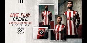
CONFIRMED 2019/2020 Kit Mega Thread

All advertisments are hidden for logged in members, why not log in/register?

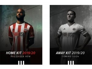
Home kit is pretty average, would've love to have seen little black strips between the red and white stripes like our league one champions home shirt had.
If I do buy a kit (55 quid is putting me off) it'll be the away kit, love the minimalist approach to it and the red stripes down the side.

Can i just say, what a shit company logo USG has, looks very very tacky.

That was the first Championship season.

League One champions was just red and white stripes.
 

Amazing how people see things. I like the home kit but think the away one is rubbish. Why couldn't we have one of these ?View attachment 56379
Because some would have liked that, some wouldn’t and there’d be no difference at all :)

Should've done a poll OP

I like it though, it's very "Premier League" which can be good and bad because there's always going to be a concession for being stylish or on trend or whatever - which is why the collar is a bit overthought and there aren't stripes on the whole back.

It's very very nice though, better than last season by a long way and I was one of the few that really liked last seasons.
What makes a kit ‘Premier League’? Bearing in mind one of the best United kits in recent times was worn in League One?
 
Home kit is a poor design - badge/Adidas logo way too far to the side of the shirt.
Away kit is alright, but even utd would find it difficult to mess up a plain white shirt.

Shirt sponsor has a horrible looking logo.

Overall - predictably underwhelming, it's incredible how rarely they give us a nice looking shirt.
 
Home shirt good points this years sponsors logo isn't green red is good. Not sure about the black shoulder stripes and the white front of the collar. The back is better than last seasons all white back but the stripes low down look a bit shit. Oh and the stripes on the front are not sharply defined due to the weave of the cloth.
Away shirt pretty plain but sometimes less is more, the red sponsors logo's tie in well with the red Adidas stripes down the sides, I expect this shirt to be one of the all time favourites, if it has red numbers on the back it will be sheer class.
 
Because some would have liked that, some wouldn’t and there’d be no difference at all :)


What makes a kit ‘Premier League’? Bearing in mind one of the best United kits in recent times was worn in League One?

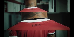
Things like the nickname or club name on back of neck, usually have to be at a high level for stuff like that when you're with a major kit supplier.

Posh materials/number of materials (there are 3 on this new kit by the looks of it, red sleeve and back material, red stripe with a horizontal rib texture, white stripes with a dot/honeycomb texture)

High quality sponsor application - those little letters would probably have been easier to stick on a white box.

Added features on top of a more generic base, the cuffs on our kit are similar to the ones Real Madrid have.

The league one kit was nice but loads of other teams had it. This kit and our 17/18 kit seemed a level up, this one especially.
 
Home shirt not bad, but with a few changes it could have been even better:
1. Continue the black stripe all the way round the collar
2. White adidas stripes
3. Ditch the solid panel on the back.
The away kit's good, but is it enough of a contrast? Suspect we're going to need a 3rd kit (or maybe re-use last season's away kit)
 
I hadn’t actually clocked that the badge and Adidas logo were further apart than usual on the home shirt, but seeing it alongside the away kit it’s a lot move obvious – also when you look at their positioning of the sponsor, which will be sized the same on both kits. Might actually just be a result of them keeping the placement centred on the red stripes like last season – they’ve widened the stripes slightly this year so they’re naturally shifted further apart as a result.

F4BE4B68-0718-4570-AB03-229EAF026BD8.jpeg
 

Home shirt not bad, but with a few changes it could have been even better:
1. Continue the black stripe all the way round the collar
2. White adidas stripes
3. Ditch the solid panel on the back.
The away kit's good, but is it enough of a contrast? Suspect we're going to need a 3rd kit (or maybe re-use last season's away kit)


Of course there will be a need for a 3rd kit to sell.
 
You're absolutely right, we don't need a third kit. But then I'm a believer in never needing one as i think it's totally unnecessary.
Why do you really hope we have one though? Not happy with what's been released? I ask politely and out of curiosity, not looking for a squabble.
Just because I love football shirts and I love Sheffield United.
 
I hadn’t actually clocked that the badge and Adidas logo were further apart than usual on the home shirt, but seeing it alongside the away kit it’s a lot move obvious – also when you look at their positioning of the sponsor, which will be sized the same on both kits. Might actually just be a result of them keeping the placement centred on the red stripes like last season – they’ve widened the stripes slightly this year so they’re naturally shifted further apart as a result.

View attachment 56387

So they have, looks good tho.
 
That's Toddla T innit

Fucking hell, so it is. Not that that means much to me. He's one slightly younger Bez looking mother. I just assumed we'd roped in a guy from the ticket office to dance with the rapper or sumat, certainly moves like a local bloke with no music background.
 
Fucking hell, so it is. Not that that means much to me. He's one slightly younger Bez looking mother. I just assumed we'd roped in a guy from the ticket office to dance with the rapper or sumat, certainly moves like a local bloke with no music background.

He reminds me of Tim Westwood circa presenting Pimp My Ride UK.

He's a Blade though, so I'll cut him some slack, I think he knows those moves were awful.
 
He reminds me of Tim Westwood circa presenting Pimp My Ride UK.

He's a Blade though, so I'll cut him some slack, I think he knows those moves were awful.

Great comparison!!

"Ey yo, it's the big dog!"

"Tim, hurry up mate - you need to finish this take, then pick the kids up from school and call in at Sainsbury's for something for tea."
 

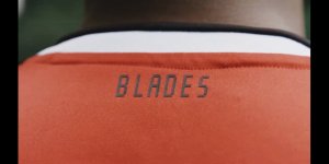
The sponsor’s not perfect but they’ve changed it to red and it looks ok on the shirts (who knew...companies WILL change their corporate colours to match a football shirt! I was told last season by some on here no way would a company do this when they’re paying us money). Compare it to a green sponsor on white block and an orange and green logo on the back where we now have a nice tasteful “Blades” and there’s no comparison.
 

All advertisments are hidden for logged in members, why not log in/register?

All advertisments are hidden for logged in members, why not log in/register?

Back
Top Bottom