SHOREHAMST.com
shorehamst.com
- Joined
- Jul 22, 2006
- Messages
- 966
- Reaction score
- 1,672
Follow along with the video below to see how to install our site as a web app on your home screen.
Note: This feature may not be available in some browsers.
All advertisments are hidden for logged in members, why not log in/register?

this to me has all the essentials of what we SHOULD have
simple stripes, front AND back, hints of black,...
I really do hope we have a third kit but I don’t think we will. We definitely won’t NEED one going off this photo.
View attachment 56366
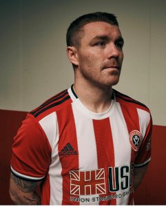
Now that I've had a better look, can't say I'm too keen on the home shirt.
Too much red, the United & Adidas badges are too far apart, the collar being a third white and two thirds black & white along with the black Adidas stripes just looks odd, the sponsor is way too big and the red logo on a red shirt just doesn't look right at all.
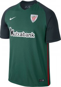
The away shirt however is fantastic, again the sponsor is too big but the red logo goes perfectly with the red trim.
Superb work from our marketing team once again with the video aswell.

Yeh I like the fabric, definitely looks much better in that pic. Still not sold just yet though.I disagree. The close up pic of the home shirt sells it for me. Love the fabric on the stripes... Same as last year.
View attachment 56370
I disagree. The close up pic of the home shirt sells it for me. Love the fabric on the stripes... Same as last year.
View attachment 56370

On reflection.
Is the new kit better than any concept designs that were doing the sites before today?
So based on GallonofMagnet saying the following
- My original kit wasn't far off apart from the collar and cuffs
- The collar is quite busy
- The socks are red
I assume it'll look something like this. I've also seen someone say the shorts are white though.
View attachment 56288
I really do hope we have a third kit but I don’t think we will. We definitely won’t NEED one going off this photo.
View attachment 56366
Must admit, did love the launch rub-a-dub video!Bloody beautiful and a class kit reveal as well.
New kit not bad. Although I was hoping for the return of the halcyon days mid late 70's black piping on the red white stripes. Would help us standout from all dem other red and white striped teams.
Bound to be some luminescent glow in the dark one right?!Both are nice, but the away kit gets the plaudits for me.
Any word on a 3rd strip this season?
Oh the red socks bug me too mate. At least the the sponsor decals are smallish so that's summat.Already said my bit mate but it seems that I'm in the minority most seem to like it and I bet it'll be a very good seller like last seasons was.
Bound to be some luminescent glow in the dark one right?!

The main thing bugs me though about the home kit, is the big red panel at the back. The whole white thing last year was a bit crap I thought. Just stick stripes front and back! Sponsorship logo at least is smaller than the garish previous one!
What's wrong with red socks I prefer them to a bland whiteOh the red socks bug me too mate. At least the the sponsor decals are smallish so that's summat.
All advertisments are hidden for logged in members, why not log in/register?
