If I may say so, this is bollocks. You can go in the club shop and have names/numbers applied in minutes. Enough
correct shirts for the players (the 'shop window') could have been produced and then get on with the supply chain. It's not only us, though. When Wet Spam's latest bent sponsor (Alpari) went bust, they've hurriedly put the latest sponsor (Betway) on a crude, white background - similar to our quick lash-up with the first 'John Holland' incarnation:
This is simply not necessary. Step back. Take a breath.
And get it right. The first 'John Holland' (and Sunderland's efforts) were worthy of a first-year art student at Sheffield College. When applying a logo or lettering to anything other than a plain background use a contrasting 'fill' and 'stroke'.
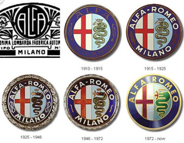
Talking of which. The badge. Maybe it
does hark back to the dim and distant days when computers, Photoshop and even Letraset were but a twinkle in the designer's eye. In the modern age, it's pathetic. 'Here, first-year art student, we want a design of a
sports badge.' 'Sports badge, eh? I know! Let's have it on a
shield!'
Very original. 'And while we're being crass, let's have sheafs of corn etc. It's
Sheffield, innit? And while we've left our fucking design brain at home, let's bung a fucking
lion on top as that's the first thing people think of when Sheffield is mentioned.'
I don't care if our brilliant, circular badge has changed over the years. For once in our miserable fucking lives, we've stumbled upon something that is just
right. DON'T CHANGE IT!.
Do not fuck with the brand! Cars for example, change models, specs, colours etc. but the
badge/logo remains constant. I hardly expect Ford to bung a fucking lion on top of their badge or Audi to put fucking sheafs of corn in their four rings.
It's
not too late!


.jpg")

.jpg")


.jpg")

NwBmk~$(KGrHqJ,!jQEw5fJ-7D5BMZmmOZKsQ~~_12.JPG")