OK lets get Baxter Basics. Things that are crap about replica shirts etc.
NYLON, There cannot be many of us who enjoy wearing artificial fibre next to our skin. Some 'air-tex' cloths from the mid-1970s notwithstanding.
SHORT SLEEVED CLUB SHIRTS WORN OVER TIGHT FITTING LONG SLEEVED VESTS to make the player feel stronger, thats bullshit, they might as well put spinach on their Weetabix® or lucky heather in the radiator grille of their baby-Bentleys and it looks CRAP. Especially with a stripe on the team shirts sleeves. A design crime and let me be the judge of this.
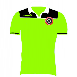
The MACRON LOGO.
SILLY PATTERNS IN THE WEAVE, that leads to horrors like the Man Utd, Gingham Table Cloth look. There should be no patterns revealed in detail that are invisible from the stands.
EXCESSIVE DECORATION ON THE SHORTS. My God those shorts we wore in the Premier with extra highlights inspired by a Baboon's backside in a state of arousal. A straight stripe down the seams on the outside of the thigh is the ONLY acceptable enhancement. A contrasting coloured hem is utterly non-U. (How we laughed at Moscow Dynamo's shorts when they turned up in the 50s). Adidas stripes are completely acceptable by the way.
Aye and while I'm about it. 'Stripes' formed from a line of little manufacturer's logos are anathema. Admiral started this in 1976ish and Macron do it now, NO, NO, NO.
I shall be willing to field any questions that arise as I shall be trying to dodge hard-work all day.......

")
")
 Hot off the press on Merseyside, I give you the Liverpool '3rd' kit. Hideous, ugly and everything you hate about football kits, but check the socks!
