Errea....new kit supplier?

All advertisments are hidden for logged in members, why not log in/register?

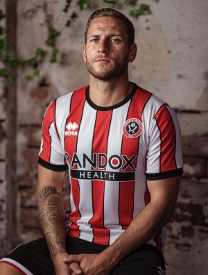
Thoughts on the kit?


  • Total voters
    641

I like it.

I don't absolutely love it, I mean let's be honest it's literally the minimum of what's required. Badge, logo, sponsor, red/white stripes and holes for the body parts. In terms of all the kits this year its very plain but I prefer that. Lots of kits this season seem to have some shit faint design relating to a bridge or a car park near them claiming "this is our heritage"

I'm in the minority here but I prefer no black pin stripes personally so if I was to change anything I'd take those off
That's a whole debate in itself - what should have been the shit faint design for us? I'm voting for the cholera monument.
 

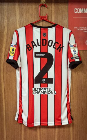
This is going to look stupid without a name & number on it and just having that sponsor where it is, at least on last seasons shirt it was at the bottom of the solid back so didn't look quite as bad.

(Also, having the words Ultimate Champions on a football shirt is cringey as fuck, especially when you're not even champions of anything)

home 5.jpg
 
Seeing them come out the tunnel, it looks like my 4 year old daughter stuck the badge on with Pritt Stick. No way they get through the game without at least one of those falling off.
 
Loving the kit, although the numbers could do with a white boarder or something - they're tricky to pick out and my eyes work pretty well 😆
 
Like the home shirt... looks better on tele... loving the keepers shirts though... the yellow one is Peak, but I'm also liking this green effort Wes is wearing
 
Really like it. First home shirt I’ve liked in three years and like the plain collar and that the pinstripes actually border the red and white stripes now rather than being off like last year.

Is it just me though or would the sponsor on the back look better centrally aligned rather than being aligned to the left? I know it must be how they have the logo but to me it just don’t look right as a sponsor logo done that way.
 
Love the new kit. Was worried when we left Adidas but it looks great.
If the away kit is the one ‘leaked’ then I think that looks really good also.
 
Is it me or does the head hole look too big ?
Just seen Norwood and it looks like it's massive, you could see the red underneath shirt.
 

All advertisments are hidden for logged in members, why not log in/register?

All advertisments are hidden for logged in members, why not log in/register?

Back
Top Bottom