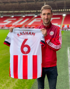
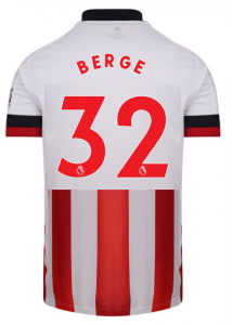
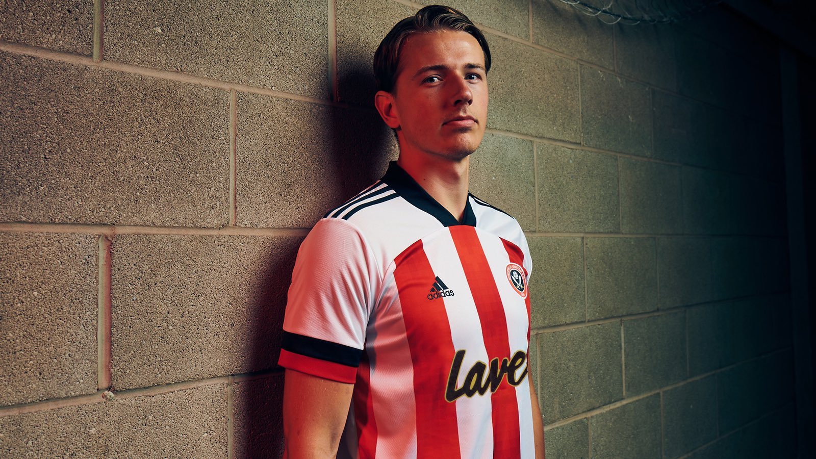
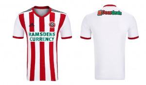
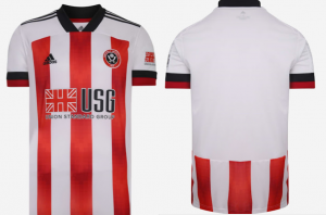
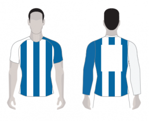
These are them - New Kits 20/21 - 'leak'

All advertisments are hidden for logged in members, why not log in/register?

Is there a reason for this?
It doesn't look as bad when the colours are the same but fucking hell, I'm going to have to sleep on this to see if I feel better about it in the morning. Fuck's sake.
 

Is there a reason for this?
It doesn't look as bad when the colours are the same but fucking hell, I'm going to have to sleep on this to see if I feel better about it in the morning. Fuck's sake.

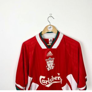
They're going for a retro look. 90's aesthetic is fashionable nowadays, big fat collars and jaunty cuts.

3b5977daf3f22171092b9a7b46108795_listingImg_kzgSHfxcSg.jpgs-l1600.jpg
 
I really like it, I'm a fan generally of the template which as has already been said is a nod to classic 90's Adidas designs.

I'll be able to judge properly when I get one but on the face of it I like it better than our previous two, with the one we had for our first season back in the championship still being the best we've had from Adidas so far.
 
Have the club confirmed the colour of the numbers and letters on the back of the shirt?

🙏 for red
 
Just seen it, not read too much of this thread my immediate opinion.
"Fuck man fuck, what the fuck is that? What the fuck IS that?" Looks like the centre panel has been separately stitched on to the collar section, that is the wankest shirt I've seen produced for United. Somebody should be sacked for that abomination. If I die and go to Hell I expect that shirt to be waiting for me. Utter Shit Sack somebody.
Edit: To add even the players don't make it look good it's a pile of fucking arse and I was laughing at Wednesday's retro 1980s ooh computer map blocky bollocks, even that's better than this shit. Fucks sake.
Great rant
 
A steaming pile of shite is that way too much white. No away kit is that going to be worse? I dread to think.

Time for a return to Umbro


sheff-utd-92-home_6_1_1.jpg
Have Umbro learnt how to centre their stripes yet? Such a shame that absolute beauty was let down by random strip alignments
 
Not happy about the red numbers. Shame UEFA are so draconian about shirt regulations
 

Fair point. I do agree you will never please everyone, however, still say the majority would not vote for this shirt if there were three or four credible alternatives. We cannot prove it either way but just my hunch.

🤔
1596550504759.png
 
Each to their own, but I don't like the new shirt. The white shoulders and sleeves look awful.
Vogue? More like Vague.
Screenshot_20200804_154341_com.facebook.katana.jpg
 
It’s been appropriated by racists, but the simple thing is to ignore that and don’t let them ‘own’ it. Mind you, the bigger question is what have we got to be nationally proud about at the moment?

Either way, this looks way better..


Berge looks like he should be manning the door at one of Freddie Mercury's lavish parties, wearing a german SS uniform.

Eegckc0WsAAxSiR


...or maybe it's just me..? 🤣
 
More like port!
True. “Port wine stain” it’s called. I know a dermatologist in Nottingham who persuaded the Trust to buy a special piece of equipment for removing those. It cost the Trust thousands, but then he couldn’t be arsed to use it regularly, so it just gathered dust in the corridor. Meanwhile the waiting list for port stain removals was piling up!

I’m not a doctor btw - but I know this for fact because I was shagging his secretary at the time and she told me! ;)

(Not “during“ you understand?
I bet by the time you had finished the secretary became an expert in "yoghurt" stains!
 
Can we have a sticky thread just to let people know these UEFA shirt regulations aren't actually a thing?
Even better, here's a link to the actual UEFA Equipment Regulations (2018) which replaced the 2012 UEFA Shirt Regulations, although they'd only have mattered to us if we were in Europe.

Article 8 states:
Colours and patterns
8.01If a playing attire item comprises three or more colours, one must be clearlydominant on the surface of that item. For hooped, banded, striped or checkeditems (i.e. with two dominant colours), any use of a third colour must notdominate or affect the distinctiveness of the shirt or socks.
8.02The dominant colour (or colours in the case of hooped, banded, striped orchecked items) must be equally visible on the back and front of each item ofplaying attire, excluding the number zone on the back of shirts(see Paragraph 7.01(b)).
8.03The colours used to create a hooped, banded, striped or checked shirt on thefront must both be clearly visible on the back of the playing attire if the samepattern (e.g. stripes) is not used on the back of the playing shirt.
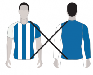
-This also has some pictures of what is and isn't acceptable.

Article 53 also matters:
53.03The contrast between shirt colours in the number zone must be less than or equalto a Delta L of 25. Colour combinations with a Delta L difference value greaterthan 25 require a single-colour patch on the back of the shirt to serve as thenumber zone.

8.01 appears to rule out using a third colour for socks.
8.02 means our new kit would have been dubious whether it'd be legal as the colours aren't equally visible on both sides.
8.03 means you need to use the colours from the front on the back, so the red numbers and partial stripes might just about do the job, the example pictures show that a full plain backs on striped shirts isn't allowed, rather than the other way around like people seem to think the rule is (the previous white-backed shirt with black numbers from a couple of years ago failed both of these last two).
53.03 is one for fans of the 70s box, if we had full stripes, the number would have to be on a solid colour, so no black numbers directly onto red/white stripes like we'd normally have (but the Milans and Barca don't need boxes as there's less contrast between the stripe colours).

Other exciting regulations would make the Bouncing Day Massacre shirt illegal due to the black sleeves, the green away kit from 95 wouldn't be allowed due to excessive Umbro logos in the print and we couldn't have white away shirts as the change shirt can't contain one of the main colours of the home.

The rules are either really interesting or really dull depending on how you look at them, but none of them apply to us as we're not in a UEFA competition (although they may be taken into consideration by whoever is selecting our future shirt designs).
 
Even better, here's a link to the actual UEFA Equipment Regulations (2018) which replaced the 2012 UEFA Shirt Regulations, although they'd only have mattered to us if we were in Europe.

Answered your points below:

8.01 appears to rule out using a third colour for socks.
This explains why Man Utd wear White socks in Europe but Black in the League.

8.02 means our new kit would have been dubious whether it'd be legal as the colours aren't equally visible on both sides.
I disagree. Our new kit is OK because it has enough of the front of the shirt (stripes) visible on the back. Our promotion shirt wouldn't be allowed.

1596639148813.png = 1596639202151.png

1596639310962.png = 1596639217093.png


8.03 means you need to use the colours from the front on the back, so the red numbers and partial stripes might just about do the job, the example pictures show that a full plain backs on striped shirts isn't allowed, rather than the other way around like people seem to think the rule is (the previous white-backed shirt with black numbers from a couple of years ago failed both of these last two).
We are using the front colours, by using stripes. This seasons shirt could have Black or Red numbers, could have blue if we really wanted too. It just needs to contrast the number box:

1596639602589.png

53.03 is one for fans of the 70s box, if we had full stripes, the number would have to be on a solid colour, so no black numbers directly onto red/white stripes like we'd normally have (but the Milans and Barca don't need boxes as there's less contrast between the stripe colours).

I'd prefer us to have a League Shirt and should ever we qualify for Europe, just do what Atletico Madrid have done before and just patch the back up for the CL.

League Shirt:
1596639756345.png

Same shirt, but for Europe:
1596639709490.png
 

Thought you guys might like to see how the American press rates our new kits...


What do the yanks know about our heritage ? Too much white, no stripes on back - burn it! ;)

TBH though. Anybody who doesn't put the Man Utd and WBA kits as the bottom two kits, shouldn't have an opinion
 

All advertisments are hidden for logged in members, why not log in/register?

All advertisments are hidden for logged in members, why not log in/register?

Back
Top Bottom