Eskimo
Member
Which had no black pinstripes of courseJust give us the TC era shirt we city of Sheffield crest on
Follow along with the video below to see how to install our site as a web app on your home screen.
Note: This feature may not be available in some browsers.
All advertisments are hidden for logged in members, why not log in/register?
Which had no black pinstripes of courseJust give us the TC era shirt we city of Sheffield crest on
Except the ‘Wards’ shirts Wards and everyone before the 1970sAll my favourite home shirts have a decent amount of black on them. Pinstripe for me.
The 92/93 is probably my personal favourite, the lace up collar was top notch tooExcept the ‘Wards’ shirts Wards and everyone before the 1970s
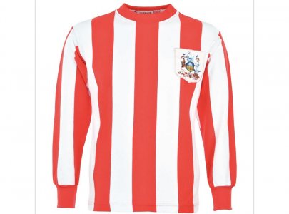
Plain.Seems to be a big debate on the Errea thread. So, do you prefer a black pinstripe/separator, or straight red/white stripes?
My 2 favourite shirts don't have a black separator, so i've vote no. pinstripe.
Pinstripe:
View attachment 137309
or..
Plain
View attachment 137310
This is why current badge can go onto shorts and arms …image shows why it’s awesome and nowt wrong we loving our cityNow that’s crazy…why give up the finest club badge in football for a boring city coat of arms!?
It's notAmongst all the red and white striped teams, I think the black pinstripe is a fairly unique to us.
Tis…so there.It's not
Think Soton had it briefly a good few years ago, but we have brought it back on numerous occasions. Also we’ve used black on our shirts a lot more than all the others stripey clubs.It's not
We are the city’s club anyway…This is why current badge can go onto shorts and arms …image shows why it’s awesome and nowt wrong we loving our city
Southampton had the pinstripes for most of 80s and early 90s.Tis…so there.
Think Soton had it briefly a good few years ago, but we have brought it back on numerous occasions. Also we’ve used black on our shirts a lot more than all the others stripey clubs.
Black shorts. White socks, take or leave the pin stripes.Pin stripes. Black shorts, White socks
ExactlyWe are the city’s club anyway…
I don’t like it as much - couple of hairy blokes flashing a tit each (I know it’s Vulcan and Thor) and some wheat.This is why current badge can go onto shorts and arms …image shows why it’s awesome and nowt wrong we loving our city
And we had the best player ever wearing itI don’t like it as much - couple of hairy blokes flashing a tit each (I know it’s Vulcan and Thor) and some wheat.
Would much rather have the design classic that is our current badge - represents our nickname, swords are cool and it’s a nice nod to the cutlery/steel heritage of the city, white rose of Yorkshire, represents our club colours and it was inspired by an original design of Jimmy Hagan.
We only had the council crest for 11 years anyway
I don’t like it as much - couple of hairy blokes flashing a tit each (I know it’s Vulcan and Thor) and some wheat.
Would much rather have the design classic that is our current badge - represents our nickname, swords are cool and it’s a nice nod to the cutlery/steel heritage of the city, white rose of Yorkshire, represents our club colours and it was inspired by an original design of Jimmy Hagan.
We only had the council crest for 11 years anyway
Of course black shorts what else?Once you've had a bit of black, theres no going back!
Pinstripes and black shorts all the way!
Pin stripes. Black shorts, White socks
You meant, No, Yes, Yes, surely?Yes, yes, no.
Black socks with red trim. But that's another debate.
White equals relegation ?Of course black shorts what else?
This is why current badge can go onto shorts and arms …image shows why it’s awesome and nowt wrong we loving our city
[/QUOTE
Proper Utd shirt that, we don't play in pinstripes!!
We've had 2 promotions in white socks and multiple relegation in them.White equals relegation ?
There will be those who know better, but in my mind we get relegated when white shorts are the home kit.
 s24su.com
We've had 2 promotions in white socks and multiple relegation in them.
we've NEVER been promoted with black pinstripes
Home Page 2026 - Sheffield United Unofficial | S24SU.com
~~~~~~ BACK SOON - WORKING ON A FEW BITS - FORUM OPEN AS NORMAL ^ ~~~~~~ ~~~~~~ BACK SOON - WORKING ON A FEW BITS - FORUM OPEN AS NORMAL ^ ~~~~~~ Sheffield United 0 – 1 Crystal Palace – 12th August 2023 Martin Fox August 12, 2023 Pre-Season Friendly – Chesterfield 0 – 2
Until this season ?Black pinstripes in a playoff final would be reyt recipe for disaster then.
All advertisments are hidden for logged in members, why not log in/register?