Not disagreeing. Let's look at the previous 10 years:
2014/15 (Macron) - 3/10. Nothing works - red block across the shoulders and the sides jars with the sleeves; Macron logo higher than the United badge, crap sponsor
View attachment 111545
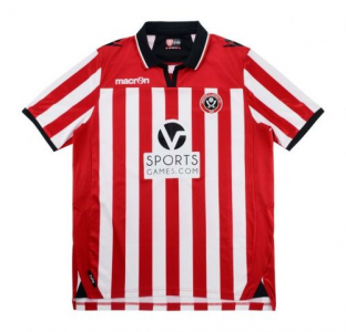
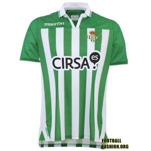
2012/13 (Macron) - 6/10. I understand that this has historical influences but the run of central logos annoys me (maybe unjustifiably). Put the Macron logo and United badge in the white stripes either side and this would have been a solid 8 or 9.
View attachment 111546
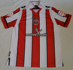
2011/12 (Macron) - 7/10. Their best effort.
View attachment 111547
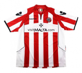
2010/11 (Macron) - 4/10. The sponsor box suggests that Visit Malta's logo is more important than anything relating to United
View attachment 111548
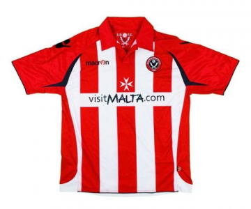
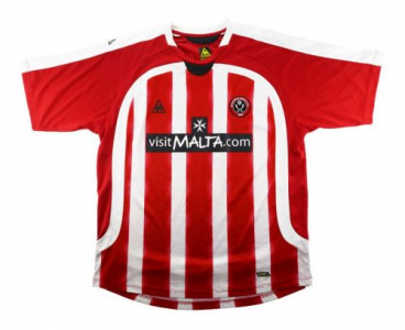
2009/10 (Macron) - 5/10. Same as the following season with the sponsor box while the sides didn't work
View attachment 111549
2008/09 (Le Coq Sportif) - 2/10. Was the designer on drugs or just tossing it off on a Friday afternoon? Nothing to recommend about this.
View attachment 111550
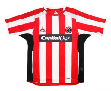
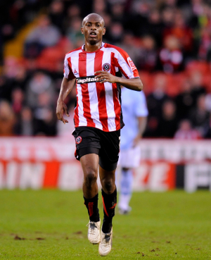
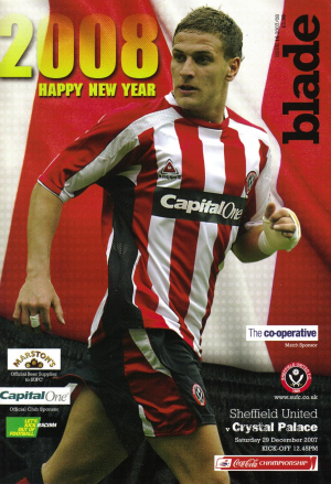
2007/08 (Le Coq Sportif) - 5/10. Relatively positive but either the sponsor is too high or the United/LCS logos too low while the black box looks like a bit of the base template which should have been coloured but got missed
View attachment 111551
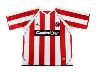
2006/07 (Le Coq Sportif) - 6/10. My abiding memory of this was that it was about 6 foot wide and didn't fit any of our players
View attachment 111552
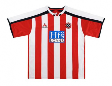
2005/06 (Le Coq Sportif) - 6/10. White bar on the shoulders and blue sponsor detract from a relatively good shirt
View attachment 111553
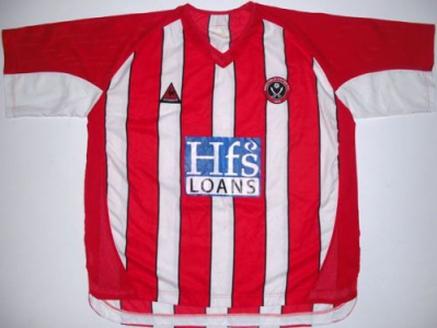
2004/05 (Le Coq Sportif) - 3/10. From memory we had red shorts with this and just didn't look like Sheffield United.
View attachment 111554
From memory the quality of both the Macron and Le Coq Sportif shirts wasn't great and both really struggled with the shape of the shirt.

 www.footyheadlines.com
