Deadbat
Well-Known Member
- Joined
- Aug 6, 2009
- Messages
- 6,656
- Reaction score
- 39,863
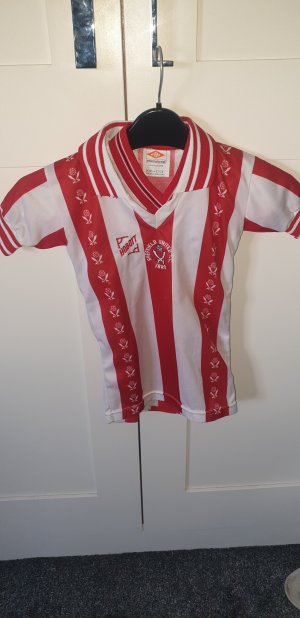
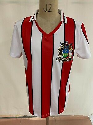
Decent efforts but to nit pick, the stripes seem too thick on both compared to the originals and also the yellow and brown had no trim on the collar/sleeves did it? Also the hobbot logo is too big as is the cutlers on the stripes?
Maybe I am wrong.
I love the companies that do reproductions and applaud any attempts likes of the sheffield Retro Shop, Gun Retro, Shoreham St Magnifique have done though.
I got a great repro from Toffs of the yellow and brown which is really close to the original.
Maybe I am wrong.
I love the companies that do reproductions and applaud any attempts likes of the sheffield Retro Shop, Gun Retro, Shoreham St Magnifique have done though.
I got a great repro from Toffs of the yellow and brown which is really close to the original.