We've not had a good, "traditional" home kit for years though. I like this season's effort, it's certainly better than the crap we've put up with recently.
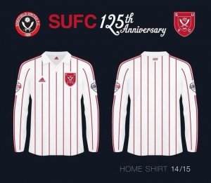
2014/15: 5/10 - not enough stripes, central adidas logo, awful sponsor logo, Blades badge too far over and too low down (looks like an afterthought)

2013/14 4/10: awful top section, misaligned macron logo and United badge

2013/14 7/10: decent stripes, good use of black but why are the badge and macron logos central?

2011/12 7/10: decent effort from macron (nb most of the pictures showing the Westfield Health logo were of a certain former striker so I've had to use the launch picture which predated the sponsorship deal]:

2010/11: 5/10 - whose idea was it to put the white bar across the middle?

2009/10: 5/10 - just not a great shirt.

2008/09: 4/10 - what the hell is that squiggly white line all about? And why are the stripes different widths?

2007/08 5/10: sponsor logo too high and random mesh elements while black doesn't really fit in. However, the red and white stripes, badge and Le Coq logos are all good

2006/07: 5/10 - a potentially good shirt ruined by placing the Blades badge and Le Coq logos too low and too wide while the Capital One logo is again too high

So in the last 10 years the best two kits we've had (aside from this year's) have been flawed. It seems that grasping that a Sheffield United shirt should be simple red and white stripes is beyond Le Coq Sportif, Macron and adidas so far.
Something like this. Perfect.

")