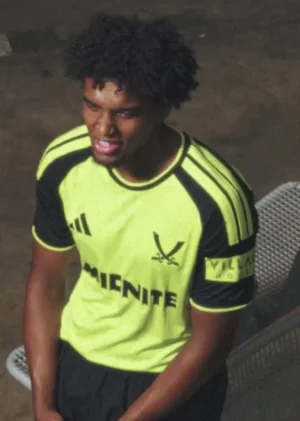
Ginger Gnome
Active Member
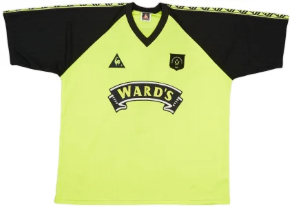
Really dark navy would probably have made it pop a bit better than black, never really liked the Wards one in the 90s with the black sleeves

Follow along with the video below to see how to install our site as a web app on your home screen.
Note: This feature may not be available in some browsers.
All advertisments are hidden for logged in members, why not log in/register?

It's understandable if one was too busy perving on the away kitTrue I was obviously not paying attention. My bad.


Is this real or a mock up?
May I be the first to say they’ve had a mare using that crest on that kit instead of pairing it up with the trefoil on the away kit.


I'm with you.They've done it again with the massive swords.
Fucking dreadful.
I'm waiting for it to drop too, maybe tomorrow t coincide with the 3rd kit?!Is this real or a mock up?
Its not on the website but none of the trefoil jackets are.

Still got that one, along with the original blind your eyes fluorescent one in 89-90Reminds me of this one
View attachment 241501
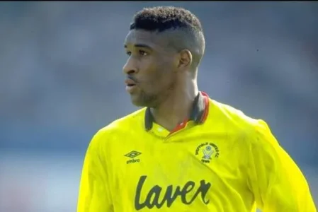
This kit was magnificent, one of the all time best kits we've hadStill got that one, along with the original blind your eyes fluorescent one in 89-90
View attachment 241502
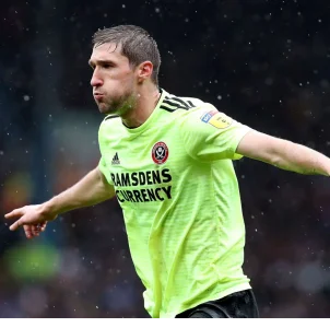

Was sat on skeggy north pier that day just about picking up RS match reports to listen to the scores, sent GF and her Daughter to the arcades, she wasn't too impressed.This kit was magnificent, one of the all time best kits we've had

The bestThis kit was magnificent, one of the all time best kits we've had


Yep. It’s a pretty bad 3rd kit without those massive swords. But to put those on it’s horrendousThey've done it again with the massive swords.
Fucking dreadful.
Trefoil, stylish kit would’ve been the way to go. Maybe a really deep dark red would’ve been greatIt’s a bit of a waste as a third kit.
I’d rather trefoil and traditional badge but perhaps with a monochrome logo or black and green logo.
Should have kept their powder dry and gone with this colour for the away kit best season. This colour should be a first choice away kit
Missed an opportunity to hold back on this and provide something original IMHO.
Anyone find the shirts a bit big. I bought XL away kit as I’m usually 44 inch chest and far too much material in it (supposedly 43-47in).
Think I’ll return it and chance it with a large.

I believe String has a match worn original of this. Was offered a pretty penny for it in Bochum but didn't have another shirt to wear so declinedStill got that one, along with the original blind your eyes fluorescent one in 89-90
View attachment 241502


Crocks? Entrance music gotta be Baggy trousers by Madness



Definitely seems like they have gone for a modern take on this one.Reminds me of this one
View attachment 241501
All advertisments are hidden for logged in members, why not log in/register?