mattbianco1
Forum Royalty
I like Bournemouths third shirt;

Speaking of Bournemouth. They're charging £60 a ticket for the pre-season friendly against Real Madrid!!!!
That's perfect. Incorporates all our colours and looks good.
Follow along with the video below to see how to install our site as a web app on your home screen.
Note: This feature may not be available in some browsers.
All advertisments are hidden for logged in members, why not log in/register?
I like Bournemouths third shirt;
Speaking of Bournemouth. They're charging £60 a ticket for the pre-season friendly against Real Madrid!!!!
That's perfect. Incorporates all our colours and looks good.
What about this -
For it's time, that was a lovely shirt
I like Bournemouths third shirt;
That's the basics of a perfect away kit to me.
Good for what? Home kit?
No. Away kit, silly
Agreed but we'd have black instead of the dark blue..")
I suppose we should describe Bournemouth's home strip as having been "refreshed" from the version worn over the last two seasons. The very popular home design now has gold piping on the shirt, a nice touch given the team's promotion last season. The black away strip also has gold detailing while the mainly white third strip features a bold diagonal sash in traditional colours. This is a very classy set of kits indeed.
I'm not going to argue but....
I am pretty sure that the diagonal stripe is Black & Red i.e. Bournemouths colours?!?!
See here: http://www.historicalkits.co.uk/English_Football_League/season/2013-2014/championship.html
")
I went into the club shop today to ask and they said "no definite date yet but it's within the next two weeks!"

I like Bournemouths third shirt;
Speaking of Bournemouth. They're charging £60 a ticket for the pre-season friendly against Real Madrid!!!!
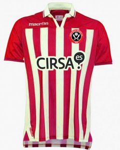
Hunting around for some Green 'n White striped shirts (being a Park Avenue fan and appalled at our new choice of shirt for the upcoming season), I came across one of the 2013 Macron design's for Real Betis. I like the actual styling and being a bit of a dab hand at Photoshop, decided to "Red 'n White" it to see what it looked like.
Adding a crest to finish it off, I thought I'd post the rough draft for you guys to peruse. Whadya think? If this was this new season's shirt, would you be happy with it? I reckon I would...
Craig UTB!
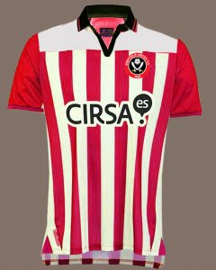
I'd take that. Maybe a white banding at the top though instead of solid red? Can you mock that up?
Wish I could use photoshop
Yeah, it's what I was kinda referring to on the other Macron kit thread; tend to be a too generic. Lets see what's revealed in about 10 days. Might be pleasantly surprisedlooks ok Craig. All a bit samey samey , kits these days aren`t they?
Yeah, your wish is my command
With the white 'banding', the collar got lost, so I designed it with a black one. Whadya reckon?
Craig UTB!


Totally agree, have always said "less is more" (wherdya think JW got it from...but still not anywhere near as good as a straightforward red and white stripe that runs from top to bottom of shirt and down the sleeves...why can't we just stick with that???
); plain & simple R&W stripes - perfect!My fave shirt - a reproduction of that would be right up my streetNeed to stop peeing about and slap a macron logo and Westfield Health/Redtooth on one of these...
View attachment 6053
Bring it on...Hunting around for some Green 'n White striped shirts (being a Park Avenue fan and appalled at our new choice of shirt for the upcoming season), I came across one of the 2013 Macron design's for Real Betis. I like the actual styling and being a bit of a dab hand at Photoshop, decided to "Red 'n White" it to see what it looked like.
Adding a crest to finish it off, I thought I'd post the rough draft for you guys to peruse. Whadya think? If this was this new season's shirt, would you be happy with it? I reckon I would...
Craig UTB!
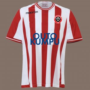
See my 'outukumpu' round neck version above. That one would be my preference. Watch the final thing look nothing like...LOLI'd be happy with this. Would prefer it rounded rather than open/V shaped at the neck though.

IS THE FUCKING THING OUT YET OR WHAT ?????
Thats at least three weeks oldShould be next week 'Tinho.Look, it says so on the thread title.

All advertisments are hidden for logged in members, why not log in/register?