23/24 season kit thread

All advertisments are hidden for logged in members, why not log in/register?

Some care, some don't. It's all subjective and often divisive.

For me, certain key parameters have to be adhered to for a striped Sheff United shirt. There is a minimum and maximum acceptable stripe width, and the centre stripe is ALWAYS RED.

As mention previously, thin stripes at a distance make the shirt appear pink, and thin striped shirt often look cheap. I'm not a fan. Overly thick stripes end up giving the impression that the shirt isn't striped, but just 3 blocks of colour.

Using official Errea templates, a few of my artistic impressions thrown into the ring. Always only 3 red stripes visible, a less vibrant red (Adidas got it spot on. Last season was too bright), a Bramall Lane watermark on some designs.
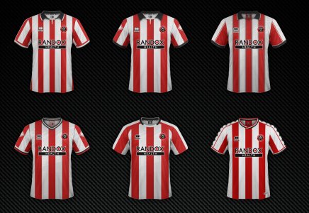
All_kits.jpg
 

Some care, some don't. It's all subjective and often divisive.

For me, certain key parameters have to be adhered to for a striped Sheff United shirt. There is a minimum and maximum acceptable stripe width, and the centre stripe is ALWAYS RED.

As mention previously, thin stripes at a distance make the shirt appear pink, and thin striped shirt often look cheap. I'm not a fan. Overly thick stripes end up giving the impression that the shirt isn't striped, but just 3 blocks of colour.

Using official Errea templates, a few of my artistic impressions thrown into the ring. Always only 3 red stripes visible, a less vibrant red (Adidas got it spot on. Last season was too bright), a Bramall Lane watermark on some designs.


View attachment 164536
Don't like 3 and 6. Too "Southamptony"
 
Some care, some don't. It's all subjective and often divisive.

For me, certain key parameters have to be adhered to for a striped Sheff United shirt. There is a minimum and maximum acceptable stripe width, and the centre stripe is ALWAYS RED.

As mention previously, thin stripes at a distance make the shirt appear pink, and thin striped shirt often look cheap. I'm not a fan. Overly thick stripes end up giving the impression that the shirt isn't striped, but just 3 blocks of colour.

Using official Errea templates, a few of my artistic impressions thrown into the ring. Always only 3 red stripes visible, a less vibrant red (Adidas got it spot on. Last season was too bright), a Bramall Lane watermark on some designs.
View attachment 164536
2 and 4 😍
 
Beauty is in the eye of the beholder. Simple as.

Don't get why anyone cares whether someone else likes it or doesn't like it.
 
Some care, some don't. It's all subjective and often divisive.

For me, certain key parameters have to be adhered to for a striped Sheff United shirt. There is a minimum and maximum acceptable stripe width, and the centre stripe is ALWAYS RED.

As mention previously, thin stripes at a distance make the shirt appear pink, and thin striped shirt often look cheap. I'm not a fan. Overly thick stripes end up giving the impression that the shirt isn't striped, but just 3 blocks of colour.

Using official Errea templates, a few of my artistic impressions thrown into the ring. Always only 3 red stripes visible, a less vibrant red (Adidas got it spot on. Last season was too bright), a Bramall Lane watermark on some designs.
View attachment 164536
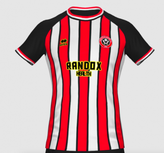
All are quite nice, but 4 would be the best. Just being picky but I'd match the cuffs to the collar. Maybe add the pinstripes from 3. Just feels like it adds that little extra...
 
Screenshot 2023-07-13 at 13.05.16.pngScreenshot 2023-07-13 at 13.12.53.png

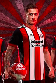
If we keep Randox as sponsor or even if we announce someone else, just give it some homage to the 90's Laver sponsor. Laces would be a class touch, but I doubt we'd get that. The pinstripes for me just add some nice detail for me, I know people may not want them. Also, wouldn't be opposed to solid black sleeves like that adidas top 🤷‍♂️
 
View attachment 164551View attachment 164552

If we keep Randox as sponsor or even if we announce someone else, just give it some homage to the 90's Laver sponsor. Laces would be a class touch, but I doubt we'd get that. The pinstripes for me just add some nice detail for me, I know people may not want them. Also, wouldn't be opposed to solid black sleeves like that adidas top 🤷‍♂️

As nice of an idea as that is, I doubt many companies would let us mess with the branding they probably paid millions for.
 
Some care, some don't. It's all subjective and often divisive.

For me, certain key parameters have to be adhered to for a striped Sheff United shirt. There is a minimum and maximum acceptable stripe width, and the centre stripe is ALWAYS RED.

As mention previously, thin stripes at a distance make the shirt appear pink, and thin striped shirt often look cheap. I'm not a fan. Overly thick stripes end up giving the impression that the shirt isn't striped, but just 3 blocks of colour.

Using official Errea templates, a few of my artistic impressions thrown into the ring. Always only 3 red stripes visible, a less vibrant red (Adidas got it spot on. Last season was too bright), a Bramall Lane watermark on some designs.
View attachment 164536
I like 1,2 and 4.

Our new kit wont be anything as good as this though. We only do crap.
 

Been browsing in club shop earlier collecting some tickets.

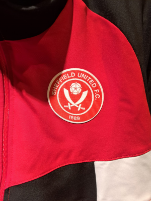
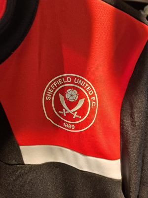
The new style badges are not without error. They look like they've been cut manually not electronically.

1st two items i saw had issues. Amazing quality as always

One - border thins as it goes around.
1689258523703.png

Two - creased as it was glued on
1689258539249.png
 
Been browsing in club shop earlier collecting some tickets.

The new style badges are not without error. They look like they've been cut manually not electronically.

1st two items i saw had issues. Amazing quality as always

One - border thins as it goes around.
View attachment 164567

Two - creased as it was glued on
View attachment 164568
Also if its anything like the black & gold training jacket I picked up last season, they seem to be confused where 12 o'clock is.
 
Been browsing in club shop earlier collecting some tickets.

The new style badges are not without error. They look like they've been cut manually not electronically.

1st two items i saw had issues. Amazing quality as always

One - border thins as it goes around.
View attachment 164567

Two - creased as it was glued on
View attachment 164568
Tbh my expectations regarding any kit/training suppliers standards are low. I always triple check the shirt I'm going to buy for stitching faux pas, whether it be adidas or macron.

Errea has been particularly poor though, despite imo looking good. I was hoping things would improve this season after the club publicly addressing the quality. Hopefully, you just came across a few dodgy ones.

I feel sorry for the staff working in the stores though, as they will be the ones to get the grief!
 
Some care, some don't. It's all subjective and often divisive.

For me, certain key parameters have to be adhered to for a striped Sheff United shirt. There is a minimum and maximum acceptable stripe width, and the centre stripe is ALWAYS RED.

As mention previously, thin stripes at a distance make the shirt appear pink, and thin striped shirt often look cheap. I'm not a fan. Overly thick stripes end up giving the impression that the shirt isn't striped, but just 3 blocks of colour.

Using official Errea templates, a few of my artistic impressions thrown into the ring. Always only 3 red stripes visible, a less vibrant red (Adidas got it spot on. Last season was too bright), a Bramall Lane watermark on some designs.
View attachment 164536
They're all gorgeous but no way can bloody ERREA be putting sleeve strips and badges on their kits. Top right is my favourite. bottom right is the best collar
 
View attachment 164551View attachment 164552

If we keep Randox as sponsor or even if we announce someone else, just give it some homage to the 90's Laver sponsor. Laces would be a class touch, but I doubt we'd get that. The pinstripes for me just add some nice detail for me, I know people may not want them. Also, wouldn't be opposed to solid black sleeves like that adidas top 🤷‍♂️
Don’t think laces are allowed anymore - H & S woke anti-growth coalition remoaner Trotskyist bastards
 
Been browsing in club shop earlier collecting some tickets.

The new style badges are not without error. They look like they've been cut manually not electronically.

1st two items i saw had issues. Amazing quality as always

One - border thins as it goes around.
View attachment 164567

Two - creased as it was glued on
View attachment 164568
And how much were said items, dare I ask?
 
Their quality control processes have been utterly fucking abysmal.

Their designs are fairly decent.
Training kits look basic and naff, but last year's home, third and GK kits were class, IMO in terms of design, dire in terms of execution. Didn't buy them due to the quality.

The craftsmanship is as poor as we've had. The materials are as cheap as we've had. The prices are still at a premium.

Errea have been a disaster so far, IMO. In terms of quality of materials, timeliness of kit releases, consistency if product/errors, and then price bracket in light of all of the above.
 

All advertisments are hidden for logged in members, why not log in/register?

All advertisments are hidden for logged in members, why not log in/register?

Back
Top Bottom