Blades Crest Referendum

All advertisments are hidden for logged in members, why not log in/register?

Should We Modify The Current Badge?


  • Total voters
    585
  • Poll closed .
Our badge is in my opinion one of the finest in the land, and if any attempt was made to radically change it beyond recognition, I'd be in the fucking car park with shoes off and a molotov cocktail in hand in a heartbeat.

However

I wouldn't mind making a little tweak to make it more impactful looking on the actual shirt. This is not to say I wouldn't keep the current badge for use on every other bit of media, just the shirt really.

Personally, I'd do away with the lettering and the round bit on the edge and make it a bit more minimalist. If my proposal gains favour, maybe we could put it to the club?

Summat like this, or summat to that effect? Here's a poll for you to take.

View attachment 162494

Quite a few clubs have consulted with fans recently about making modifications to their crest, and many changes have been welcomed.

Given that we've had the current design since 1978, would you welcome such a change?
Is it just me that thinks that looks a bit shite?
 

Just no!
The simplicity of the badge is what makes it so great. It tells you everything you need to know at a glance.

Unlike some teams, Coventry for example which have intricate details and seemingly random things like Elephants.

We've had colour variations of the current badge on away kits that freshen the look, they didn't even need to change the design. We've had orange with black text, orange with white text, green with gold text.
 
need some palm trees and arabic writing.
Imsheeeeeeeeeeeeeee.....................................................🌴🌴🌴palm trees :(, Cun't find nowt arabic, so two narrowbricks 🧱:(.
I recon the present badge with colour changes would suffice when revamps are required.
Don't forget the badge was designed by a Blade and in it's present form is in it's third incarnation.
 
Everyone copying us has got annoying I'll be honest. Our crest is one of the best in the world IMO - but we can be even more groundbreaking. We were innovative before, we can be again.
 
Best badge around LEAVE IT ALONE plain and simple - look at the teams with new badges all sh@te
(Middlesbrough Blade)
 
Everyone copying us has got annoying I'll be honest. Our crest is one of the best in the world IMO - but we can be even more groundbreaking. We were innovative before, we can be again.
Scrap the badge on the top and give everyone blades beanie hats
 
Thing about changing the badge is usually it ends up tinpot like that wonky bozz eyed one over in s6.

Then the usual regret sets in..

The shield on the 90s (laces) shirt was class though..
 

What's the matter with modern society, we're forever tinkering with stuff that doesn't need tinkering with.
Well it takes their mind off what they ought to be doing.
Having said that and having said previously here I'm not totally against modifications to the badge.
Providing the rose, cutlasses and lettering remain in a ball configuration, unlike my example, where the date aught to curve following the circumference of the clubs name.
As I said, previously, colour changes without altering the dynamics for refreshening if required, fitting in with colour schemes. 2022-23 possible shirt best one yet.jpg
 
Well it takes their mind off what they ought to be doing.
Having said that and having said previously here I'm not totally against modifications to the badge.
Providing the rose, cutlasses and lettering remain in a ball configuration, unlike my example, where the date aught to curve following the circumference of the clubs name.
As I said, previously, colour changes without altering the dynamics for refreshening if required, fitting in with colour schemes. View attachment 162549
I've personally never liked the shield design.
 
EF81AEEB-0453-4831-8D87-6DC7A5519444.jpeg


The risk in redesigning a badge is you end up left with something like this because the marketing guys tell you it’ll look better on tweets and stuff.
 
Our badge is in my opinion one of the finest in the land, and if any attempt was made to radically change it beyond recognition, I'd be in the fucking car park with shoes off and a molotov cocktail in hand in a heartbeat.

However

I wouldn't mind making a little tweak to make it more impactful looking on the actual shirt. This is not to say I wouldn't keep the current badge for use on every other bit of media, just the shirt really.

Personally, I'd do away with the lettering and the round bit on the edge and make it a bit more minimalist. If my proposal gains favour, maybe we could put it to the club?

Summat like this, or summat to that effect? Here's a poll for you to take.

View attachment 162494

Quite a few clubs have consulted with fans recently about making modifications to their crest, and many changes have been welcomed.

Given that we've had the current design since 1978, would you welcome such a change?


Jesus I thought we disagreed in the Ukrainian thread ....I'll just say no lol.
Our badge is in my opinion one of the finest in the land, and if any attempt was made to radically change it beyond recognition, I'd be in the fucking car park with shoes off and a molotov cocktail in hand in a heartbeat.

However

I wouldn't mind making a little tweak to make it more impactful looking on the actual shirt. This is not to say I wouldn't keep the current badge for use on every other bit of media, just the shirt really.

Personally, I'd do away with the lettering and the round bit on the edge and make it a bit more minimalist. If my proposal gains favour, maybe we could put it to the club?

Summat like this, or summat to that effect? Here's a poll for you to take.

View attachment 162494

Quite a few clubs have consulted with fans recently about making modifications to their crest, and many changes have been welcomed.

Given that we've had the current design since 1978, would you welcome such a change?
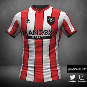

I think it looks better as is, because let's face it, if the club went ahead they would get some stupid idiot from London and would then proceed to make the pigs batch look positively splendid with some shit design that we get no say on.

Better safe than sorry.
 
I missed your reply Montymagic , sorry. This is my explanation.

I feel I need to qualify a few things here.

I would never suggest changing the badge, I'd just like to see a simplified version worn only on the shirt to make it look a bit more simple and impactful.

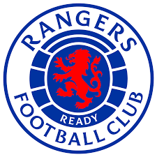
For example, take Rangers F.C

This is their official badge

download (3).png


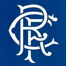
But they've always worn this badge on their actual shirts

images (12).jpeg


That's all I'm getting at, just using a simplified, minimalised design on the shirt itself.
 
I missed your reply Montymagic , sorry. This is my explanation.

I feel I need to qualify a few things here.

I would never suggest changing the badge, I'd just like to see a simplified version worn only on the shirt to make it look a bit more simple and impactful.

For example, take Rangers F.C

This is their official badge

View attachment 162572


But they've always worn this badge on their actual shirts

View attachment 162573


That's all I'm getting at, just using a simplified, minimalised design on the shirt itself.


I see where you are coming from and it could work but unless the fans get a say in the final design,I'm out...I don't trust the club or whoever to do it justice with zero input.
 
I see where you are coming from and it could work but unless the fans get a say in the final design,I'm out...I don't trust the club or whoever to do it justice with zero input.
You only have to look at the countless pages of arguments about whether our shirts should have pin stripes or not to realise that giving the fans a say in the design of something like this is just going to end in arguments, can't please everybody.
 

Shield crests are generally pretty shit. They are over complicated. They became popular in the 90’s even for teams whose crests were already formed within a sort of emblem - including ours. It’s like a lot of things from the 90’s. They’re good to look back on and formed part of that era, making it what it was.

Take the Burnley crest. It’s a crest within a crest.


It’s highlighted in this reply to that tweet. The outer crest servers no purpose whatsoever.


All advertisments are hidden for logged in members, why not log in/register?

All advertisments are hidden for logged in members, why not log in/register?

Back
Top Bottom