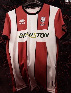
Errea....new kit supplier?

All advertisments are hidden for logged in members, why not log in/register?

Thoughts on the kit?


  • Total voters
    641
It’s bespoke cos they’ve designed & manufactured it with a unique misaligned stripe under the left arm pit while the right side lines up perfectly. Bet nobody else has owt like that.

View attachment 139712

Like the stripes pretty much perfect with the pinstripe, but that collar and arm cuffs are awful
 

It's not all bad, but it's certainly not great.

To compare, we've had some bland ones: John Holland home kit (Adidas' initial offering) and the absolute no-mark that was the anniversary shirt.

We've had some crackers: league one promotion home, first season back in the champ home, first prem season home, last season home. In fact, the kits were very decent this season just gone.

We've also had some absolute disasters: Ramsdens currency home, second season prem home. Those two rank among our all time worse kits IMO.

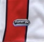
This one is safe, it just doesn't look good quality. The worst bit about is is the Errea logo, looks cheap. It doesn't say high end championship, ambition, at all.

I can see sales taking a notable drop off. Errea have also done themselves no favours with the delays.
 
So what's 'bespoke' about it then? You were the one telling me it was late into being because it was bespoke. So come on GokWan, talk us through why this design is bespoke....
Does bespoke mean a bloke in t shop were speakin abaht it?
Be spoke.. Sounds it to me. Is it...?....
 
If there is another identical shirt in the currently available Errea catalogue then it’s a template…… if we are the only team using this shirt design then it is bespoke and has been designed with the club.

If you or someone else wants to show everyone the existing Errea template or another team using this same design in these or different colours then you can continue to say it’s not bespoke and rub our noses in it till the cows come home.
This is the same template.

8565F37F-91DF-477B-A12B-E266D98BA9DA.jpeg
 
Fewer stripes than that one we've been linked to.
The stripes or pattern don’t form part of the ‘template’. The template is the cut of material, collar, cuffs etc. the main body and sleeves have a different design sublimated on them but the template is the same.

See post #2773 - same template, various colours, sublimated designs etc.
 
Last edited:

Just out of ‘interest’ (sic)-
How / why are folk griping grousing & grizzling about the clubs ‘failure’ to come up with an agreeable / acceptable (bespoke) design when there’s next to no consensus on here 🤔

Any road is it not the case that a simple (52:48) majority is sufficient mandate - after all we’ll sell very few of the buggers in N Ireland - apart from Derry maybe 😳
 
The stripes or pattern don’t form part of the ‘template’. The template is the cut of material, collar, cuffs etc. the main body and sleeves have a different design sublimated on them but the template is the same.

See post #2773 - same template, various colours, sublimated designs etc.
Ahhhh
All makes sense now
Big gap at bottom to get over yer gut
Smaller gap at top to poke yer ‘ed through
Sticky out bits on each side with (even) smaller hole at end to accommodate ‘limbs’ but not too long to allow display of ‘tats’
Colour(s) / pattern on material inconsequential, manufacturer’s logo / identity crucial

Now, tell me about shorts 😉
 
Home shirt looks smart.

Unsure about the keepers top.

Would like to see the 3rd shirt as I think black and gold are a decent combo
 
I genuinely don’t know if these comments are a piss take, are people really that arsed about the branding? They’re all made in identical sweatshops anyway
Cheap branding does make shirts look tacky, I'm sorry it just does. It also points towards a club that quite possibly went for the cheapest option rather than the best option.
 
My main gripe is with the club using ‘bespoke’ as some kind of massive USP around the deal with Errea.

I honestly don’t give a shit what it looks like, as previously said I’ll have to buy multiple of each whether it’s the best kit ever or a dogs dinner.

I just think that this ‘bespoke’ bollocks has become a convenient excuse for not getting a kit made in a decent timescale.

Let’s face it, posters on here have come up with very similar to the one that’s been leaked using an online kit generator, so it hardly justifies the delay.
 
An "okay" kit or a "memorable" kit sometimes depends on what kind of season we have playing in it.

Exactly this. Often it's more about what is associated with a shirt rather than the shirt itself. If we go up, it turns the shirt into an instant classic.

Bit like Blackpool is a bit of a shithole but there are reasons why I love the place.
 
That home shirt is like when a dodgy pub band plays a cover of 'Wonderwall'.

Technically it's all the same chords & lyrics but it feels more like a poor imitation than the genuine quality of the real thing.
Those fine details do make a difference, so for those who are wondering why there's a fuss because after all it's red & white stripes etc, or for those who are underwhelmed (as I am), by these but can't quite put their finger on it, I think that's why.
I don't hate them, and a very basic shirt like this will never be too bad, but at the same time they do feel a tad too simplistic.

I don't know how that analogy works, but it really, really does!!
 
Some folk do need the latest kit for a wedding...

View attachment 139699

Not withstanding the kit thing there, that has to be the unhappiest wedding picture I've ever seen.

He's thinking "well I've had to aim a lot lower than I'd have liked"

She's thinking "well, Jason Statham was unavailable so I've had to marry charity shop Jase"

Kids are thinking "we wish our dad's were here"......
 
How? If thats the kit it smashes all the adidas kits out of the water
Because these things are clearly subjective and I don’t like it . The trim on the neck could have more detail (why not white-black-white, like the 70s shirt it’s trying to replicate?). The badges look too high on the shirt and the material looks terrible.

Anyway, I don’t particularly care. As long as the team is performing well.
 
Last edited:
Reminds me of the kit we wore when Phil Thompson was captain under Porterfield - that had red and white stripes - also reminds me a bit of when Martin Khul was captain under Billy Mac , that had red and white stripes
 

Cheap branding does make shirts look tacky, I'm sorry it just does. It also points towards a club that quite possibly went for the cheapest option rather than the best option.
The 'best' option in the club's eyes is the wonga that comes out of it. We won't see all the numbers on that because we don't know the deal. They don't give a fuck about the right collar or three stripes to match your Gazelles. And in a way, rightly so.(and yes I know, 'But Oreyt, less people will buy it if it's Errea'. In my experience shirt buyers buy shirts. I dare say they knocked 10% off the sales Adidas achieve when calculating as they would have predicted a few Jean Paul Gaultier's would be disappointed with the switch).

It's the same reason they sell cooking lager in the stands. It's the best deal for them. There's enough people who like cooking lager to make it the right choice. Personally, I don't like it, but I understand it
 

All advertisments are hidden for logged in members, why not log in/register?

All advertisments are hidden for logged in members, why not log in/register?

Back
Top Bottom