Club Crest - One for the older blades

All advertisments are hidden for logged in members, why not log in/register?

Highbury_Blade

Bummed in the gob
Joined
Aug 9, 2009
Messages
24,619
Reaction score
13,225
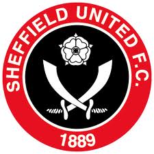
A blog entry by John Ashdown at the guardian got me thinking about the time when our badge changed in 77-78(?)

What was the reaction at the time, to the new badge? Anyone miss the coat of arms that it replaced?

And by extension, what would the reaction be if the club decided to do away with or heavily modify the blades on our badge?


I'd like to see the blades replaced by a square and compass to reflect our rich, if somewhat secretive, property development heritage... :D
 
I would like to see the old coat of arms back temporarily, just for a bit of a change and the nostalgia of it. It reminds me of our most successful era.

A few teams have gone the way of using their old crest again and I think it wouldnt hurt us either. Nothing against the modern one, which I also like....just think it would make a nice change.
 
Our current badge is great.

If you put 50 random club badges on a sheet of paper, minus the team names/initials, you can identify us right away. Everyone knows what club it represents. A lot of others have crests that all look the same to me. That is something I enjoy personally, but I'm sure must be a positive from a business point of view too (marketing and branding guff).

I wouldn't want a crappy crest for sure and because of my age (born 1982) I've only known one badge - I would find a different one hard to identify with, though I'm sure plenty of older Blades felt that way when they changed it.

Changing logo costs an incredible amount of money. Every sign, every letter head, every bit of crappy merchandise, all has to be done.

So it's not going to happen... :)

Besides, I agree with you. Our badge is ace anyway.
 
im very much on the side of the old crest, the crest of the city of sheffield for the football club of the city of sheffield
just think how much it may annoy/upset our friends on the city council who wear blue and white under their pinstripes, not to mention our mates from tother side of the city, it may not even raise an eyebrow

other than that reason, I think it is a far more pleasant badge to look at.
Ive always felt that the change was unneccesary, not that it really matters too much in the grand scheme but it was akin to the more recent marketing gimmics of calling Bradford Northern the Bulls and Hull FC the Sharks etc and then even more recently in cricket calling Derbyshire the Falcons then Phantoms etc - it seems something of an unneccesary modern Americanisation of a traditional culture within sport over here.
 
I think it was supposed to be Jimmy Sirrell that designed the current badge back in the day. Must have been 77-78 I think but I am useless at that sort of stuff. Dazzler would put us all straight on that one.

I was not too bothered at the time - I quite liked the new one as it was more simple and could be drawn by a school boy (if I still had my school books I could have checked) whereas the City Crest would have been a nightmare to sketch for someone who is as poor at drawing as I am. Not sure why we have the Sea Cutlasses. We are a bit like the difference between a vaccum cleaner and an Afghan Admiral in that respect.

Have you noticed the glass wall of club badges during the Football League Show on BBC 1 where the Blades badge stands out prominent when the camera pans round to the full frontal view (ooer mrs)? Last year we were prominent on the side wall behind Manische's head. This season we have our very own back light that illuminates the Blades badge in all it's glory with the frontal view.

The current badge is very distinct, very recognisable and quite striking. Very good in my opinion.

For crap badges look at those for Weeds and Wendy - w**kers the lot of 'em.
 
As I understand things, the current badge is based on a design that Jimmy Hagan came up with. Jimmy Sirrell just suggested something along the lines of that as a new club badge. I think at the time the City Council wanted the crest returned to their sole use and had told SUFC they couldn't use it anymore.


P.S. Check my ava for what I think ;)
 
Our current badge is great.

If you put 50 random club badges on a sheet of paper, minus the team names/initials, you can identify us right away. Everyone knows what club it represents. A lot of others have crests that all look the same to me. That is something I enjoy personally, but I'm sure must be a positive from a business point of view too (marketing and branding guff).

I wouldn't want a crappy crest for sure and because of my age (born 1982) I've only known one badge - I would find a different one hard to identify with, though I'm sure plenty of older Blades felt that way when they changed it.

It's certainly better than having a bloody lion!

I love our badge.
 
The current badge ,in its circular form ,is in my mind a design classic .It gets spoilt on the occasions when we have a shield background as has been the case on some shirt designs .

My recollection was that we as a club decided on a change becuase although the right to wear the city crest carried a lot of kudos it also meant it was not subject to a copyright and as such every tom dick and harry was able to produce "sheffield united " goods and sell them as such ,so the club designed the badge and so claimed the copyright to all club produce

a change driven by simple economics as i have always understood
 
It was the piggy council that put the boot in with the crest ! ...fook the crest an fook them the new uns better! :eek:
 
I love our badge as unlike many teams, you can't make a crappy mascot up for a 'Blade'. Wednesday have a fecking pig mascot and Barnsley have a poxy midget striker with a bandaged head called "Hulmo" the inbred

But with us, our badge means we're immune from bloody mascots.... Oh wait a minute we've got a chuffin Pirate and his pissing mate....


Many clubs have messed about with their badges, The Toon, Weeds, Dingles etc, most of whom have eventually reverted to their original crests. Ours has stood the test of time. It looks good in its usual circular form, and I actually quite like it when it's depicted in a shield. It's instantly recognisable, and doesn't lend itself to a particular period of design, so it is timeless.

The old city crest does have an appeal, but I feel that lies in the past and has an antique-y feel about it, though this may be because we only see it on black and white photos and retro shirts!

If you want to know what happens when you change your corporate identity, ask Royal Mail about their flirtation with the branding 'Consignia'!
 
I was proud when they first introduced the Sheffield Coat of Arms to be used by the Blades. It meant we represented Sheffield and no one else including t'pigs could use it. We can keep our corporate badge and put the coat of arms back on shirt. After all there is only one club in Sheffield.
 
The current club badge was introduced in the very first season in which I saw a match (1977/8), so I've no idea what the feeling was like about any change at the time (I was three), but I must admit, ours is a fantastic badge.

Incidentally, the city crest was used for just eleven years (and the occasional match, including the 1925 Cup Final), and the current badge (subject to some cosmetics), is thrice the age. As far as I'm aware, United have only ever had three club badges actually on the shirts. The first one is claimed to be the oldest known football badge in existance.

As for the versions of the badge on shield mentioned by TheSwollengland, I agree. The seemingly miniature version we had in the mid-90s looked terrible, especially on the Leedsalike kit we had for the 1997 Play Off Final, and subsequently used as an away kit. That said, probably my favourite kit had a 'shielded' badge, the 'lace-up' home kit from 1992-4.
 
As for the versions of the badge on shield mentioned by TheSwollengland, I agree. The seemingly miniature version we had in the mid-90s looked terrible, especially on the Leedsalike kit we had for the 1997 Play Off Final, and subsequently used as an away kit. That said, probably my favourite kit had a 'shielded' badge, the 'lace-up' home kit from 1992-4.

My Favourite home shirt was the 97-99 one, which also had a shield, but i think the shirt would still have looked great with our current badge.
 
Why doesnt every British club just have a club crest with a £ or euro emblem.Cant be fuckin arsed with the rest of the world curreny signs but thats what its all about these days.They dont give a flying fuck about history or nostalgia.Football as i know is fucked.
 
>just have a club crest with a £ or euro emblem
heh quality.. LOL.. ours was designed by no less than jimmy hagan.. apparently
 
Lights blue touchpaper.....
 

Attachments

  • New Image.JPG
    New Image.JPG
    91 KB · Views: 53


All advertisments are hidden for logged in members, why not log in/register?

All advertisments are hidden for logged in members, why not log in/register?

Back
Top Bottom