Kit thread: Here we go!!!!!!!!!!!

All advertisments are hidden for logged in members, why not log in/register?


I feel for Marcus Worldius Cupius.

#PrayForMarcus


Marcus should think of Bolton fans, they've signed Don from us even though his legs went and he was doing his best Bambi impression for the latter third of the season.
 
I'm sure someone will state marketing people know what they're doing, but I'm confident a blurry teaser video of red and white stripes with black shorts will have sweet FA impact on sales.

Maybe they're going to keep edging us with slightly less blurry pics for days thinking we'll all ultimately climax into a crescendo of online payments.

A lot of marketing (which I've worked in) is smoke, mirrors and bullshit.

'50% of it works, 50% doesn't but we're not sure which way round.' Well fuck off, Tarquin and Chloe and come back when you do know. There used to be (might still be) a firm in Sheffield called Ancon. Every month in Cnstruction News, they took out a full-page advert. The first month, it was just a big A. The next month N and so on. Utter waste of time & money.

Anyway, to add something to the shirt debate, I thought last seasons was great and wish they didn't change them all the fucking time. Surely people like to wear shirts from days gone by rather than fork out £40-odd quid every year for some minor detail change.
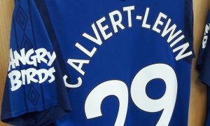
I'll be disappointed in we stick with the Ramsdens green background because - like Door Deals, it would look shite. At the start of last season, Everton had 'Angry Birds' as their sleeve sponsor (and you think we struggle to get sponsors). AB's logo is red and Everton fans protested until it was changed to white-on-blue. I'll also be pissed off if the solid back is white instead of red as it'll look like we play in white from many angles - like that shitty one from a few seasons ago.

angrybirds.jpg
 
The elaborate social media reveals of new signings were bad enough, but clubs apparently now need to be having fancy reveals of new shirts, complete with trailers for the upcoming new shirt with nonsense like '#ForgedInSteel' all over it.

Modern football is rubbish, basically.
 
I think on the balance of probabilities we are going to get red and white stripes.
 
Not always, my 90s ones is half peeled off but yeah the recent ones have

They were like that puff paint shit kids have. Awful. And it went a horrible colour when you'd washed it a few times, that's if they didn't peel off as you say.

The diamond kit 'Avec' died almost immediately.
 
Has anyone driven past the lane to see if the pictures above club shop have been taken down yet?
 
What's the obsession with having Black on our kits?

47 of our striped kits were just standard red/white stripes with 8 carrying black pinstripes (if you include the deckchair shirt). We then had white before stripes, a diamond shirt, a white anniversary one and an Ajax style shirt. That's over 85% of our striped shirts without black. That's not even considering years, considering kits used to be worn for 4 or more years at one bit. Without working it out, it's probably more like 90%+ without black.

http://www.historicalkits.co.uk/Sheffield_United/Sheffield_United.htm

We had no black on the shirts (with stripes) for 81 years from 1894 to 1975.

edit: ok worked it out. Since 1894 when stripes came in, we have had 16 seasons with black pinstripes. So 87% without black
 
Last edited:

What's the obsession with having Black on our kits?

47 of our striped kits were just standard red/white stripes with 8 carrying black pinstripes (if you include the deckchair shirt). We then had white before stripes, a diamond shirt, a white anniversary one and an Ajax style shirt. That's over 85% of our striped shirts without black. That's not even considering years, considering kits used to be worn for 4 or more years at one bit. Without working it out, it's probably more like 90%+ without black.

http://www.historicalkits.co.uk/Sheffield_United/Sheffield_United.htm

We had no black on the shirts (with stripes) for 81 years from 1894 to 1975.

edit: ok worked it out. Since 1894 when stripes came in, we have had 16 seasons with black pinstripes. So 87% without black

Don't think it's anything other than 'it looks nice' really. Although as you say most of our kits don't have it.

Perhaps nostalgia, I know the first kit I remember really well and United were playing in when I started going to the Lane had black pinstripes, and if you're going on kits should have colours of the badge logic then there's reason to have black (and yellow/gold) but I'd go with the looking nice argument first.

If it looks like any of the mockups I've made though I'll be happy black or not.
 
mattbianco1 It's probably also partly because it differentiates United's shirts from Stoke/Sunderland/Southampton/Exeter, particularly as we mess about so much with the colours of the shorts and socks (neither of which should ever, ever be red).
 
What's the obsession with having Black on our kits?

47 of our striped kits were just standard red/white stripes with 8 carrying black pinstripes (if you include the deckchair shirt). We then had white before stripes, a diamond shirt, a white anniversary one and an Ajax style shirt. That's over 85% of our striped shirts without black. That's not even considering years, considering kits used to be worn for 4 or more years at one bit. Without working it out, it's probably more like 90%+ without black.

http://www.historicalkits.co.uk/Sheffield_United/Sheffield_United.htm

We had no black on the shirts (with stripes) for 81 years from 1894 to 1975.

edit: ok worked it out. Since 1894 when stripes came in, we have had 16 seasons with black pinstripes. So 87% without black

It sets us apart and looks awesome... simples
 
Last year’s had a sewn on badge, last one to be embroidered was in the promotion season

For reference. Good shirt knowledge, I'd not really noticed until I actually looked.

IDuhGPLr.jpg
 
Conspiracy Theory..

Could the photo shoot have featured Brooks so it’s been pulled and to be re-done?
 
For reference. Good shirt knowledge, I'd not really noticed until I actually looked.

IDuhGPLr.jpg
When you look at them side by side like that, the patch on last seasons shirt looks far better. The embroidery on that promotion shirt is pretty poor, yet it's absolutely perfect on the white anniversary shirt.
 
Sewn on badge an instant improvement.

My god, what do we sound like...:(

Hard to tell from the photo but it looks to me like the badge is sewn on using “blanket stitch”? If so, that’s very unfortunate. The last time we had a badge sewn on with blanket stitch we were relegated. We should have gone for a “cross-stitch” design. We were promoted to the Prem with that style of embroidery.
 
A lot of marketing (which I've worked in) is smoke, mirrors and bullshit.

'50% of it works, 50% doesn't but we're not sure which way round.' Well fuck off, Tarquin and Chloe and come back when you do know. There used to be (might still be) a firm in Sheffield called Ancon. Every month in Cnstruction News, they took out a full-page advert. The first month, it was just a big A. The next month N and so on. Utter waste of time & money.

Anyway, to add something to the shirt debate, I thought last seasons was great and wish they didn't change them all the fucking time. Surely people like to wear shirts from days gone by rather than fork out £40-odd quid every year for some minor detail change.
I'll be disappointed in we stick with the Ramsdens green background because - like Door Deals, it would look shite. At the start of last season, Everton had 'Angry Birds' as their sleeve sponsor (and you think we struggle to get sponsors). AB's logo is red and Everton fans protested until it was changed to white-on-blue. I'll also be pissed off if the solid back is white instead of red as it'll look like we play in white from many angles - like that shitty one from a few seasons ago.

View attachment 40857

Im with you on that. I also don’t like them changing the kit every season. We will eventually run out of design options - there’s only so much you can do with red n white stripes. Instead they should focus more on the style or fabric of the shirt and leave the design alone. For example: a full length red n white striped shirt in flowing chiffon would look simply lovely and no need to argue over the colour of the shorts because they wouldn’t be necessary.
 

When you look at them side by side like that, the patch on last seasons shirt looks far better. The embroidery on that promotion shirt is pretty poor, yet it's absolutely perfect on the white anniversary shirt.
The difference is that one badge is embroidered and one badge is woven On embroidered badges you get the 3D/Raised effect whereas on a woven badge the design is more sharp. I prefer the woven badges for the same reasons mentioned above. I also have some woven badges ready for next DIY kit extravaganza!
 

All advertisments are hidden for logged in members, why not log in/register?

All advertisments are hidden for logged in members, why not log in/register?

Back
Top Bottom